

You’ve seen them everywhere, even if you don't know them by name. That rotating banner of images, products, or news at the top of a homepage? That’s a website carousel, often just called a slider.
Think of it like a digital photo album built right into your website. It lets you feature several key messages in one prime spot without making your page feel cluttered or overwhelming.
Unpacking the Website Carousel
Imagine a compact, rotating billboard on your site; that's a carousel for websites in a nutshell. Instead of dedicating a huge chunk of your screen to a single promotion, a carousel cycles through several. It’s a common feature in web design, though its actual effectiveness is a hot topic among designers and marketers.
At its core, a carousel is a combination of a few key parts working together. Getting to know these components is the first step in figuring out if a carousel is the right fit for your website. If you're looking for more ways to spruce up your site, you can find plenty of inspiration among the digital marketing resources on our company blog.
Core Components of a Carousel
Every website carousel, no matter how fancy, is built from the same basic parts. Each one plays a specific role in how users interact with your content.
Here’s a quick look at the essential components that make a carousel tick.
Key Carousel Features and Their Functions
| Component | Primary Function |
|---|---|
| Slides | The individual content panels that rotate. Each one usually has an image, text, and a call-to-action. |
| Navigation Controls | The interactive bits that let users take control, like arrows for next/previous and dots to show slide position. |
| Container | The outer frame that holds everything together and defines the carousel's visible space on the page. |
These simple elements come together to create a dynamic and interactive feature for your website.
How It All Works Together
The real trick to a carousel is in its transitions. You can set them to advance automatically every few seconds or wait for a user to click an arrow or dot. The movement is designed to catch the eye and present information one piece at a time.
A well-designed carousel should feel less like a slideshow and more like an interactive story. Each slide should offer a distinct but related message, guiding the visitor through a curated experience.
Essentially, a carousel for websites is a space-saving tool that packs multiple messages into an engaging format. When you get it right, it can put your most important content front and centre. The secret is finding that sweet spot between eye-catching visuals and a genuinely user-friendly experience.
Are Carousels a Help or a Hindrance on Your Website?

The humble website carousel is easily one of the most argued-about elements in web design. On one hand, it seems like a brilliant fix for a common headache: how do you fit several important messages into that prime bit of on-screen real estate without making people scroll?
You can think of it as a revolving billboard for your homepage. It lets you feature a new product, shout about a sale, and share a glowing customer review, all in the same compact space. For businesses juggling multiple priorities, this feels like an obvious win.
But for all its space-saving glamour, the carousel comes with a long list of potential problems that have kept designers debating for years. The real question is, do people actually use them, or have they just become part of the digital background noise?
The Banner Blindness Problem
One of the biggest knocks against the carousel for websites is something called banner blindness. We’ve all been conditioned over years of internet browsing to automatically tune out anything that looks like an advert. Because carousels are often big, flashy, and sit right at the top of the page, our brains frequently file them under "promotional banner" and simply ignore them.
This means all that crucial information you’ve tucked away on slides two, three, and four might as well not be there. Your visitors usually arrive with a goal in mind, and a big, moving block of content can often feel more like an obstacle than a helpful starting point.
The hard truth is that if your users don't engage with the very first slide, the chances of them ever seeing the others are slim to none. This makes the placement of your main message absolutely critical.
And this isn't just a hunch; the data backs it up. One study found that the average click-through rates on carousels were stuck between 1.7% and 2.3%. More telling, though, is that the first slide hogged almost all the attention, getting between 48-62% of all the clicks the carousel received.
Technical Headaches and SEO Hurdles
It's not just about user behaviour, either. Carousels can bring a host of technical issues that can drag down your site's performance, hurting both user experience and your search engine optimisation (SEO) efforts.
-
Page Load Speed: Most carousels are built with multiple high-resolution images and hefty JavaScript code. If these aren't optimised properly, they can seriously slow your website down, which is a sure-fire way to send your bounce rate soaring.
-
Mobile Experience: A slider that looks sleek on a desktop monitor can become a clunky, frustrating mess on a smaller screen. Tiny navigation buttons, unreadable text, and awkward swiping can ruin the experience for the huge number of people browsing on their phones.
-
Accessibility Issues: For someone with motor skill difficulties, trying to click a moving target is a nightmare. For those who use screen readers, an auto-playing carousel can be disorienting and confusing if it’s not coded with accessibility in mind.
From an SEO point of view, a badly built carousel can muddy the waters. For example, some people are tempted to put a H1 heading on every slide. This dilutes the page's focus and makes it much harder for Google to figure out what the page is actually about. Getting these technical details right is a core part of any good marketing strategy for small businesses, because site performance is directly tied to visibility.
At the end of the day, a carousel isn't inherently good or bad—its success is all in the execution. A lazy, poorly planned carousel will almost certainly hurt your site. But a thoughtful, well-designed one can still be a great way to present content in a compact and engaging way. The trick is knowing how to do it right.
How to Design a User-Friendly Carousel

Creating a really effective carousel for websites has less to do with flashy animations and more to do with smart, user-focused design. A carousel that just gets in the way will do more harm than good, so making it genuinely usable is the top priority. The goal is to build an experience that feels completely intuitive.
This means we need to think beyond just making it work. It's the small details that count—from crystal-clear navigation to lightning-fast load times. Every single element should be there for a reason: to help the user. Let's walk through the key principles for crafting a carousel that actually improves your site.
Make Navigation Obvious and Accessible
A visitor should know exactly how to use your carousel the moment they see it. If the controls are confusing, people will simply ignore it, and you've wasted valuable screen space.
To make sure your carousel guides attention properly and is easy to scan, you need a good grasp of the principles of visual hierarchy. This helps you place controls where they make sense and are immediately visible.
Here are the essentials for clear navigation:
- Visible Arrows: Use prominent arrows with strong contrast on both sides of the slides. Steer clear of tiny, semi-transparent icons that just blend into the background.
- Slide Indicators: Always include dots or small thumbnails below the carousel. Not only do they show people where they are, but they also let them jump straight to a specific slide.
- Swipe Support for Mobile: It’s a must. Mobile users expect to swipe left and right on a carousel—it's second nature on any touch device.
Prioritise Performance and Speed
Speed is non-negotiable in modern web design. A slow-loading carousel can send your bounce rate through the roof, especially on mobile, where connections aren't always reliable.
To fight this, you need to think about optimisation from day one. Compress every single image to get the file size down without turning it into a pixelated mess. It’s also a great idea to lazy load images on slides that aren't visible straight away, so they only load when the user actually scrolls to them.
Giving users full control over their experience is a cornerstone of good design. Try to avoid auto-playing carousels. Unexpected movement is distracting and can be a real accessibility problem. If you absolutely have to use auto-play, make sure there's a clear pause button and that the animation stops when someone hovers over it.
Design for Every User
An inclusive design makes sure your carousel works for everyone, including people who use assistive technologies. Thinking about accessibility isn't just a box-ticking exercise; it’s a core part of creating a positive experience for all your visitors.
Start by making sure it works with a keyboard. Users should be able to tab to the carousel, use the arrow keys to move between slides, and hit Enter to follow a link. This is vital for anyone who can't use a mouse.
You should also use ARIA (Accessible Rich Internet Applications) attributes in your code. These give screen readers the context they need to understand what the carousel is and how it works. For instance, an aria-label can describe what the navigation buttons do, ensuring a user with a visual impairment knows exactly what to click. A well-built, accessible carousel shows you care about every person visiting your site.
When Should You Actually Use a Carousel on Your Website?

Deciding to add a carousel for websites is a strategic move, not just a design flourish. It’s certainly not a one-size-fits-all solution, and dropping one onto a page without a clear reason is a recipe for the usability headaches we've already touched on.
The secret is to match the tool to the task. A carousel should only get the nod when its unique ability to cycle through content genuinely helps you achieve something a static element can't. Think of it like a specialist tool in a toolbox—you wouldn't use a sledgehammer to hang a picture. When used properly, a carousel can expertly guide a visitor's attention, present a series of related items, and save valuable screen space without burying essential information.
Showcasing E-commerce Product Collections
One of the best and most common places to find a carousel is in e-commerce. Let’s say you’re launching a new line of summer dresses or a collection of related smart home gadgets. A massive grid of products could easily overwhelm a visitor, but a single hero image wouldn't do justice to the entire range.
This is where a product carousel really comes into its own. It lets you introduce the whole collection in a single, interactive, and visually appealing block. Each slide can feature a different item, showing off a great photo, a punchy description, and a direct link to its product page. This creates a neat, shoppable experience that tempts people to explore without having to scroll endlessly.
It's a fantastic way to tell a visual story about a group of products. It’s perfect for:
- New Arrivals: Giving your latest stock the spotlight.
- Best-Sellers: Highlighting popular items to create social proof.
- Themed Collections: Grouping products for a holiday, a season, or a special sale.
Displaying Portfolios and Creative Work
For any creative professional—photographers, designers, artists, you name it—their portfolio is their lifeblood. A carousel offers a dynamic, controlled way to present their best work. It moves beyond a simple, static gallery and creates a curated, step-by-step viewing experience.
Each slide can be dedicated to a single project, giving the visitor a moment to focus on one piece before moving to the next. This controlled narrative is brilliant for showing off the depth and quality of someone's work in a compact space. It's an elegant solution for anyone needing to present a series of visual projects.
Highlighting News Articles or Blog Posts
News sites and content-heavy blogs face a constant challenge: how to feature multiple top stories without their homepage looking like a cluttered mess. A carousel for websites is a popular and effective solution here. It can cycle through the day's biggest headlines, each with a strong image and a link to the full story.
A well-designed news carousel is like the front page of a digital newspaper. It gives readers a quick, scannable overview of the most important content right now. This boosts the visibility of several articles and encourages people to dive deeper into the site.
A word of warning, though: it's absolutely vital that the very first slide features your most important story. User engagement almost always drops off after the first slide. By using a carousel with this kind of strategic thinking, you can really improve the user experience and hit your goals.
Choosing The Right Tools To Build a Carousel
So, you've decided a carousel is the right fit for your website. The next big question is: how do you actually build it? Thankfully, you're not short on options. The market is packed with tools, from simple drag-and-drop plugins for beginners to powerful JavaScript libraries for seasoned developers.
The right choice really boils down to your technical comfort level, your budget, and what you need the carousel to do. It’s not just about flashy features, either. A poorly coded tool can be a real drag on your site's performance, slowing it down and frustrating visitors—the exact opposite of what you’re trying to achieve.
Optimisation is everything. The performance gap between a well-optimised carousel and a clunky, unoptimised one is massive.
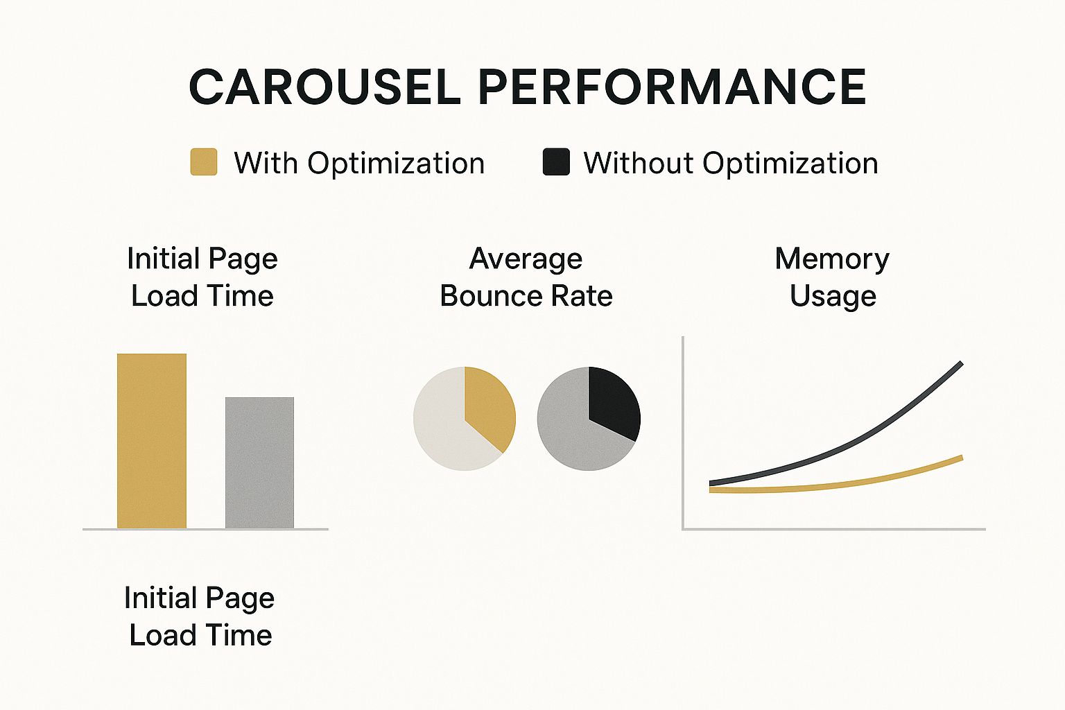
As you can see, taking the time to fine-tune your carousel's code and assets pays off big time with a faster, more engaging experience for your audience.
WordPress Plugins for Easy Implementation
For the millions of us using WordPress, plugins are by far the most direct route. These tools give you a visual interface, which means you can build a professional-looking slider without touching a single line of code. They’re perfect for small business owners, marketers, or anyone who needs to get a great result, fast.
Here are a few of the most popular choices out there:
- Smart Slider 3: This is often hailed as one of the best. It has a super intuitive editor, a massive library of templates to get you started, and lets you add layers of text and buttons. The free version is incredibly generous with its features.
- Soliloquy: If site speed is your top priority, Soliloquy is a fantastic choice. It’s known for being incredibly lightweight, simple to use, and SEO-friendly, so it won’t weigh your pages down.
- Slider Revolution: For those who want to go all out with creative control, Slider Revolution is a beast. It’s more than just an image slider; you can build complex animations, interactive scenes, and even entire hero sections with it.
A quick word of advice: When you're looking at plugins, always check when they were last updated and if they have active support. An old, neglected plugin can be a security headache and might not play nice with the latest version of WordPress.
JavaScript Libraries for Full Customisation
If you're a developer or have one on your team, JavaScript libraries offer you the keys to the kingdom. You get total control over how your carousel looks, behaves, and performs. Unlike plugins, they're not tied to any specific platform like WordPress; you can integrate them into any website. This is the way to go for custom-built projects where an off-the-shelf solution just won't cut it.
These libraries give you the engine, but it's up to you to build the car around it. Think of it like this: a plugin is a ready-made car, while a library is a high-performance engine and chassis you build upon. Understanding how these fundamental pieces fit together is crucial, just like grasping the basics is essential for anyone diving into online promotion. To see how different elements form a bigger picture, this beginner's guide to digital marketing provides a great foundation.
Some of the go-to JavaScript libraries include:
- Swiper.js: A modern, free, and hugely popular library. It was designed with a mobile-first mindset, so it’s incredibly fast, touch-friendly, and packed with features.
- Slick Carousel: A true classic in the development world. Slick has a reputation for being "the last carousel you'll ever need" because it’s so versatile. It’s fully responsive, supports lazy loading to improve performance, and works beautifully with swipe gestures.
- Flickity: This one is all about creating carousels that feel incredibly natural and responsive to touch. It’s praised for its fantastic physics and clean, easy-to-use API.
Comparing Your Options
So, do you go for a user-friendly plugin or a powerful JavaScript library? It all comes down to what you value more: ease and speed, or total creative freedom and custom performance. To help you weigh things up, I’ve put together a simple comparison table.
Comparison of Popular Website Carousel Tools
This table breaks down the core differences between plugins and libraries, helping you see at a glance which path is better suited for your project.
| Tool Name | Best For | Ease of Use | Key Feature |
|---|---|---|---|
| WordPress Plugins | Beginners, marketers, and anyone on WordPress needing a quick solution. | Very High | Visual, drag-and-drop editors with plenty of pre-built templates. |
| JavaScript Libraries | Developers, custom web projects, and situations where performance is critical. | Low (requires coding skills) | Complete control over style, function, and optimisation. |
Ultimately, choosing the right tool makes all the difference. Whether you opt for a simple plugin or a custom-coded library, the goal is the same: to create a carousel that enhances your website and helps you connect with your visitors.
Lessons from High-Engagement Social Media Carousels
It's funny, isn't it? The classic website carousel often gets a bad rap for poor engagement, yet its cousin on social media is a superstar. Hop on Instagram or LinkedIn, and you'll see multi-slide posts that people actively swipe, read, and share. So, what’s their secret, and what can we learn from them?
The biggest difference is storytelling. Social media carousels aren't just a jumble of images. They’re structured narratives, carefully designed to pull you from one slide to the next. Think of them less like a rotating billboard and more like a mini-presentation or a chapter from a book.
The Power of a Compelling Narrative
The best social media carousels know one thing: the only job of the first slide is to get you to swipe to the second. They grab your attention with a strong hook—maybe a bold question, a surprising stat, or an intriguing statement. From there, each slide builds on the last, delivering information in easy-to-digest, bite-sized pieces.
This simple shift turns passive viewing into active participation. Instead of just waiting for an animation to finish, the user is in the driver's seat, swiping at their own pace to see what comes next. That journey is far more engaging than a simple auto-playing slider.
The most effective carousels create a sense of curiosity and incompletion. By framing content as a step-by-step guide, a list of tips, or a story with a clear beginning, middle, and end, they give users a genuine reason to keep swiping.
And this narrative-driven approach really works. Marketing data from the UK shows that Instagram carousel posts hit an average engagement rate of 1.92% per post. That’s higher than static images (1.74%) and even videos (1.45%). If you want to dive deeper into the numbers, you can explore UK social media statistics that matter.
Actionable Takeaways for Your Website Carousel
To bring this success over to your own carousel for websites, it’s time for a mindset shift. Stop seeing it as a container for disconnected promotions and start treating it like a storytelling tool.
Here’s how you can apply these lessons from social media:
- Create a Strong Hook: Your first slide has to make an impact, fast. Use a powerful headline and a striking visual that clearly promises value.
- Tell a Cohesive Story: Make sure every slide connects logically to the one before it. You could guide a user through a process, showcase different facets of a single product, or walk them through a customer success story.
- Focus on One Idea Per Slide: Don't overload your visitors. Keep the text minimal and stick to one clear point before moving on.
- Include a Clear Call-to-Action: The final slide needs to give clear instructions. Tell the user exactly what to do next, whether it’s "Shop Now," "Learn More," or "Read the Full Story."
Understanding the essential types of social media content that people love to engage with is a great starting point. By adopting this narrative approach, you can turn a tired website slider into an interactive experience that your visitors will actually enjoy.
Frequently Asked Questions
Let's be honest, carousels can be a bit tricky. It’s easy to get tangled up in questions about how they affect your search rankings or just how many slides is too many. Here are some straightforward answers to the questions we get asked all the time.
Think of this as a quick-start guide to help you get your carousel right, making sure it’s a genuine asset to your site, not a liability.
Are Carousels Bad For SEO?
They certainly can be if you're not careful. The biggest SEO traps with carousels are sluggish loading times and a muddled page structure, both of which can really hurt your rankings.
The main culprits are usually huge, unoptimised images and clunky JavaScript that drag your site's speed down—and we all know page speed is a massive factor for Google. Another common mistake is sticking a unique H1 heading on every single slide. This just confuses search engines, leaving them unsure what your page is actually about. To sidestep these issues, always compress your images, keep the code lean, and make sure your one-and-only H1 tag sits on a static part of the page, not within a slide.
How Many Slides Should a Website Carousel Have?
From everything we've seen, the sweet spot is 3 to 5 slides, maximum. The data on this is crystal clear: people just don't click past the first slide very often.
Keeping the number of slides low forces you to focus on what’s truly important, preventing you from overwhelming visitors the moment they arrive.
The golden rule for carousels is to put your most important message or call-to-action right on that first slide. You have to assume most people will never see the others.
By limiting the slides, you’re not just improving the user experience; you’re making your own messaging sharper and more effective.
Should My Website Carousel Auto-Play?
As a general rule, it's best to avoid auto-playing carousels. That constant movement can be really distracting, often whisking away important information just as someone starts to read it.
Beyond being annoying, auto-play can create serious accessibility hurdles for people with cognitive disabilities or anyone using a screen reader. If you feel you absolutely must have it for a specific design, then you need to hand over control to the user. That means including obvious controls like a big pause button, or at the very least, making sure the animation stops the instant someone hovers their mouse over it.
Ready to find more great tools to level up your website and marketing? The Digital Marketing Toolbox is a hand-picked collection of the best solutions out there for analytics, SEO, customer engagement, and a whole lot more. Find the perfect widget or platform to help you grow. Explore the toolbox and start optimising your business today at https://grow-your-biz.com.


