
Before you can even think about improving conversions, you need a solid baseline. It's time to get your hands dirty in the data to figure out what's really going on with your website. This means digging into your analytics to find your actual conversion rate, pinpointing the exact pages that are losing you customers, and understanding which traffic sources are pulling their weight.
Getting a Diagnosis of Your Current Conversion Performance
Trying to boost your website's conversions without understanding the current situation is like driving blind. You need a map, a starting point. This isn't about looking at vanity metrics; it’s about finding real, actionable insights that will shape your entire approach. Think of it as a health check for your website, revealing its strengths and, more importantly, its weaknesses.
To get a better handle on where to begin, it’s worth exploring some proven strategies to improve website conversion rates. The whole process really kicks off inside your analytics platform, whether that's Google Analytics or something similar. This is where you move past the surface-level numbers and start to see the story your data is telling.
Finding Your True Conversion Rate
Your overall conversion rate gives you a bird's-eye view, but the real magic happens when you start segmenting that data. Let's look at the UK e-commerce scene as an example.
UK E-commerce Conversion Rate Benchmarks
A summary of average conversion rates across different industries and devices in the UK to help you benchmark your performance.
| Industry/Device | Average Conversion Rate |
|---|---|
| Fashion & Apparel | 1.9% |
| Health & Beauty | 3.1% |
| Home & Garden | 2.5% |
| Desktop (All Industries) | 4.8% |
| Mobile (All Industries) | 2.9% |
As you can see, performance varies massively. What's really telling is the device split: desktop users convert at around 4.8%, which is almost double the rate of mobile users at 2.9%. This is a huge deal, especially when you realise that mobile often drives the majority of traffic—sometimes as much as 73%!
That single discrepancy should set alarm bells ringing. Is your mobile checkout a nightmare to get through? Are product pages a mess on smaller screens? This is exactly the kind of question you need to be asking.
This chart shows a classic conversion funnel and just how many people you lose at each step, from the moment they land on your site to when they finally sign up or make a purchase.
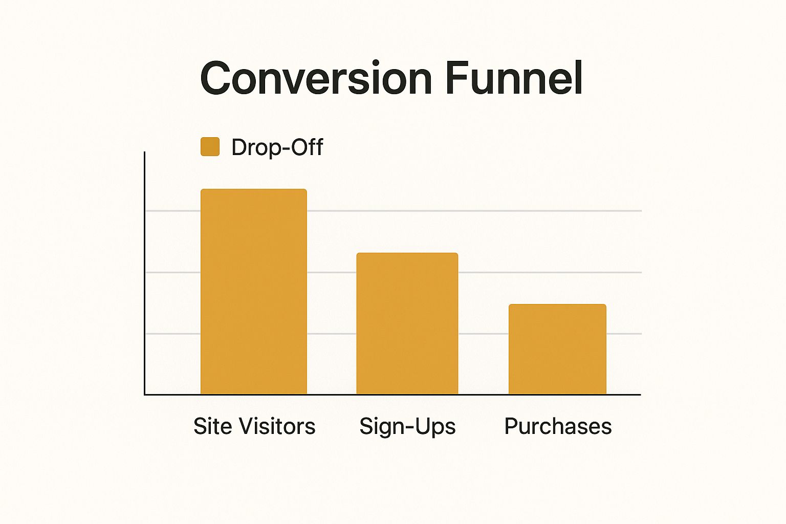
You can see the dramatic drop-off between each stage. Those gaps are your biggest opportunities.
Identifying High-Exit Pages and Leaky Funnels
Next up, you need to find the specific pages where potential customers are giving up and leaving. In Google Analytics, the "Exit Pages" report is an absolute goldmine for this.
A high exit rate on a critical page—like your checkout or pricing page—is a massive red flag. It’s a clear signal that people were interested enough to get that far, but something put them off right at the final hurdle.
Finding these leaks is crucial. For example, I’ve seen cases where a huge number of users were abandoning the cart right on the shipping information page. A quick investigation revealed that the delivery costs were a complete surprise and far too high.
By zeroing in on these problem spots, you can make focused, targeted changes that have a genuine impact on your revenue. This groundwork is what sets you up for successful conversion rate optimisation down the line.
Streamlining Your User Experience
Let's be blunt: a confusing or slow website is a conversion killer. If visitors can't find what they need in a few seconds, they won't hang around to solve the puzzle. They'll just leave. Polishing your user experience (UX) isn't about making things look pretty; it's about creating a completely frictionless path from the moment someone lands on your site to the moment they take action.

Think of your website's navigation as the signposts in a physical shop. If a customer can't find the tills or the changing rooms, they'll walk out frustrated. It’s the same online. If your pricing, contact details, or key product pages are buried, you're actively pushing potential customers away.
The goal is to minimise the number of clicks and the amount of brainpower a user needs to get what they want. It’s a simple principle, but it's the absolute foundation of good UX and a critical part of any real effort to increase website conversions.
Make Every Second Count with Page Speed
One of the biggest roadblocks to a great user experience is a slow-loading page. We live in an age of instant gratification, and even a one-second delay can see your conversion rates plummet by up to 7%. Your visitors expect a snappy, responsive experience, especially when they're on their phones.
To get a quick diagnosis, run your site through a free tool like Google's PageSpeed Insights. It will analyse your performance and give you a clear, actionable list of things to fix. I’ve found the most common culprits are usually:
- Oversized Images: Always compress your images before uploading them. You can dramatically cut load times without any noticeable drop in quality.
- Bloated Code: Clunky code from too many plugins or a poorly built theme can really weigh your site down.
- Slow Server Response Time: If this is flagged, it might be a sign that you've outgrown your hosting plan and it's time for an upgrade.
Your website's speed isn't just a technical metric; it's the first impression you make. A fast site feels professional and reliable, whereas a slow one immediately creates doubt and frustration, pushing visitors away before they even see your offer.
Design for Mobile First, Not Mobile Friendly
With most web traffic in the UK now coming from mobile devices, a "mobile-friendly" mindset just doesn't cut it anymore. A true mobile-first design philosophy means you plan and build the experience for the smallest screen first, then adapt it upwards for tablets and desktops.
This forces you to prioritise the core journey for the majority of your users. A shrunken-down desktop site nearly always leads to tiny, unreadable text, buttons that are impossible to tap, and clunky forms. These are absolute conversion killers on mobile. For a broader look at how this fits into the bigger picture, our beginner's guide to digital marketing provides some excellent context.
I saw this in action with a UK-based clothing retailer I worked with. Their mobile add-to-cart rate was shockingly low. We redesigned their product pages with a mobile-first approach, introducing big, thumb-friendly "Add to Basket" buttons and a much simpler size selector. The result? A 45% increase in mobile conversions in the first month. It just goes to show how focusing on that mobile journey is a powerful way to increase website conversions where it really counts.
How to Build Unshakeable Trust with Your Visitors
Trust is the bedrock of any successful website. Before anyone hands over their card details or personal information, they need to feel certain your business is legitimate, secure, and will actually deliver what you promise. This isn't about one magic bullet; it's about weaving multiple trust signals throughout your site that work together to put visitors at ease.

Let's start with the absolute essentials. An SSL certificate—that little padlock icon in the browser address bar—is non-negotiable. If you don't have one, browsers often flag your site as "Not Secure," which is a surefire way to kill a sale before it even begins. You also need a privacy policy that's clear and easy to find, showing you take data protection seriously.
But getting the basics right is just the starting line. The real magic happens when you introduce social proof.
Let Your Customers Do the Talking
There’s nothing more powerful than genuine feedback from happy customers. When a potential buyer sees that other real people have had a great experience with you, it dramatically reduces their hesitation and any perceived risk.
Here’s how to make your social proof count:
- Real Customer Testimonials: A simple quote isn't enough. Add a name, a photo, and maybe their company or town to give it authenticity. It makes the praise feel so much more genuine.
- Independent Reviews: Don't just host reviews on your own site. Embed a widget from a trusted platform like Trustpilot or Google Reviews. People trust these because they know you can't just delete the bad ones.
- In-Depth Case Studies: If you're in B2B or sell high-ticket services, a detailed case study is your best friend. Walk readers through a client's problem, how you solved it, and the brilliant results you achieved.
Placement is everything. Think about adding a compelling testimonial right on your checkout page. It can be that final little push someone needs to click "buy now."
The best marketing you have isn't what you say about yourself; it's what your happy customers say for you. Let their voices build that crucial confidence.
Show Off Your Professional Credentials
In some industries, general trust signals just don't cut it. If you’re in finance, healthcare, or any other heavily regulated field, displaying UK-specific accreditations is absolutely essential for earning a visitor's confidence.
Consider the UK healthcare sector, where websites see an average conversion rate of around 3%. Displaying certifications from official UK regulatory bodies and endorsements from experts directly reassures potential patients. In fact, one UK healthcare provider saw a massive 61.67% revenue increase after testing changes on their pricing page that were closely tied to boosting these trust metrics. You can dig into these ecommerce conversion benchmarks on SpeedCommerce for more detail.
These badges and certifications prove you adhere to professional standards, showing visitors they are in safe hands. Building this kind of trust is a powerful way to drive conversions, and you can build on it even further when you understand the advantages of email marketing to nurture those hard-won leads.
Crafting Copy and CTAs That Actually Convert
So, you’ve got a slick website design and it loads in a flash. Great. But that’s only half the battle. If the words on your pages fall flat, you’re leaving money on the table.
Your headlines, your product descriptions, and especially your call-to-action (CTA) buttons are what turn a casual browser into a paying customer. It's the copy that does the heavy lifting, guiding visitors from 'just looking' to 'I need this'.
Think about it this way: people don't buy a drill bit; they buy a hole. They don’t want a waterproof jacket; they want to stay warm and dry on a miserable, rainy day. Your job is to stop listing dry features and start selling real-world benefits. Frame your copy around how your product or service solves a problem and makes their life better.
That’s where testing comes in. You need to know what resonates with your audience, not just what a blog post tells you. Tools like VWO let you pit different versions of a page against each other to see what truly works.

This isn’t just a nice-to-have; it’s a fundamental part of figuring out what makes your customers tick.
How to Write a Call to Action That People Actually Click
Your CTA button is the final, crucial step. It’s the gatekeeper to your conversion goal, and it needs to be unmissable. Vague, lazy words like ‘Submit’ or ‘Click Here’ are absolute conversion killers. They feel non-committal and give the user zero motivation.
Instead, pack your CTAs with action and value. Show them exactly what they’re getting.
-
Weak CTA: Submit
-
Strong CTA: Claim Your Free Trial
-
Weak CTA: Download
-
Strong CTA: Get My Free Ebook
Your CTA button isn’t just a button; it’s the satisfying conclusion to the promise you made on the page. Use a bold, contrasting colour to make it pop, and place it right where your user is most likely to be ready to act.
Stop Guessing, Start Testing: The Power of A/B Testing
If you're serious about boosting conversions, guesswork has to go out the window. The only way to truly know what works is to test it. This is where A/B testing (also called split testing) comes into play. You simply show two different versions of a page element to your audience and see which one gets better results.
You can test practically anything:
- Headlines: Does a direct, benefit-led headline outperform a question?
- Button Text: Does "Start My Journey" get more clicks than "Sign Up Now"?
- Images: What works better – a picture of your product in action or a clean studio shot?
- Value Propositions: Which of your key benefits resonates most with new visitors?
My advice? Start small. When you change just one thing at a time—like the button text—you get crystal-clear data on what caused the shift in performance. Over time, these small, evidence-based tweaks add up to massive improvements in your overall conversion rate.
Ultimately, winning more conversions comes down to crafting messages that speak directly to user needs and spur them into action. To really get this right, you need to become a student of persuasive writing. For a solid starting point, check out this A Practical Guide to Copywriting.
Where Are Your Best Customers Coming From?
It's one thing to know who converts on your site, but the real magic happens when you figure out where they're coming from. Let's be honest, not all traffic is created equal. Someone who clicked a link in your weekly newsletter has a completely different mindset to a person who just stumbled across your site from a random social media post.
If you really want to move the needle on conversions, you’ve got to put your energy where it counts: on the channels that bring you visitors who are already warmed up and ready to act.
These are your high-intent channels. When you dig into your analytics, you’ll see some pretty big differences. For example, UK websites often see visitors from email newsletters and referral links converting at rates of 5% or even higher. Compare that to organic search, which typically sits around 2%, or social media, which can struggle to even hit 1%. You can dive deeper into these average website conversion benchmarks on CleverTap. The data tells a clear story—your email list and your happy customers are absolute gold.
Nurturing Your Email List for Higher Conversions
An engaged email list isn't just a list of contacts; it's one of your most valuable assets for driving conversions. These aren't just faceless visitors. They're people who have explicitly said, "Yes, I want to hear from you." That existing relationship builds a layer of trust that makes them far more receptive to your offers.
The trick is to stop sending generic email blasts and start building genuine relationships.
- Roll out the welcome mat. Set up an automated welcome series for new subscribers. Use it to introduce your brand's personality, explain what makes you different, and maybe offer a little something to encourage their first purchase.
- Segment your subscribers. Don't treat everyone the same. Group people based on what they’ve bought or looked at before. This lets you send them offers and content that are actually relevant to them.
- Offer real value. Your emails shouldn't just be about selling. Mix in genuinely helpful content, tips, or stories. This establishes you as an expert and keeps people opening your emails even when they aren't ready to buy.
Think of your email marketing less like a megaphone and more like a conversation. If you consistently provide value and build that relationship, the sales will come naturally.
To help you prioritise, here's a quick look at how different channels typically perform.
Conversion Rate by Traffic Source
| Traffic Source | Average Conversion Rate |
|---|---|
| Referral | 5.0%+ |
| 5.0%+ | |
| Organic Search | 2.0% |
| Paid Search | 1.5% |
| Social Media | 1.0% |
As you can see, the people who already know and trust you (or trust someone who knows you) are by far your best bet for conversions.
Turn Happy Customers into Your Best Marketers
Honestly, who’s better at selling your product than a genuinely thrilled customer? A simple referral programme can turn all that positive sentiment into a steady stream of high-converting traffic. When someone arrives on your site because their friend sent them, half the work is already done. That personal recommendation is powerful social proof.
You don't need a super-complex system to get this going. A simple "give £10, get £10" model can work wonders. Just give your current customers a unique link to share. When a friend uses their link to make a purchase, they both get a discount. It’s a classic win-win that brings in new customers and encourages repeat business from your existing ones.
Zeroing in on these high-intent channels is a cornerstone of any smart marketing strategy for small business. By simply putting more effort into what’s already working, you can see significant growth without having to start from scratch.
Your Questions on Website Conversions Answered
Diving into conversion rate optimisation (CRO) can feel like opening a can of worms. There's a lot of jargon, a dizzying number of tools, and plenty of conflicting advice out there. Let's clear up some of the confusion and tackle the most common questions that pop up when you're trying to get more from your website.
Getting these fundamentals right is the first step towards setting realistic goals and picking strategies that actually work for your business.
What Is a Good Website Conversion Rate in the UK?
This is the big one, isn't it? But honestly, there’s no single magic number. What’s considered "good" really comes down to your industry. For a typical UK e-commerce site, you're likely looking at something between 1.7% and 3%.
But that's just a rough average. The specifics can vary wildly.
- A high-end luxury fashion retailer might be happy with 1.9%.
- A personal care brand, with a lower price point and repeat buys, could hit 6.8%.
Here's a better way to think about it: the most important benchmark isn't what your competitors are doing, it's what you were doing last month. If you've managed to bump your rate from 1.5% to 2.0% in a quarter, that's a brilliant result. Focus on making steady, incremental improvements.
How Long Does It Take to See Results from CRO Efforts?
I wish I could give a simple answer, but it truly depends. The time it takes to see a real impact hinges on two things: the size of the change you're making and, most importantly, the volume of traffic your website gets. If you don't have enough visitors, you'll be waiting forever to get a statistically reliable result.
For a website with plenty of traffic, a small A/B test—say, changing the colour of a "Buy Now" button or rewriting a headline—could give you solid data in just a couple of weeks. On the other hand, a huge project like redesigning your entire checkout flow will naturally take months to roll out and measure properly. The key is to be patient. Let your tests run their course to ensure the data you're collecting is trustworthy before you call it a day.
Which Tools Are Essential for Increasing Website Conversions?
You don't need a massive, expensive tech stack to get started. A few key tools working in tandem will give you a surprisingly clear picture of what's happening on your site.
For a solid foundation, you’ll want a mix of the following:
- Web Analytics: This is non-negotiable. Google Analytics is the place to start. It tells you what people are doing on your site – where they come from, which pages they visit, and where they drop off.
- A/B Testing Platforms: To figure out if your ideas for improvement actually work, you need a testing tool. Think VWO, Optimizely, or even the built-in testing features in GA4. These let you show different versions of a page to different users and see which one converts better.
- Behaviour Analytics: To understand the why behind your analytics data, tools like Hotjar or Crazy Egg are fantastic. They offer things like heatmaps and session recordings, so you can literally watch where people are clicking, how far they scroll, and where they get stuck.
- Qualitative Feedback: Sometimes, the easiest way to find a problem is just to ask. Using survey tools like SurveyMonkey or Typeform lets you get feedback directly from the people using your website.
Ready to stop guessing and start growing? The The Digital Marketing Toolbox is your one-stop hub for discovering the best tools to analyse, test, and optimise your website for maximum conversions. Explore our curated catalogue and find the perfect solutions to turn more visitors into customers. Find out more at https://grow-your-biz.com.


