
You’ve seen them everywhere: those rotating slideshows of images and text, usually sitting right at the top of a homepage. This is a website carousel, and it acts a bit like a digital billboard on your site's most prized bit of land, cycling through different messages one after another.
While they look like a clever way to pack more information into a small space, their real-world impact on user experience and SEO is one of the hottest topics in web design.
The Great Carousel Debate: Why It Matters

The humble carousel has sparked more arguments than almost any other feature in modern web design. On one side, you have the stakeholders—the marketing heads, the department managers. They often love carousels because they solve a tricky internal problem: everyone wants their message featured prominently on the homepage. A carousel feels like a fair compromise, giving each department a moment in the spotlight.
But on the other side, you'll find a chorus of developers, user experience designers, and SEO experts shaking their heads. For them, this isn't about how a carousel looks, but whether it actually works. Does this flashy, rotating feature genuinely help visitors and hit business targets, or does it just get in the way? The answer could have a huge impact on how well your website performs.
The Problem with Engagement and Visibility
Here’s the hard truth: the data consistently shows that people just don't interact with carousels. Most visitors scroll right past them, a phenomenon known as "banner blindness", where our brains are trained to ignore anything that resembles an advertisement. A big, moving box at the top of a page? That fits the bill perfectly.
This means any important messages you've carefully placed on the second, third, or fourth slide might as well not be there.
One of the most famous studies on this came from the University of Notre Dame. They found that a tiny 1% of visitors actually clicked on the carousel. Even more telling, a staggering 84% of those clicks were on the very first slide. The others were almost completely ignored.
This single statistic completely undermines the main reason for using a carousel in the first place. If no one ever gets to slide two or three, the feature has failed at its one job: to communicate multiple messages.
Every element on your site should be working towards a goal. These elements are a key part of any successful digital marketing strategy, but only if they are effective. You can explore our beginner's guide to digital marketing to understand how every component of your site should support your goals. The evidence suggests that for most visitors, anything beyond the first slide is effectively invisible, a finding you can learn more about from the breakdown of carousel click-through rates.
How Website Carousels Impact User Experience

On the surface, a website carousel seems like a smart way to pack a lot of information into a small space. But in reality, they often create more problems than they solve, getting in the way of a smooth and intuitive visitor journey. One of the biggest hurdles is a phenomenon known as banner blindness.
We've all become experts at tuning out what looks like an advert. Years of browsing have trained our brains to skip over flashy, banner-like elements to get to the content we actually want. A big, rotating carousel on a website fits this description perfectly, meaning many users will subconsciously ignore it and scroll right on by.
So, your most important messages, promotions, and calls-to-action—the very things you put in the carousel to get noticed—end up being completely invisible. Instead of drawing people in, the carousel just becomes part of the background noise.
The Frustration of Lost Control
Have you ever tried to read a slide, only to have it vanish just before you finished? That’s a classic frustration with auto-playing carousels. They take control away from the user, forcing everyone to read at the same predetermined speed.
This isn't just a minor annoyance. For people who read a bit slower or have cognitive disabilities, this constantly shifting content can be genuinely disorienting and stressful. It creates an experience that feels rushed and exclusionary, leaving them unable to absorb the information.
Carousel UX Challenges vs User Expectations
Carousels often introduce features that directly conflict with what users have come to expect from a well-designed website. This mismatch can lead to significant frustration.
| Carousel Feature | Common UX Problem | User Expectation |
|---|---|---|
| Auto-playing Slides | Content moves before it can be read, causing anxiety. | Users want to control the pace of their reading and interaction. |
| Small Navigation Dots | Difficult to see, click, and understand which slide they represent. | Clear, obvious, and easily clickable navigation is standard. |
| Multiple Messages | Creates a lack of focus and overwhelms the visitor. | A clear primary message and call-to-action should be evident. |
| Hidden Content | Important information is buried on slides 2, 3, and beyond. | Key information should be visible immediately, not hidden. |
Ultimately, these design choices often do more harm than good, actively working against your goal of clear communication. A carousel on a website ends up hiding your key marketing messages on slides that most people will never even see.
A poorly implemented carousel can easily undermine an otherwise solid plan. You can learn more by checking out our guide on creating a marketing strategy for small businesses.
The Problem of "Carousel Blindness"
The banner blindness effect is so strong with this feature that many UX experts now call it "carousel blindness." When a visitor lands on a page with multiple rotating messages, it's easy to feel overwhelmed and confused about where to look first.
Instead of showcasing a variety of content, the carousel creates a confusing first impression. It can make visitors feel like they have to work too hard just to understand what your site is about, often encouraging them to leave rather than dig deeper.
Uncovering the SEO and Performance Costs

Beyond the obvious user experience headaches, a carousel on a website almost always comes with a heavy technical price tag. These hidden costs can directly hurt your site's performance and drag down its visibility in search results, a problem that’s especially painful for mobile visitors who won’t wait around for slow pages.
So, where does this performance drain come from? The main culprits are the hefty assets a carousel needs to run. They rely on bulky JavaScript files for their functionality and are typically loaded with large, high-resolution images. This double whammy can dramatically increase your page’s total size, which means it takes longer to load for your visitors.
And that delay is far more than just a minor annoyance. Page speed is a huge ranking factor for Google, so a slow-loading carousel can actively push your website down the search results.
The Page Speed Penalty
Think of your website’s performance budget like packing a suitcase for a flight. You have a strict weight limit before you start getting hit with extra fees. A carousel is like packing three pairs of heavy walking boots when one light pair of trainers would have been fine.
It eats up a massive chunk of your performance budget for an element that—as we’ve already seen—offers very little in return. This is particularly damaging to your Core Web Vitals, which are Google's key metrics for measuring real-world user experience, like the Largest Contentful Paint (LCP).
When a carousel is the largest element "above the fold," it can badly delay your LCP time. A poor LCP score is a direct signal to search engines that your page is slow and frustrating, which can seriously harm your rankings.
You don't have to guess, either. You can see the damage for yourself using a free tool like Google's PageSpeed Insights. Just run a test with the carousel active, then another with it disabled. The difference will give you a crystal-clear picture of the impact.
Confusing Search Engines with Poor Structure
The technical trouble doesn't end with speed. A badly built carousel on a website can also cause real SEO problems by muddling how search engine crawlers understand your content's hierarchy and focus.
A classic mistake is putting an H1 tag on every single slide. Your H1 is supposed to be the single, main headline for the entire page. Using several of them just dilutes their SEO value and sends mixed messages to Google about what your page is actually about.
What’s more, the content on slides two, three, and beyond is often seen as less important—or even completely ignored—by search engines because it’s not visible when the page first loads. Google’s algorithms are clever enough to figure out that content hidden from immediate view is probably not as crucial as what’s presented upfront.
These technical challenges are a major reason why website carousels are falling out of favour. They demand complex code and can slow a site to a crawl, especially on mobile, where every millisecond counts for keeping visitors engaged and your SEO in good standing.
Navigating Web Accessibility with Carousels
Making a website accessible isn’t just about ticking boxes on a compliance sheet; it's about inclusive design. Unfortunately, this is an area where the carousel on a website can go from a neat visual feature to a major roadblock for users with disabilities.
Think about it from the user's perspective. For someone with an attention disorder, auto-playing slides are incredibly distracting. That constant motion can hijack their focus, making it almost impossible to concentrate on anything else on the page. Right away, you’ve broken a golden rule of accessibility: always give the user control.
Then there are the users who rely on screen readers. A badly coded carousel might as well be a black hole. If the slides aren't announced properly and the navigation controls are just unlabelled buttons, the entire feature becomes gibberish, locking out a huge segment of your audience.
The Keyboard Navigation Breakdown
Another common failure is keyboard accessibility. Many people can't use a mouse due to motor impairments, relying completely on a keyboard to get around. If your carousel doesn't support basic keyboard commands, it becomes completely unusable for them.
At a minimum, users must be able to:
- Tab to the carousel: The entire component needs to be reachable with the Tab key.
- Navigate between slides: They should be able to use the left and right arrow keys to move back and forth.
- Control playback: A clear play/pause button that works with the Enter or Spacebar key is essential.
- Interact with links: Any button or link inside a slide has to be reachable and usable via the keyboard.
Without these fundamental features, the carousel is little more than a decorative element that actively excludes people.
An accessible website ensures that all users, regardless of ability, have equal access to information and functionality. Failing to make interactive elements like carousels accessible is not just poor design—it's a form of digital exclusion that can carry legal risks.
Your Accessibility Checklist
Building an accessible carousel is a technical task, not an aesthetic one. It comes down to writing functional, inclusive code. Your checklist must include proper ARIA (Accessible Rich Internet Applications) attributes to tell assistive technologies what the carousel is doing, clear visual focus indicators so keyboard users can see where they are, and descriptive alt text for every single image.
To make sure your carousels and other dynamic elements are up to scratch, it's worth following a comprehensive guide. This ultimate website accessibility checklist provides the detailed steps you need. This isn't just a friendly suggestion; it's a vital part of creating a website that genuinely works for everyone.
Smarter Ways to Implement a Carousel
Look, I get it. Despite all the evidence stacked against them, sometimes a carousel feels like the only option. Maybe the marketing team is insisting on it, or a specific design just seems to call for one. If you absolutely must use a carousel, the mission changes from "avoid at all costs" to "do the least amount of harm."
Think of the following as your guide to responsible carousel design. By following these best practices, you can sidestep the common pitfalls that give carousels such a bad name and build something that’s less likely to annoy your users or tank your SEO.
The Content and Control Strategy
First things first: the content. A carousel stuffed with ten different messages is set up for failure from the start. You need to be ruthless with your messaging and adopt a "less is more" mindset.
- Limit Your Slides: Stick to 3 to 5 slides, maximum. Anything more than that is just clutter, and you can bet those later slides will never see the light of day.
- Prioritise the First Slide: Your most important message and call-to-action must be on the very first slide. Seriously. The data is clear—most people won't see anything else. Design with that assumption in mind.
- Give Users Full Control: The best option is to disable auto-play completely. Let people navigate at their own pace. If you're being pushed to use auto-play, make sure there’s a big, obvious pause button and that the rotation stops dead the second a user’s mouse hovers over it.
By putting the most critical information on the first slide and giving users control over navigation, you acknowledge user behaviour rather than fighting against it. This simple shift in mindset is the foundation of a better carousel experience.
Technical and Navigational Best Practices
Getting the content right is only half the battle. How you build the carousel is just as important. A clunky, poorly coded slider will drag down your site’s performance and frustrate visitors, especially those on mobile.
The navigation controls need to be impossible to miss. Forget those tiny, hard-to-see dots that are a nightmare to tap on a phone. Use large, high-contrast arrows or clear text labels so people know exactly where they’re going.
And please, for the love of good performance, optimise every single image. Huge, uncompressed images are the number one reason carousels kill page load times, which can do real damage to your Core Web Vitals and SEO. Finally, make sure the whole thing is properly responsive—it has to look and work perfectly on every screen, from a tiny phone to a huge desktop monitor. For those who need a structured starting point, learning to use tools like an Elementor Slider Widget can help implement these features more effectively.
To keep everything straight, here’s a quick checklist to run through before you push that new carousel live.
Carousel Implementation Checklist
This table summarises the essential checks to ensure your carousel is as user-friendly and effective as possible.
| Best Practice | Reasoning (Why it's important) | Implementation Tip |
|---|---|---|
| Limit to 3-5 Slides | Prevents content overload and ensures key messages aren't buried in unseen slides. | Be selective. If a message isn't crucial, cut it. |
| Prioritise First Slide | Most users only see the first slide, so it must contain the primary message and CTA. | Treat the first slide as your main hero section. |
| Disable Auto-Play | Gives users control, prevents banner blindness, and improves accessibility. | If auto-play is mandatory, add a prominent pause button. |
| Use Clear Navigation | Obvious arrows and indicators make it easy for users to interact, especially on mobile. | Use large, high-contrast icons. Avoid tiny dots. |
| Optimise All Images | Large images are the main cause of slow load times, hurting UX and SEO. | Compress images and use modern formats like WebP. |
| Ensure Accessibility | Makes the carousel usable for people with disabilities, including screen reader users. | Use proper ARIA attributes and ensure keyboard navigation. |
| Test on Mobile | A poor mobile experience will frustrate the majority of your visitors. | Manually test on different devices, not just in a simulator. |
Following these guidelines won’t magically turn a carousel into the perfect design element, but it will certainly minimise the potential damage to your user experience and site performance.
High-Performing Alternatives to Carousels
If the data tells us that a carousel on a website isn't working, what’s the alternative? Thankfully, you don't have to look far. Several better design patterns can highlight your content far more effectively, all without the usual user experience headaches and performance drags. The common thread? Clarity and user control.
The most powerful alternative is often the simplest: a static hero section. Think about it: one powerful message, one stunning image or video, and one crystal-clear call-to-action (CTA). By ditching the rotating distractions, you put a spotlight on your main message, making it incredibly easy for visitors to take that all-important next step.
This single-focus approach almost always beats sliders when it comes to conversions because it leaves no room for confusion. Users land, they understand, and they know exactly what to do.
This decision flowchart can help you figure out if a carousel or an alternative is the right move for your specific goals.
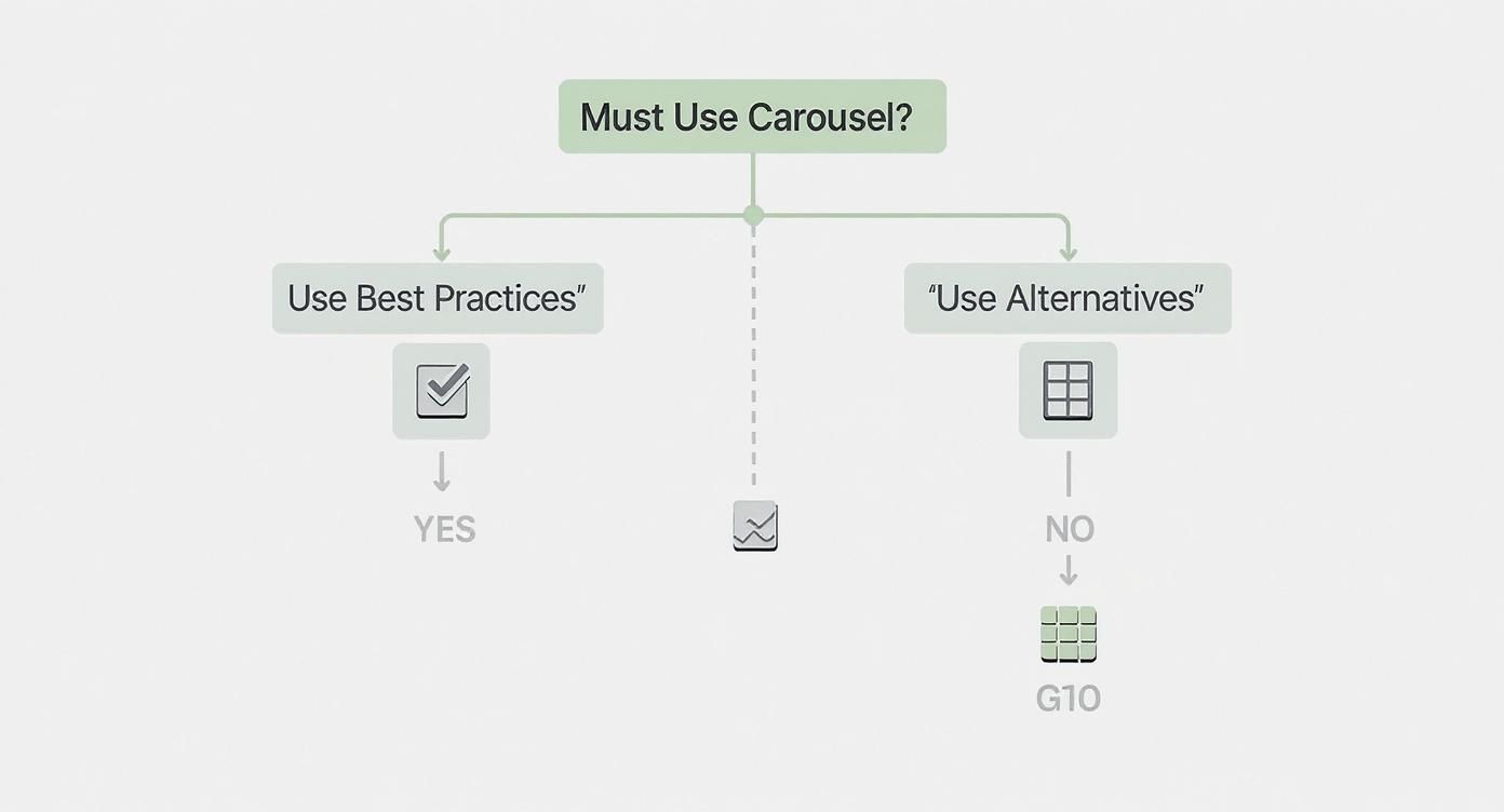
As you can see, unless you have a very specific, user-driven reason for a carousel, a high-performing alternative is nearly always the better choice.
More Effective Design Patterns
Beyond the hero section, a few other excellent options can present information in a way that’s both more accessible and engaging. Each serves a different purpose, but they all share the goal of making content visible and easy to find.
- Grid or Card Layout: Perfect for showing off multiple products, articles, or features at the same time. This lets people scan everything at a glance and click what interests them, putting them firmly in the driver's seat.
- Tabbed Content: A great way to organise related information into neat sections. Users click a tab to reveal the content, keeping the page clean and compact while making sure nothing gets lost on a hidden slide.
- Content Prioritisation: It sounds almost too basic, but simply putting your most important content first in a vertical layout is often the most effective strategy. You guide the user's eye naturally down the page.
When you choose an alternative, you’re actively putting user experience, accessibility, and speed first. These designs respect your visitor's attention and are far more likely to help you hit your business goals than a rotating banner that most people just ignore.
These alternatives don't just improve usability; they also tie in perfectly with smarter marketing. A focused hero section, for instance, can act as a powerful anchor for a targeted campaign, complementing the advantages of email marketing by delivering a unified, compelling message from the very first click.
Answering Your Top Questions About Website Carousels
Even with all the data, a few key questions about carousels tend to pop up again and again. Let's tackle them head-on so you can feel confident about your site's design and performance.
So, Are Carousels Always Bad for Websites?
Not always, but their effective use cases are surprisingly narrow. They can work brilliantly for things like an image gallery on a photographer’s portfolio or a product tour where a visitor is already motivated to click through multiple views.
Where they almost always fall flat is for homepage marketing messages. The real test is whether the user has a genuine, pre-existing reason to interact with the slider.
A carousel isn't inherently "bad," but it is frequently misused. The problem often starts when it's used to solve an internal political debate—like trying to give multiple departments equal billing on the homepage—instead of being used as a genuine tool to improve the user experience.
Can Carousels Be SEO-Friendly?
It’s a tough challenge, but with careful implementation, you can minimise the damage. You must avoid having multiple H1 tags (one for each slide), ensure every image has descriptive alt text, and be ruthless about optimising image file sizes to protect your site speed.
Crucially, your most important content has to be on that first, immediately visible slide. Search engines tend to devalue or ignore content that’s hidden from view on page load.
What’s a Good Number of Slides for a Carousel?
If you're absolutely set on using one, less is more. Aim for no more than three to five slides.
Anything beyond that is a surefire guarantee that the content on the later slides will almost never be seen. It all comes down to prioritisation. If a message isn’t important enough for the first or second slide, it probably doesn’t belong in the carousel at all.
Ready to build a high-performing website without the guesswork? The Digital Marketing Toolbox provides a curated catalogue of the best tools for SEO, analytics, and conversion optimisation. Discover and compare top solutions to drive real growth today at https://grow-your-biz.com.


