
Think of a website contact form as a digital gateway. It's a smart, simple way for visitors to send you a message directly from your site, without you having to plaster your email address all over the web. It essentially acts as a structured communication channel, gathering key details like names, email addresses, and the actual message in a tidy, organised way. This makes managing leads a doddle and gives your users a much better experience.
Why Your Website Needs More Than Just an Email Link

In a world filled with instant messages and social media DMs, just sticking a mailto: email link on your website might feel like enough. But honestly, that old-school approach often causes more headaches than it's worth—for both you and your potential customers. A proper contact form isn't just a "nice-to-have"; it’s a core tool for professional communication, lead generation, and customer service.
Picture it as your website’s digital receptionist. It’s on the job 24/7, ready to greet visitors, guide their questions, and make sure nothing slips through the cracks. A public email address is like leaving the door wide open for spam and unstructured, often unhelpful, messages. A form, on the other hand, gives you a controlled and efficient way to manage every conversation from the get-go.
Building Trust and Streamlining Communication
A well-crafted contact form is about more than just collecting information; it’s a signal of professionalism. When someone sees a clean, logical form, it tells them you have a proper system in place for handling their enquiry. That small detail can make a big difference in how they perceive your brand.
It also makes life easier for your visitor. Instead of having to find and open their email app, copy your address, and start a new message from scratch, they can get in touch right there on the page.
For you, the benefits are even bigger:
- Organised Enquiries: Every submission lands in a consistent format, making it far easier to sort, prioritise, and forward to the right person on your team.
- Essential Information Gathering: You can set required fields (like a phone number or a specific service they're interested in) to make sure you have everything you need to give a helpful reply, cutting down on endless email tennis.
- Spam Reduction: Modern forms come with clever tools like reCAPTCHA or "honeypot" fields that are brilliant at filtering out the junk that inevitably floods a publicly listed email address.
By providing a reliable and always-available point of contact, you meet modern consumer expectations. It’s about offering a seamless, professional experience that respects the user's time and effort.
Meeting Modern Customer Expectations
People today have very little patience for clunky or slow communication. A recent MaxContact survey of UK consumers revealed that a staggering 55% abandon phone calls because of long waiting times. That frustration is pushing more and more people towards digital channels for anything that isn't urgent.
Even more telling, the same study found that 42% of consumers have switched providers entirely because of a poor contact centre experience. That's a huge business risk. Website contact forms tackle this problem head-on by offering a 24/7 channel with no queues, which is exactly what people are looking for. You can find out more about what UK customers want in the full report.
The Anatomy of a High-Converting Contact Form

What’s the real difference between a contact form that works hard for your business, bringing in quality leads, and one that just sits there, collecting digital dust? It all comes down to its anatomy—a smart blend of user psychology, clean design, and a good dose of simplicity. A great form isn't just a list of boxes to tick; it's a conversation starter, making it effortless for a visitor to reach out.
At its heart, any contact form that actually gets filled out is built on a few core components. These are the absolute essentials, the non-negotiables that make that first connection possible. Getting these right is the first step to building a form that works for you, not against you.
The Essential Building Blocks
Think of your form’s fields as the questions you'd ask someone in a quick, face-to-face introduction. You'd only ask for what you need to get a proper conversation going. The same applies here.
The undisputed essentials are:
- Name Field: This is the most basic, yet crucial, element of personalisation. Kicking off your reply with someone's name instantly makes the exchange feel warmer and more professional.
- Email Address Field: This is your line back to them. Without a valid email, the conversation is over before it even starts. Always, always make this field required.
- Message Box: This is the "why." This open-ended space is where the user tells you what they need, giving you the context to reply meaningfully and turn a simple message into a genuine opportunity.
A great contact form respects the user's time by asking only for what is absolutely necessary. Remember, every extra field you add creates friction and can chip away at your conversion rate.
Nailing these fundamentals is key. Sticking to proven web form design best practices will give you a huge head start in making your form effective.
Strategic Additions: When More Is More
While keeping it simple is a fantastic rule of thumb, sometimes you genuinely need a little more information upfront to handle enquiries efficiently. This is where you can add a few strategic optional fields. The trick is to gather useful data without scaring the user away.
For instance, adding a dropdown menu like "How can we help?" allows people to self-select what their enquiry is about (e.g., "Sales Question," "Tech Support," "Partnership Enquiry"). This one small addition can automatically route the message to the right person or department, which means faster replies and a much better experience for the customer.
Only add extra fields when they serve a clear purpose, such as:
- Phone Number: Ask for this only if a phone call is a standard part of your follow-up. It's often best to make it optional, as many people prefer to stick to email initially.
- Company Name: A must-have for B2B companies looking to qualify leads, but completely pointless for most B2C interactions.
- File Upload: Invaluable if you offer quotes or technical support where a customer might need to send a screenshot, document, or project brief.
Essential vs Optional Contact Form Fields
Deciding which fields to include is a balancing act. You need enough information to act, but not so much that you deter people from filling out the form. This table breaks down the most common fields to help you decide what’s truly necessary for your specific needs.
| Field Type | Primary Purpose | Impact on Conversion | Recommendation |
|---|---|---|---|
| Name | Personalisation and identification. | Low (Negative) | Essential. Helps build rapport from the first reply. |
| Email Address | The primary channel for communication. | Low (Negative) | Essential. The form is useless without it. |
| Message Box | To understand the user's intent and needs. | Low (Negative) | Essential. Provides the context for your conversation. |
| Phone Number | For direct voice communication. | Medium (Negative) | Optional. Only make it required if calling is your main follow-up method. |
| Dropdown Menu | To segment enquiries (e.g., Sales, Support). | Low to Medium (Negative) | Optional but recommended. Speeds up internal routing and response times. |
| Company Name | Lead qualification for B2B. | High (Negative) | Optional. Only use for B2B contexts where it's vital. |
| File Upload | To receive supporting documents. | High (Negative) | Optional. Use only when necessary, such as for support tickets or quotes. |
Ultimately, your goal is to make the form as easy and unintimidating as possible. Start with the essentials, and only add more fields if they solve a specific business problem or significantly improve your workflow.
The All-Important Call-to-Action Button
Finally, we arrive at the grand finale of your form: the Call-to-Action (CTA) button. You might be surprised how much the text on this button matters. A generic word like "Submit" works, but it’s incredibly dull and uninspiring.
Instead, use action-oriented language that reminds the user of the value they're about to receive. Phrases like "Get Your Free Quote," "Send My Message," or "Request a Consultation" are far more powerful because they're directly tied to the user's goal. This simple tweak reframes the action not as a chore to be completed, but as the first step toward getting what they came for.
Designing for Trust and User Confidence
When someone lands on your contact page, they’re doing more than just looking for an email address. They’re making a snap judgement about your business. In that moment, your contact form isn't just a tool; it's your digital handshake. Its design can either build instant trust or send up a red flag, making all the difference in whether they choose to share their details.
Think of it like a physical shop. A clean, well-lit storefront with clear signs feels inviting and safe. In the same way, a professionally designed form that clearly respects a user's privacy and security encourages people to step inside and start a conversation. Every single element, from how you handle spam to making sure it’s accessible, shapes this crucial first impression.
Fortifying Your Form Against Spam
Nothing undermines credibility faster than a website riddled with spam. If your form is an open door for bots, it suggests a lack of care that can make real people think twice. Putting spam protection in place isn't just a technical chore—it's a powerful trust signal.
The go-to method for most is Google's reCAPTCHA. This clever tool can tell the difference between a human and a bot, often with a simple checkbox or even completely invisibly. It immediately tells visitors you take security seriously. Another smart, behind-the-scenes trick is the "honeypot" field. This is a form field hidden from human view but irresistible to bots. When a bot fills it out, the submission is automatically binned.
These measures work quietly to keep your inbox clean, but more importantly, they show your users that you run a professional and secure operation.
A secure form is a trustworthy form. By actively preventing spam, you’re not just saving yourself a headache; you're reassuring every legitimate user that their submission will be seen and valued.
The Non-Negotiable Privacy Policy
In an age where everyone is conscious of their data, people want to know what you’re going to do with their information. Just asking for an email without explaining why can feel a bit intrusive. This is where having a clear, easy-to-find privacy policy is absolutely essential.
A simple checkbox with a link to your privacy policy near the 'submit' button is now standard practice, and for good reason. It does a few important jobs:
- It creates transparency: You're being upfront about how you handle data, which builds a massive amount of trust.
- It ensures you're legally compliant: Regulations like GDPR demand clear consent before you collect any data.
- It reassures the user: It gives them peace of mind that their details aren't going to be sold or spammed.
This small addition turns your form from a simple data-grab into a respectful agreement between you and your visitor.
Creating an Accessible and Inclusive Experience
Real user confidence comes from building something that works for everyone, regardless of their abilities. Web accessibility isn't just about ticking a compliance box; it's a fundamental part of good design and shows what your brand stands for. An inaccessible form can be incredibly frustrating for users with disabilities, effectively shutting the door on a significant part of your audience.
Making your contact forms for websites accessible means paying attention to a few key details. Proper field labels are vital for screen readers, which announce the purpose of each field to visually impaired users. You also need to make sure the entire form can be navigated and filled out using only a keyboard, as many people can't use a mouse. You can learn more about building an inclusive digital presence in our guide on what is responsive web design.
On top of that, your error messages need to be specific and helpful. Instead of a vague "Error," something like "Please enter a valid email address" guides the user to fix the issue without any guesswork. This thoughtful approach ensures a smooth experience for all and shows that you value every single enquiry.
Building this level of trust helps make that first point of contact seamless, which is critical for any business. Efficient, trustworthy digital forms are key to improving first-contact resolution rates—a vital metric that often sits around 70-80% for top-performing UK operations and has a direct impact on customer retention. For more on this, check out the UK Contact Centre HR & Operational Benchmarking Report.
How to Implement Your Contact Form
Alright, you’ve designed your form, and now it’s time for the exciting part: bringing it to life on your website. This is where the rubber meets the road. Getting your form live is often far less technical than it sounds, and you certainly don't need to be a web developer to pull it off.
There are three main routes you can take to get a form up and running. Each has its own pros and cons, so let’s break them down to see which one makes the most sense for you.
Using Your Website Builder's Native Tools
If you’re using an all-in-one platform like Squarespace, Wix, or Shopify, chances are it already has built-in tools for creating forms. This is usually the path of least resistance.
Think of it like using the camera app that came with your smartphone. It’s designed to work perfectly with the hardware, it’s intuitive, and you don't have to install anything extra. Most of the time, you just drag a form element onto your page, make a few tweaks to the fields and colours, and you're good to go.
This approach is perfect for:
- Beginners looking for a straightforward, no-fuss solution.
- Business owners who want to keep everything simple and managed under one roof.
- Anyone who just needs a basic, reliable contact form without any complex bells and whistles.
The only real downside? You're limited to what the platform gives you. If you need advanced features like conditional logic or specific integrations they don't offer, you might hit a wall.
Installing a Dedicated WordPress Plugin
For those of you running a WordPress site, plugins are your best friend. A dedicated form plugin is like adding a specialist app to your website that does one job and does it brilliantly.
Once you install a plugin, you get a user-friendly builder to create your form. You can then pop it onto any page, post, or sidebar using a simple shortcode or block. This method gives you a fantastic blend of user-friendliness and serious power. For instance, the Constant Contact plugin lets you add forms practically anywhere on your site with ease.
This is the go-to choice for:
- WordPress users who want more control and customisation.
- Marketers needing to connect forms to their email marketing lists or CRM systems.
- Anyone wanting advanced features like multi-page forms, file uploads, or payment collection.
Embedding a Third-Party Form Builder
Your third option is to use a standalone form-building service and simply embed the form on your site. These tools are completely independent of your website platform, meaning you can build a form once and use it anywhere—WordPress, a custom site, you name it.
This is a bit like hiring a specialist contractor. You build the form on their website, and they hand you a snippet of code to paste into your page’s HTML. The form then appears seamlessly on your site but is actually powered and managed from the third party's dashboard. If you'd like to learn more about how this works, check out our guide on how to add widgets to your website.
Building trust is a huge part of encouraging someone to fill out your form. Key elements like security, transparency, and accessibility play a massive role in that decision.
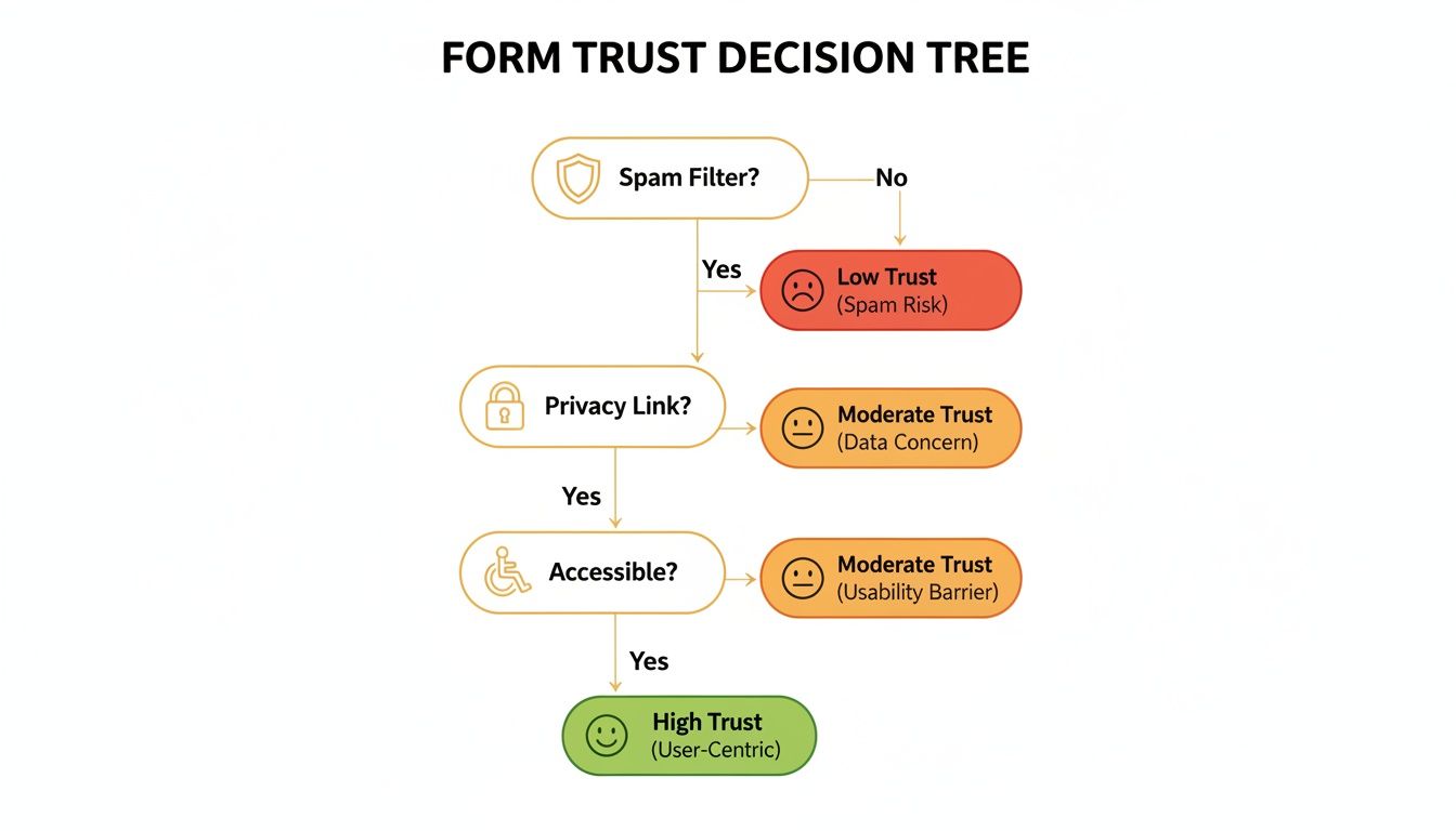
As you can see, things like a clear link to your privacy policy and robust spam filtering aren’t just technical details—they’re signals to your users that you take their security seriously.
Choosing Your Path: The best method really boils down to your specific needs. For simplicity, stick with your website builder. For power on WordPress, go with a plugin. For maximum flexibility across any platform, a third-party builder is your best bet.
Ultimately, all these roads lead to the same destination: a working form that connects you with your audience. By weighing up your options, you can pick the approach that aligns best with your goals and technical comfort level.
8. Measuring and Optimising Form Performance

Getting your contact form live is just the starting line. The real work—and the real results—begin when you stop seeing it as a static page and start treating it as a dynamic tool that can be constantly improved.
Without data, you’re just guessing. You might think your form is doing its job, but you’ll have no idea how many potential customers are bailing halfway through or what tiny tweaks could double your leads. This is where tracking comes in.
Key Metrics to Monitor
To really understand what's happening with your form, you need to keep an eye on a few core metrics. These numbers tell a story, revealing user behaviour and flagging up areas for improvement.
- Submission Rate (or Conversion Rate): This is the big one. It’s the percentage of visitors who actually complete and submit your form. Think of it as your form’s primary health indicator.
- Abandonment Rate: The flip side of the submission rate, this tells you how many people start filling out the form but never hit 'submit'. A high abandonment rate is a major red flag that something is wrong, like too many fields or a confusing question.
- Time-to-Completion: This tracks how long it takes the average user to fill out the form. If it’s taking too long, your form might be too complex, causing friction and frustration.
Setting up tracking for these isn't as daunting as it sounds. Tools like Google Analytics can be configured to treat form submissions as goals or events, giving you a clear view of how your form is contributing to your website's success.
Think of your form's metrics as its vital signs. A low submission rate or high abandonment rate is like a fever—it’s a clear signal that something needs your attention.
The Power of A/B Testing
Once you have your data, you can start making informed changes. The best way to do this is through A/B testing (also called split testing). It's a simple concept: you create two versions of your form, change just one thing, and show them to different users to see which one performs better.
You could test almost anything, for instance:
- Button Text: "Submit" versus "Get in Touch"
- Button Colour: A calming blue or an urgent green?
- Number of Fields: Does asking for a phone number kill your conversion rate?
- Headline: Is "Contact Us" better than "Let's Start a Conversation"?
The idea is to make small, data-driven tweaks instead of relying on guesswork. Over time, these tiny improvements add up, often leading to a huge lift in submissions. To get started, you can find some great actionable conversion rate optimization tips for forms. And if you need help setting up the tracking itself, our guide on how to set up Google Tag Manager is a great resource.
Enhancing the Post-Submission Experience
What happens after someone clicks ‘submit’ is just as crucial as the form itself. This is your first chance to confirm their message was received and to reinforce their decision to reach out. A clunky post-submission experience can make users feel ignored or uncertain.
A solid strategy has two parts: a well-designed thank-you page and a prompt automated email. The thank-you page confirms their submission and tells them what to expect next (e.g., "We'll be in touch within 24 hours"). The automated email provides instant reassurance that their enquiry hasn't vanished into the ether.
Managing submissions effectively is critical for building trust, even at an enormous scale. For example, HMRC processed 287,535 digital forms in a single month. Their target to clear 80% of these within 15 days, though they only hit 73.0%, shows just how vital a robust backend process is. It's a powerful reminder that every business needs a reliable system to handle enquiries, no matter the volume.
Choosing the Right Contact Form Tool
With so many options out there, picking the right tool for your website's contact forms can feel like a mammoth task. The trick is to look past the flashy marketing and focus on what your business actually needs. Instead of drowning in endless feature comparisons, let's build a simple framework to help you choose wisely.
Think of it like buying a vehicle. A nippy scooter is great for quick trips around town—that’s your basic form widget. But if you're moving house, you need a proper van—an advanced form builder with all the bells and whistles. What you choose depends entirely on where you're going and what you're carrying. The aim is to find a solution that lines up perfectly with your goals, technical skills, and budget.
Core Criteria for Your Decision
When you're sizing up different tools, some things are simply non-negotiable. These fundamentals make sure your form works smoothly, stays secure, and doesn't waste your time. Don't be tempted by a tool that cuts corners on the essentials.
Here’s what your checklist should cover:
- Ease of Use: How easy is it to actually build a form? You shouldn't need a developer on speed dial just to get a simple form up and running. Look for intuitive drag-and-drop editors and straightforward instructions.
- Customisation Options: Can you easily tweak colours, fonts, and layouts to match your brand's look and feel? A form that sticks out like a sore thumb can look unprofessional and erode trust.
- Security Features: Does the tool offer solid spam protection, like reCAPTCHA or honeypot fields? A tool that lets bots run wild will turn your inbox into a junk-filled nightmare pretty quickly.
Selecting a form tool is a strategic decision, not just a technical one. The right tool empowers you to create a seamless communication channel that supports your growth, while the wrong one creates friction for both you and your customers.
Evaluating Integration and Scalability
Beyond the basics, you need to think about how this tool will fit into everything else you do. A contact form is rarely an island; it’s the first handshake in a customer relationship. Its ability to talk to the other software you use is absolutely critical.
Look for strong integration capabilities. Can it automatically ping new leads over to your CRM or add subscribers to your email marketing software, like Constant Contact? Manually copying and pasting data is a soul-destroying task that a good form tool should make obsolete. If you're using WordPress, plugins often provide the tightest integrations, letting you pop forms into pages, posts, or sidebars with a simple shortcode.
Finally, have a think about the future. A simple "get in touch" form might be all you need today, but what about next year? Choose a tool that can grow with you, offering more advanced features like conditional logic, payment collection, or multi-page forms when you’re ready to scale up. A bit of foresight now will save you the major headache of switching platforms later on.
Frequently Asked Questions
You've got the theory down, but what about the practical side of things? Let's tackle some of the most common questions that pop up when you're building and placing contact forms on a real-world website.
How Many Fields Should My Contact Form Have?
Think "less is more." Seriously. Stick to the absolute essentials you need to start a meaningful conversation. For most general enquiries, a simple Name, Email, and Message is all it takes.
Every single field you add is another little hurdle for your visitor. Research backs this up time and again; one study saw a massive 120% jump in conversions just by slashing the number of fields from eleven down to four. Before you add another box, ask yourself: is this a genuine need-to-have, or just a nice-to-have? If you really need more detail, a multi-step form is a much better way to go.
Where Is the Best Place for a Contact Form?
Your main contact form needs a permanent home on a dedicated ‘Contact’ page. Make this page impossible to miss by linking it clearly in your main navigation menu and your website's footer. It's standard practice, and it's what people expect.
But don't just leave it there. Think about where your visitors are when they're most likely to have a question. Placing forms (or clear links to them) in these high-intent spots can make all the difference.
- Services pages: Right where they're weighing up what you offer.
- Pricing pages: When they're on the verge of making a decision.
- About pages: For anyone looking to make a more personal connection.
The aim is simple: be there the moment they decide they want to talk.
What Is the Best Way to Prevent Form Spam?
Spam is an unavoidable pain, but it’s definitely manageable. The best defence combines a smooth user experience with some clever behind-the-scenes tech. The go-to solution for most is Google’s reCAPTCHA, which does a brilliant job of separating real people from automated bots without causing much hassle.
Another sneaky but effective trick is the "honeypot" field. You add a field to your form that's hidden from human visitors. Bots, however, see it and fill it in. Any submission with that hidden field completed is instantly marked as spam and never reaches your inbox.
Should I Use a Single-Step or Multi-Step Form?
This really boils down to how much information you need to collect. If you're just after a quick message, a single-step form is perfect—it's fast, straightforward, and gets the job done.
On the other hand, if you’re collecting detailed info for a project quote, a support request, or an in-depth sign-up, a multi-step form is your friend. Breaking a long set of questions into smaller, bite-sized chunks feels far less daunting. This approach often boosts completion rates because once someone starts the process, they feel more invested in finishing it.
Ready to find the perfect tools to build, manage, and get the most out of your website's forms? Dive into our curated selections in The Digital Marketing Toolbox and discover the right solution for connecting with your audience. Visit https://grow-your-biz.com to get started.


