
At its core, a landing page is a webpage stripped down to a single, focused purpose: getting a visitor to take one specific action. Forget the usual website clutter like navigation menus or sidebars. The entire point is to guide someone towards a goal, whether that's downloading a guide, signing up for a webinar, or buying a product.
For this to work, the message that brought them there—from an ad, an email, or a social post—must perfectly align with what they see on the page. It's all about creating a seamless journey.
So, What Makes a Landing Page Actually Convert?

Before you even think about opening a page builder or writing a line of copy, you need to get inside the head of your visitor. A landing page that converts well isn't just about a flashy design or clever words; it's about building a frictionless path from initial interest to final action.
Think of it this way: your main website is a general practitioner, trying to cater to everyone with different needs. A landing page, on the other hand, is a specialist. It’s laser-focused on one objective for a very specific audience. Every single element, from the headline right down to the colour of the button, has to work together to achieve that one goal.
The Power of a Single, Undivided Goal
The most common mistake I see people make is asking for too much at once. A landing page that tries to get email sign-ups and showcase other products and get social media follows is doomed from the start. Why? It causes decision fatigue. When you present a visitor with too many choices, they’ll often choose none.
This singular focus is what makes them so incredibly effective. In fact, data from the UK digital marketing scene reveals that dedicated landing pages have an average conversion rate of 26%. That's a whopping 160% higher than other sign-up forms like pop-ups or embedded boxes. These numbers speak for themselves, showing just how powerful a distraction-free environment is for turning visitors into leads.
"Your landing page has one job. Only one. Don't give it a to-do list. Give it a single, non-negotiable mission and build everything around that."
To help you stay focused, here's a quick reference for the essential elements every successful landing page must include to guide visitors toward action.
Core Components of a High-Converting Landing Page
| Component | What It Does | Pro Tip for UK Audiences |
|---|---|---|
| Compelling Headline | Grabs attention and confirms the visitor is in the right place. | Use clear, benefit-driven language. Avoid Americanisms and use relatable UK phrasing. |
| Persuasive Subheading | Expands on the headline and explains the core value proposition. | Keep it concise and focused on solving a specific problem for your target audience. |
| Engaging Visuals | A relevant image or video that supports the message and builds trust. | Feature images that reflect the UK market—local landmarks, diverse representation, etc. |
| Clear Call-to-Action (CTA) | A button or link with direct, action-oriented text (e.g., "Get My Free Guide"). | Make the CTA stand out. Phrases like "Claim Your Offer" or "Start Your Free Trial" work well. |
| Social Proof | Testimonials, reviews, or logos of clients to build credibility. | UK-based testimonials or reviews from recognisable British brands add significant weight. |
| Benefit-Oriented Copy | Explains why the visitor should care, focusing on outcomes, not just features. | Frame benefits in a way that resonates with local pain points or aspirations. |
Putting these components together thoughtfully is what turns a simple page into a genuine conversion machine.
Message Match and Building Instant Trust
Trust is the currency of the internet, and you can lose it in seconds. If a visitor clicks an ad promising a "Free Ebook on Social Media Trends," they need to land on a page that delivers exactly that. If the headline is generic or the offer is slightly different, you've broken that trust. This concept is called message matching, and it's absolutely non-negotiable.
This principle goes beyond just the text. The visual identity—your colours, fonts, and imagery—should also feel like a natural continuation of the ad or link they just left. This consistency reassures the user they’ve made a good click, making them feel more comfortable and far more likely to convert. For a deeper dive, check out these 4 tips to create the perfect landing page.
Ultimately, a landing page works when it perfectly aligns three critical elements:
- The Visitor's Expectation: Does the page deliver on the promise that brought them here?
- The Offer's Value: Is the benefit of taking action clear, compelling, and immediate?
- The Page's Clarity: Is the path to conversion simple, obvious, and free of any potential roadblocks?
Get these right, and you're no longer just building a webpage; you're building a reliable engine for growth.
Your Pre-Build Strategic Blueprint
A high-converting landing page isn’t built with a drag-and-drop tool; it’s forged with a solid strategy. I’ve seen it countless times: people get excited, jump straight into a builder, and end up with a page that looks okay but doesn’t perform. It’s like setting off on a road trip with no map—you’ll burn a lot of fuel but probably won't reach your destination.
Before you even think about headlines or button colours, you need to lay the groundwork. This strategic phase is what separates the landing pages that fizzle out from those that become reliable conversion machines. It’s all about making deliberate choices so every single element on your page drives one, measurable goal.
Define Your One True Objective
Every great landing page has one job. Just one. This isn't a suggestion; it’s a non-negotiable rule for success. What is that one thing you need the visitor to do?
Are you trying to feed your sales team with qualified leads? Do you want to sell a specific product right then and there? Or is the aim to get people signed up for your next webinar?
You have to be ruthlessly specific. "Get more leads" is far too vague to be useful. A much better objective is: "Capture email addresses and phone numbers from UK-based marketing managers interested in our new analytics software." That level of clarity becomes your North Star, guiding every single decision you make about the page's copy, design, and flow.
A landing page without a single, defined goal is just a pretty distraction. It might get compliments, but it won’t get conversions. Your entire pre-build process should revolve around achieving this one specific action.
This process of defining your objective, researching your audience, and checking out the competition is fundamental. It’s a three-legged stool, and this infographic shows how those pillars support each other.
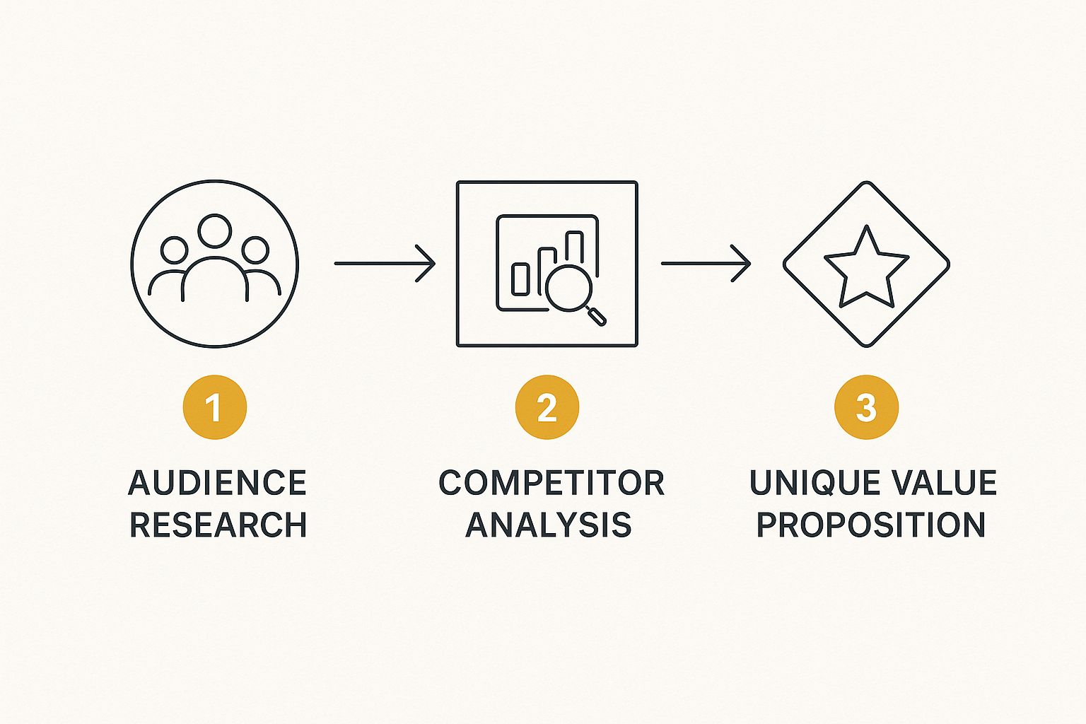
As you can see, understanding who you're talking to helps you figure out how to stand apart from everyone else, which in turn clarifies the unique value you're offering.
Uncover Your Audience’s Real Motivation
You simply can't persuade people you don't understand. The next, crucial step is to get inside the heads of your UK audience. This goes way beyond basic demographics; you need to uncover what truly motivates them and what their biggest headaches are.
What’s keeping them up at night? What specific problem are they desperate to solve? What words do they use when they talk about these challenges?
To get these answers, you need to do some digging:
- Survey Your Existing Customers: Straight up ask them why they chose you. What specific problem did your solution fix for them? Their answers are pure gold.
- Read Online Reviews: Scour reviews for your own products and, just as importantly, your competitors'. Pay close attention to what people praise and what they complain about.
- Browse Niche Forums: Go to places like Reddit or industry-specific forums where your ideal customers hang out. Be a fly on the wall and just listen to their conversations and frustrations.
Let's say you're selling a project management tool. You might discover that for small business owners, the real pain point isn't a lack of features. It's the overwhelming stress of juggling too many tasks and the fear of missing deadlines. Now you have an emotional trigger to focus on, instead of just listing software specs. Getting these details right is a core part of an effective marketing strategy for your small business.
Analyse Your Competitors’ Approach
Finally, it’s time to see what everyone else is doing. The goal here is not to copy your competitors, but to spot gaps and opportunities they've missed. Find the landing pages they use for similar offers and put them under the microscope.
- What's their main headline and value proposition?
- What kind of social proof are they using (testimonials, case studies, logos)?
- How simple or complicated is their form and conversion process?
- Where do they shine, and more importantly, where do they fall short?
Maybe you'll notice their pages are packed with confusing jargon, or their sign-up form asks for a dozen fields. That's your opening. You can win by offering a clearer message, a stronger promise, and a much smoother user experience. This competitive intelligence is a cornerstone of mastering digital marketing content strategy and ensures your page launches with a real advantage.
Designing for Clicks, Not Just Compliments

Let's be blunt: a great landing page design isn't about winning awards. It’s about winning conversions. While a beautiful page is nice, its real job is to guide, persuade, and ultimately convince a visitor to take that one, specific action you want them to take.
Think of it as choreographing where your visitor looks. You don’t want their eyes wandering aimlessly across the screen. You need to deliberately lead them from that powerful headline, down to your compelling offer, and straight to that unmissable call-to-action (CTA) button. This is all done with a strong visual hierarchy.
Master Your Visual Hierarchy
Visual hierarchy is the secret ingredient that makes a page just feel right. It’s the art of using visual cues—like size, colour, and positioning—to signal what’s important without spelling it out.
Your most crucial element, almost always the headline, should be the biggest, boldest thing on the page. The next most important piece, your CTA button, needs to pop with a contrasting colour that practically begs to be clicked.
Here's how to create that clear path:
- Size Really Matters: Bigger elements grab more attention. It’s that simple. Your main headline should dominate, with subheadings, body copy, and finer details scaling down from there.
- Strategic Colour: Colour is your best friend for drawing the eye. A bright, vibrant CTA button on an otherwise neutral background is almost impossible to ignore. Stick to your brand colours for consistency, but save your most action-oriented shade exclusively for your CTAs.
- Directional Cues: You can use subtle pointers, like arrows or even the direction someone in a photo is looking, to subconsciously guide a visitor's gaze towards your sign-up form or button.
When you control what the user sees and in what order, you control the story. You make it incredibly easy for them to follow the exact path you've laid out.
The Power of White Space
What you don’t put on your page is often just as important as what you do. That empty area around your text and images is called white space (or negative space), and it's one of the most powerful tools in your design arsenal.
A cluttered, jam-packed page creates a sense of anxiety and cognitive overload. It feels like a chore to read, and visitors who feel overwhelmed don't convert—they bounce. White space gives your content room to breathe, which immediately improves readability and makes the page feel calmer and more focused.
A generous use of white space is a sign of confidence. It tells the visitor, "This is what's important. Focus here." It cuts through the noise and makes your core message impossible to miss.
This principle of clarity goes for your content, too. In fact, UK-specific data shows that shorter landing pages with clear, concise messaging tend to outperform longer ones by 13.5%. Digging deeper, personalised CTAs have been shown to boost conversions by an incredible 42%, proving that a targeted, focused approach really pays off.
Always Build for Mobile First
Here in the UK, designing for a desktop and simply hoping it works on a phone is a guaranteed way to lose conversions. The vast majority of your traffic, especially from social media and email campaigns, is going to come from mobile devices. This isn't a suggestion; it demands a mobile-first design approach.
This means you literally start the design process by planning for the smallest screen first. It's a creative constraint that forces you to be ruthless about what’s truly essential.
Key things to get right for mobile:
- A Single-Column Layout: This is the most natural and easiest way for people to scroll on a narrow screen.
- Large, Tappable Buttons: Fingers are clumsy compared to a mouse pointer. Make sure your CTAs are big enough to be tapped easily without any frustrating zooming.
- Readable Font Sizes: Don't make people squint. Your text should be effortlessly legible.
- Compressed Images: Mobile users are often on slower data connections. Optimise your images to make sure your page loads in a flash.
Only after you’ve perfected the mobile experience should you start thinking about how the design will adapt and expand for tablets and desktops. For an excellent deep-dive into creating designs that convert, check out the Top 10 Landing Page Design Best Practices. It's a fantastic resource for ensuring your page is both beautiful and brutally effective at its one true job: driving action.
Writing Copy That Persuades and Converts
Even with a flawless design, your landing page is just a pretty picture without the right words. Think of your copy as your best salesperson—the one who works 24/7 to connect with visitors, understand their frustrations, and gently persuade them that you have the solution.
Writing for a landing page is a different beast entirely. It’s not a blog post or a casual email. Here, every single word has a job to do, and that job is to move the visitor one step closer to taking action. Too many businesses get this wrong, focusing on what their product is instead of what it does for the customer. Great copy always answers the visitor's silent question: "What's in it for me?"
Crafting an Irresistible Headline
You have maybe three seconds to grab someone's attention. That's it. Your headline is the most important string of words on the entire page, because if it doesn't land, nothing else gets read. Its role is simple: instantly tell the visitor they're in the right place and make them a promise so good they can't help but want to learn more.
A powerful headline is:
- Crystal Clear: Vague promises don't work. "Manage Your Projects Better" is forgettable. "End Project Chaos and Never Miss a Deadline Again" hits a real nerve.
- Benefit-Focused: Don't sell the tool, sell the outcome. "Advanced Photo Editing Software" is a feature. "Create Stunning Photos in Minutes" is a benefit.
- Perfectly Aligned: The headline must echo the language in the ad or link that brought them to your page. This "message matching" creates a seamless experience, builds immediate trust, and tells visitors they've come to the right place.
Your headline is the front door to your offer. If it's confusing or uninviting, people will simply walk away. Use a punchy subheading to expand on that core promise, giving just enough extra detail to pull them down the page.
Moving From Features to Benefits
Once your headline has hooked them, the rest of your copy needs to build the case. This is where you connect your solution directly to your visitor's real-world problems and desires. A classic mistake is to just rattle off a list of features—the technical specs and fancy components of what you’re offering.
Honestly, nobody cares about your "128-bit encryption" (a feature). They care about "keeping their personal data completely safe" (a benefit). They aren't impressed by your "AI-powered algorithms" (a feature); they're excited by the idea of "saving 10 hours a week on manual admin" (a benefit).
To get to the heart of it, ask "so what?" after every feature. "Our software has a new dashboard." So what? "So you can see all your key metrics in one place." So what? "So you can make faster, smarter business decisions." Bingo. That last part is the benefit you need to shout about.
This simple shift in perspective—from what it is to what it does for them—is the secret to writing copy that truly connects and persuades.
The Art of the Call-to-Action
Your Call-to-Action (CTA) is the moment of truth. It's where you ask for the conversion. The words on your CTA button need to be sharp, action-oriented, and feel completely frictionless. Lazy, generic words like "Submit" or "Click Here" are conversion killers.
Instead, make the button copy reflect what the person is actually getting.
- "Get My Free Guide"
- "Start My 30-Day Trial"
- "Claim My 20% Discount"
- "Book My Free Consultation"
This simple change frames the action as a gain for the user. They aren't just giving you their details; they are receiving something valuable. Don't forget the microcopy around the button, either. A small line of text like "No credit card required" or "We promise never to share your email" can be all it takes to dissolve that last-second hesitation.
Weaving in Trust with Social Proof
No matter how good your copy is, people are naturally sceptical. This is where social proof becomes your superpower. It’s the proof from others that you’re legitimate and that people like them have had a great experience. Weaving this into your copy is one of the fastest ways to build credibility.
Effective social proof comes in many forms:
- Real Testimonials: Use genuine quotes from happy customers. If you're targeting a UK audience, featuring testimonials from recognisable British clients adds a massive layer of trust.
- Client Logos: Displaying the logos of companies you've worked with, especially well-known ones, provides instant validation.
- Case Study Snippets: Pull out a powerful, one-sentence summary from a success story.
- Trust Badges and Awards: Show off any industry certifications or awards you've earned.
Don't just lump all your proof in one "testimonial section." Instead, strategically place it throughout the page. Put a glowing testimonial right next to the feature it praises. This creates a powerful, seamless flow of persuasion. You can easily gather these quotes through your regular customer communications, which is just one of the many advantages of email marketing for building lasting relationships.
By combining a knockout headline, benefit-led copy, a clear CTA, and rock-solid proof, you create a narrative that guides visitors smoothly from curiosity to conversion.
Choosing Your Tools and Launching with Confidence

You’ve done the hard work. The strategy is solid, the design is sharp, and the copy is ready to persuade. Now comes the exciting part: bringing it all to life with the right tech and making sure it launches without a hitch. And don't worry, you absolutely don't need to be a coding wizard to get a professional landing page off the ground.
The first big decision is picking your tool. The market is flooded with options, and frankly, the "best" one simply comes down to your budget, your technical comfort zone, and what you need the page to do. This choice will shape how you build, test, and tweak your pages down the line, so it's worth a moment's thought.
Selecting Your Landing Page Builder
Broadly speaking, you'll find tools fall into two camps: dedicated builders or those integrated into bigger platforms. Each has its own clear benefits.
Dedicated Landing Page Builders
These are specialist tools engineered for one job: creating landing pages that convert like crazy.
- Examples: Unbounce, Instapage, Leadpages.
- Pros: They are absolutely packed with features designed for marketers, like sophisticated A/B testing, dynamic text replacement, and super-fast hosting. For serious, data-driven campaigns, they’re incredibly powerful.
- Cons: They usually involve a monthly subscription and live separately from your main website, which can sometimes feel a bit disconnected.
Integrated Platform Options
These are the builders you find inside a larger ecosystem you might already be using for your business.
- Examples: WordPress page builders like SeedProd or Elementor, the built-in tool in HubSpot, or even the landing page creator in Mailchimp.
- Pros: This route is often kinder on the wallet if you're already paying for the parent platform. It keeps your website, email marketing, and landing pages all neatly under one roof.
- Cons: You might miss out on some of the highly specialised optimisation features that the dedicated tools offer.
For most businesses just getting started, an integrated solution—like a good WordPress plugin or the tool inside your marketing platform—is a fantastic, practical choice.
Your Essential Pre-Launch Checklist
Before you dream of hitting that "publish" button, running through a final checklist is non-negotiable. Think of it as your safety net. It catches those silly little mistakes that can quietly sabotage a campaign right from the start.
Here’s what I always check, without fail:
- Test Your Form: Fill it out yourself. Seriously. Do you see the thank you page? Does the confirmation email land in your inbox? Most importantly, does the lead actually appear where it’s supposed to in your system?
- Proofread Everything: One final pass. Read every word aloud. Hunt down any lingering typos, grammatical slips, or clunky sentences.
- Check All Links: Click every single link. That includes the social media icons in the footer and any "privacy policy" links. Make sure they all point to the right place.
- Verify Analytics: Is Google Analytics firing? Are your tracking pixels, like the Meta Pixel, installed and working? If you can't measure it, you can't improve it.
- Confirm Mobile Responsiveness: Grab your phone and look at the page. Is the text easy to read? Can you tap the buttons without pinching and zooming? Does anything look broken or out of place?
Launching a landing page is a buzz, but a successful campaign is built on diligence. This final check ensures every visitor gets a flawless experience, giving your page the best possible chance to convert.
It's also vital to have a realistic benchmark in mind. A wide-ranging analysis of thousands of landing pages found that the median conversion rate hovers around 6.6%. That means a typical page converts just under 7 out of every 100 visitors. This is a brilliant number to keep in mind for setting your initial goals. If you want to dive into the data, you can explore the full conversion rate report from Unbounce.
Optimising and Scaling Your Landing Page Success
Getting your landing page live is a brilliant first step, but it's really just the beginning of the journey. The real magic happens after you launch. This is where you shift from hopeful guesswork to building a reliable conversion machine, and it all starts by paying close attention to what your user data is telling you.
Your analytics platform is your new best friend. It shows you what people are actually doing on your page, not what you assume they're doing. Look closely at metrics like bounce rate (the percentage of visitors who leave without doing anything) and time on page. A high bounce rate could mean your ad copy and your page are misaligned. A low time on page might suggest your headline isn't grabbing enough attention.
Mastering the Art of A/B Testing
Once your analytics have highlighted a potential weak spot, A/B testing is how you’ll discover the fix. It’s a straightforward concept: you create a variation of your page (let's call it 'Version B') and run it against your original ('Version A') to see which one converts better.
The golden rule here is to test only one element at a time. Seriously. If you change the headline and the button colour, you'll have no idea which change actually made the difference.
Always start with a clear hypothesis. For example:
- Hypothesis: "Changing our button text from 'Submit' to 'Get My Free Guide' will boost form submissions because it clearly states the benefit."
- Element to Test: The Call-to-Action (CTA) button copy.
- Metric to Measure: Form conversion rate.
Let the test run until you hit statistical significance—most testing tools will alert you when you're there. This data-driven approach means you're making decisions based on evidence, not just a hunch.
What to Test for Maximum Impact
You can test just about anything, but some elements pack a much bigger punch than others. I always recommend prioritising your tests based on what’s likely to have the biggest impact.
Here's a hierarchy I've found works well:
- The Headline: This is often the single most powerful lever you can pull. Try testing different emotional angles or benefit-focused statements.
- The Call-to-Action (CTA): Experiment with the text, colour, size, and even the placement of your button.
- The Hero Image or Video: Does a crisp product shot outperform a video of a happy customer? Only a test will tell you.
- The Form: Play with the number of fields. You’d be surprised how often removing a single field, like a phone number, can dramatically increase conversions.
Optimisation isn't just about tweaking colours and fonts. It's a continuous learning cycle. Every test—win or lose—gives you a valuable insight into what makes your audience tick.
This ongoing process of analysing, testing, and refining is a core part of any successful marketing strategy. If you want to see how this fits into the broader strategy, our beginner's guide to digital marketing gives a great overview of the entire process. Scaling your success is all about building on these small, data-proven wins over time, eventually turning your landing page into a dependable asset for your UK business.
Answering Your Top Landing Page Questions
As you start getting your hands dirty with landing pages, you'll find a few questions tend to crop up again and again. Getting these sorted early on can save you a world of headaches, especially when you're focusing on the UK market.
Think of it this way: building a landing page is like crafting a specialist sales pitch. You wouldn't use the same script for every prospect, would you? The same logic applies here. Every single page needs to be dialled in for a specific audience and a specific goal.
Do I Really Need a New Landing Page for Every Campaign?
In an ideal world, yes. It sounds like a lot of work, but creating a unique landing page for each campaign, ad group, or even a specific traffic source is the secret to achieving what we call message match.
Imagine someone clicks your ad promising a "20% Off Spring Sale". If they land on your generic homepage, they'll feel lost and confused. But if they land on a page that screams "Spring Sale" with that exact 20% offer front and centre, you’ve created a seamless journey. That kind of relevance is what convinces people to convert.
How Is a Landing Page Different from My Homepage?
This is a big one. Your homepage is the front door to your business. It's designed for browsing, packed with navigation links—About Us, Services, Blog, Contact—and gives a broad overview of everything you do.
A landing page, on the other hand, is more like a private entrance with a velvet rope. It has one job and one job only. It ruthlessly strips away all the distractions, like navigation bars and extra links, to focus the visitor's attention on one specific action. That could be downloading a guide, booking a demo, or claiming an offer. This laser focus is its superpower.
Remember, a homepage is for exploration; a landing page is for action. Confusing the two is one of the quickest ways to lose a potential lead.
Getting your head around these fundamental differences is the first step. Once you do, you'll be well on your way to building landing pages that genuinely deliver results for your UK business.
Ready to discover the tools that can bring your high-converting landing pages to life? Explore The Digital Marketing Toolbox and find the perfect solutions to build, test, and optimise your campaigns with confidence. Visit us at https://grow-your-biz.com to get started.


