
You can't fix what you don't measure. Before you can even think about how to improve conversion rate's on your website, you need to know exactly where you stand right now. This means getting comfortable with your current performance data, understanding the key metrics, and seeing how you stack up against others in the UK market.
Setting Your UK Conversion Rate Baseline

This dashboard is your starting point. Before you jump into A/B testing headlines or overhauling your product pages, you need to draw a line in the sand. Without a baseline, your efforts are just shots in the dark.
Establishing your current conversion rate gives you the context you need to set realistic goals and, just as importantly, to actually measure the impact of the changes you make. It’s what turns random tweaks into a proper, data-driven strategy.
Think of it like getting fit. You wouldn't start a new workout regime without first knowing your current weight or how fast you can run a kilometre. Your website is no different. The initial data is your ‘before' picture, the benchmark against which you’ll measure all your future success.
Find Your Overall Conversion Rate
First things first, you need to pin down your website's main conversion rate. This is almost always the percentage of visitors who complete your single most important goal, like making a purchase.
To find it, just head into your analytics platform, like Google Analytics. Divide the total number of conversions by the total number of unique visitors over a set period—say, the last 30 or 90 days—and multiply by 100. It’s that simple.
So, if your online shop had 1,000 visitors last month and 25 of them bought something, your conversion rate is 2.5%. This is your North Star metric.
Context Is Everything: What’s a Good Rate in the UK?
A 2.5% conversion rate might sound low, but context is everything. Performance varies wildly from one industry to another. What’s considered fantastic for a business selling high-ticket electronics might be just so-so for a low-cost fashion brand. That’s why comparing your figures to relevant UK benchmarks is so important.
The UK's average ecommerce conversion rate hovers around 4.1%, which is actually quite a bit higher than the global average. Data from sources like Shopify shows that if you can push your rate above 3.3%, you're already outperforming 80% of stores.
A “good” conversion rate is always relative. It’s less about hitting a universal number and more about consistently improving upon your own historical performance and staying competitive within your specific UK sector.
To get a clearer picture, you need to drill down into benchmarks for your specific niche. This is where you can truly see if you’re lagging behind or leading the pack.
UK Ecommerce Conversion Rate Benchmarks by Sector
Looking at industry-specific data helps you understand what's realistically achievable. Here’s a snapshot of average conversion rates across different ecommerce sectors in the UK, which can help you set a more informed performance goal.
| Ecommerce Sector | Average UK Conversion Rate | Top Quartile Performance Goal |
|---|---|---|
| Fashion & Apparel | 3.8% | 5.5% |
| Health & Beauty | 3.5% | 5.1% |
| Electronics | 1.9% | 3.0% |
| Home & Garden | 2.5% | 4.0% |
| Food & Drink | 4.5% | 6.5% |
This table shows just how much “good” can vary. A 3% rate is fantastic in electronics but would be underperforming in the food and drink sector. Use this to contextualise your own numbers.
Look Beyond the Main Number
While your overall conversion rate is your headline figure, it doesn't tell the whole story. To really figure out where to focus your energy, you need to dig into the secondary KPIs that reveal how people are behaving on your site. These metrics are the clues that tell you why your conversion rate is what it is.
Make sure you’re also keeping an eye on these supporting metrics:
- Cart Abandonment Rate: What percentage of people add items to their cart but bail before buying? A high number here is a massive red flag, often pointing to problems in the checkout process, like surprise shipping costs or a clunky form.
- Bounce Rate: This is the percentage of visitors who land on a page and leave without doing anything at all. High bounce rates on key pages suggest a mismatch between what your visitor expected and what your page delivered.
- Average Session Duration: How long do people actually stick around? Longer sessions often mean visitors are more engaged, which usually leads to better conversion rates.
Getting to grips with these KPIs is a fundamental part of building an effective marketing strategy for a small business. They help you find the leaks in your funnel, turning abstract numbers into a clear, actionable roadmap for improvement.
Where Are Your Customers Getting Stuck? Finding the Friction in the Journey
A low conversion rate isn't a single, giant problem. It’s almost always a symptom of many smaller roadblocks scattered throughout your customer's path. To genuinely move the needle, you need to become a bit of a detective and pinpoint exactly where people get stuck, frustrated, or just plain confused. It’s all about finding and smoothing out these points of friction.
Think of your website like a physical shop. Are the aisles clearly labelled? Is it obvious where the tills are? Is the payment machine fiddly and complicated? These same principles apply online. Your first job is to get beyond the spreadsheets and start observing real human behaviour.
This is where you find the ‘why' behind the numbers. Your analytics might tell you 70% of users abandon their carts, but it won't tell you it’s because the shipping calculator is buried or the guest checkout option is practically invisible.
See Your Site Through Their Eyes
The absolute best way to find friction is to watch people actually use your website. Thankfully, you don’t need to stand over their shoulder to do it. Modern tools give us a digital window into their experience, revealing every click, scroll, and moment of hesitation.
Two of the most powerful tools in our arsenal for this are heatmaps and session recordings.
- Heatmaps give you a visual summary of user activity. They show you exactly where people click, where their mouse moves, and how far they bother to scroll. Bright red spots mean high activity; cool blue areas are being ignored. This can instantly tell you if your main call-to-action is being missed or if people are trying to click on something that isn't a link.
- Session recordings are even better. They are essentially videos of anonymous users navigating your site in real-time. You see their entire journey, from the landing page to the moment they leave. It’s like watching a recording of someone's shopping trip, and it’s brutally honest about where they struggle.
Watching just a handful of these recordings can be a real eye-opener. You might spot a bug that only appears on a certain browser, see users rage-clicking a broken button, or notice everyone stumbling over the same form field. These are the golden nuggets of insight you just can't get from a standard analytics report.
The goal isn’t to watch every single visitor. It’s to spot patterns. If you watch ten recordings and three of them show people getting tangled up in your navigation menu, you’ve found a significant point of friction. That's your cue to act.
Diagnosing Common Friction Hotspots
Once you start looking, you'll notice that friction tends to gather around a few key areas of the customer journey. By proactively checking these places first, you can often find your biggest conversion blockers much faster.
The Confusing Product Page
Think of your product pages as your digital salespeople. If they aren't clear, compelling, and trustworthy, your customers will simply walk away. A high exit rate on these pages is a massive red flag.
Picture this: An online clothing shop notices its best-selling jacket has a surprisingly high exit rate. Using heatmaps, they see tons of mouse activity over the sizing information, but very few clicks on “Add to Cart.” When they watch the session recordings, they see people scrolling up and down, looking lost.
The fix: The team realises their sizing chart is just a generic, unhelpful table of measurements. They swap it out for a simple, interactive “Find My Size” tool and add photos from customers showing the jacket on different body types. That little bit of extra context and reassurance removes the uncertainty, giving shoppers the confidence they need to buy.
The Demanding Checkout Form
The checkout is the final hurdle. Any unnecessary step or confusing field here can absolutely tank your conversion rate. Overly long, complicated forms are one of the biggest culprits behind abandoned carts.
Be brutally honest with yourself: is every single field in your checkout form essential? Do you really need their phone number if you're just sending an email confirmation? Study after study shows that cutting down the number of form fields directly boosts completions.
Here’s a practical checklist of things to scrutinise:
- Forced Account Creation: Never, ever force users to create an account before they can buy. Always feature a prominent guest checkout option.
- Surprise Costs: Are shipping fees and taxes shown upfront? Nothing kills a sale faster than unexpected costs appearing on the final step.
- Complex Layout: Is your checkout a single, easy-to-scan page, or a multi-step maze that feels endless? If you must have multiple steps, use a progress bar to manage expectations.
Just Ask Your Customers
Finally, don't underestimate the power of simply asking. While behavioural tools show you what people are doing, qualitative feedback tells you why.
You can implement simple, non-intrusive feedback tools to get these answers. A small pop-up on the cart page asking, “What's stopping you from finishing your purchase today?” can provide incredibly direct and actionable insights. Another great tactic is sending a follow-up email to people who abandoned their carts, politely asking if they ran into any problems.
By blending behavioural data from tools like heatmaps with direct feedback from your users, you get the complete picture. This creates a repeatable process for systematically finding and fixing the friction that’s holding you back, paving the way for real, sustainable growth.
Optimising for the UK's Mobile-First Shopper
It's a common story in UK e-commerce: most of your visitors browse on their phones, but the checkout experience feels like it was designed for a desktop and then hastily shrunk down. It's a classic mismatch, and it's costing you conversions and real revenue.
To fix this, we first need to get inside the head of a mobile user. They behave differently. They're often on the go, potentially with a weaker connection, and have far less patience. A two-second delay while your page loads? They're gone. Cramped buttons and menus hidden behind confusing icons? That's a one-way ticket to a competitor's site.
The data from UK shoppers paints a clear picture:
- Mobile browsing is all about convenience, but page speeds on cellular networks can really lag.
- Even with more traffic, desktop checkouts still convert at 1.7 times higher rates.
- A massive 60% of UK e-commerce transactions now come from mobile devices.
These figures highlight a huge opportunity. While mobile drives the majority of sales (60%), the fact that desktop conversion is 1.7 times higher shows a significant gap in the mobile experience. You can learn more about these device trends from Statista and see why closing this gap is so critical.
This is where testing comes in. You need to see what works for each device, not just assume a one-size-fits-all approach is good enough.
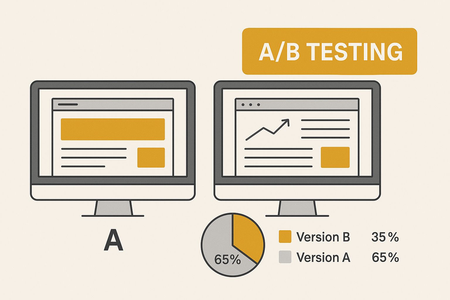
Often, when we run A/B tests, the desktop variations will outperform mobile designs simply because they haven't been properly tailored. This visual underscores why you need to create and test layouts specifically designed for the small screen.
Mobile vs. Desktop: A Tale of Two Experiences
Let’s be blunt: slow mobile pages are conversion killers. For your most important landing pages, you absolutely must aim for a load time under two seconds. That means getting serious about compressing your images, trimming down scripts, and using browser caching effectively.
But it’s not just about speed. The entire user journey needs to be rethought. This checklist breaks down the different priorities for mobile and desktop optimisation, helping you build a more complete strategy.
Mobile vs Desktop Optimisation Checklist
| Optimisation Area | Key Considerations for Mobile | Key Considerations for Desktop |
|---|---|---|
| Page Speed | Ruthlessly prioritise what loads first. Use techniques like lazy loading for images and non-critical assets. | Optimise all scripts, enable Gzip compression, and minimise server requests. |
| Navigation | Design for thumbs with sticky menus at the bottom or clear, accessible hamburger icons. Use universally understood icons. | A full navigation bar with dropdowns and hover menus works well. Provide clear pathways. |
| Checkout | Keep forms incredibly simple. Always offer a guest checkout option to reduce friction. | You can offer more advanced filters, detailed product comparisons, and strategic upsell opportunities. |
| CTAs | Place buttons where thumbs can easily reach them. Make them large and unmissable. | Use a prominent Call-to-Action in the hero section and ensure it’s visible without scrolling. |
Ultimately, mobile design is about brevity and simplicity, while desktop can accommodate richer, more detailed interactions. However, both platforms demand consistent branding and a relentless focus on performance.
Crafting Thumb-Friendly Interactions
Think about how you hold your phone. Your thumb does all the work. That's why you need to design for the thumb zone, placing your most important buttons—like ‘Add to Bag' or ‘Buy Now'—within the lower half of the screen.
Make sure your menus expand without covering up crucial information. And please, no tiny touch targets. Aim for at least a 44px by 44px area for any clickable element. This simple change drastically reduces frustration and makes every tap feel more confident and deliberate.
A researcher I know who works in UX once told me that around 90% of mobile users they surveyed said they prefer sites where the buttons are just plain easy to tap. It's that fundamental.
Making Your Calls-to-Action Count
On mobile, your Calls-to-Action (CTAs) need to work even harder. They should use clear, action-oriented verbs and pop against the background.
Use bold, contrasting colours that align with your brand, and keep the text short and sweet. Think ‘Buy Now' or ‘Add to Bag'.
Here are a few tips that have worked for me:
- Keep the copy under three words. It reduces the mental effort required.
- Use bold colours that are part of your brand palette but still create high contrast.
- A/B test different placements. You might be surprised what works best for your audience.
Designing a Simple, Fast Checkout Flow
A complicated checkout is the final hurdle where many mobile sales stumble and fall. Your job is to make it as frictionless as possible.
Reduce form fields down to the absolute essentials: email, shipping address, and payment details. You can instantly speed things up by offering an address lookup from a postcode. It's a small feature that makes a huge difference.
And don't forget a progress indicator! Showing shoppers they're on “Step 2 of 3” gives them a sense of control and makes them more likely to finish.
Here are the core steps for a mobile-first checkout:
- Combine shipping and billing forms wherever possible.
- Integrate one-click payment options like Apple Pay or Google Pay.
- Use real-time validation to catch typos in email addresses or card numbers instantly.
Keeping an Eye on Cross-Device Performance
Your work isn't done after you launch. You need to constantly monitor your performance data to catch any issues early.
Set up segments in your analytics platform to compare mobile and desktop conversion funnels side-by-side. Where are mobile users dropping off that desktop users aren't? That's your starting point.
Run A/B tests across devices for everything—headlines, layouts, CTAs, and checkout flows. With thoughtful, data-driven tweaks, you can achieve conversion lifts on mobile that are just as impressive as those on desktop.
A mobile-first strategy is no longer a “nice-to-have” for UK retailers; it's essential for survival and growth. By focusing on speed, thumb-friendly design, and streamlined flows, you can create a better experience that boosts conversions across every device.
Start by auditing your mobile UX today. Your bottom line will thank you for it.
Crafting Communication That Converts
Beyond your website's design and how fast its pages load, you have an incredibly powerful and often overlooked conversion tool: your words. The way you speak to your audience—in your sales copy, marketing messages, and even customer support chats—has a direct, measurable impact on your bottom line. To really move the needle on conversions, your communication has to be all about the customer.
This means ditching the old-school, one-way broadcast model and embracing a more responsive, helpful dialogue. UK customers, in particular, have come to expect fast and effective answers. They're often the ones making the first move and have very little patience for clunky, outdated sales processes.
Some of the biggest leaps in UK e-commerce conversion rates have come from simply fixing these communication flows. I’ve seen businesses transform their results by moving away from a sluggish model where sales teams scheduled calls weeks after an enquiry, to a nimble approach that engaged potential customers almost instantly. For a deeper look at this, you can explore a detailed analysis of how sales process optimisation has evolved.
Aligning Your Message with the Funnel
Here’s the thing: not all communication is created equal. The copy that stops someone scrolling on social media is worlds away from the reassuring text you need on a checkout page. Truly effective messaging meets people exactly where they are in their journey.
Think of it as a real-life conversation. You wouldn't ask for a sale the moment you meet someone; you build a bit of rapport first. Your marketing should work the same way.
- Top of Funnel (Awareness): At this stage, your content should be all about being genuinely helpful. Think blog posts, social media updates, and guides that solve a problem or answer a question, without a hard sell. The goal is to build that initial flicker of trust and brand recognition.
- Middle of Funnel (Consideration): Now, your audience knows they have a need and are actively looking at solutions. Your communication should guide them. This is where detailed product pages, comparison guides, case studies, and email newsletters come in, showcasing your expertise and the real benefits of what you offer.
- Bottom of Funnel (Decision): The customer is on the verge of buying. Your messaging has to be crystal clear, direct, and reassuring. This covers everything from your checkout page copy and calls-to-action (CTAs) to that last-minute pop-up offering a small discount.
Building Trust Through Consistency
Your brand’s voice needs to be consistent across every single one of these touchpoints. If your social media is witty and informal, but your website sounds like it was written by a corporate lawyer, it creates a jarring disconnect. And that erodes trust.
Consistency signals reliability. It tells the customer that the brand they had a laugh with on Instagram is the same one they can trust with their credit card details. This is one of those quiet but powerful factors that influence the decision to convert.
A consistent brand voice isn't just about plastering your logo and colours everywhere. It's about ensuring the tone, personality, and values of your business shine through in every single word you write, from a Facebook ad to a transactional email.
Writing a Value Proposition That Resonates
Your value proposition is the absolute heart of your conversion-focused copy. It’s a short, sharp statement that immediately tells visitors:
- How you solve their problem.
- What specific benefits they can expect.
- Why they should choose you over all the other options out there.
This isn't just a catchy tagline; it's the core promise you make. A strong value proposition should be the very first thing a visitor sees on your homepage, and it needs to be compelling enough to make them want to stick around.
For instance, a generic value proposition might be, “We sell high-quality office furniture.” A much stronger, conversion-focused one would be: “Ergonomic office furniture designed in the UK to end your workday back pain. Delivered in 48 hours.”
See the difference? The second example is specific, hits on a key pain point, highlights a tangible benefit (fast delivery), and adds a unique selling point (designed in the UK). This is the kind of clarity that convinces a visitor they’re in the right place. By weaving this central promise through all of your channels, and taking advantage of the many advantages of email marketing, you create a cohesive story that guides people smoothly towards becoming customers.
Building Your Continuous Optimisation Engine
Getting your conversion rate sorted isn’t a one-and-done job you can just tick off a list. The businesses that really get this right treat it as a fundamental, ongoing part of their operations. It’s a constant loop of learning, testing, and making things better. This is how you shift from making random fixes to building a proper, data-led engine for growth.
The whole process hinges on structured experimentation, and the most common way we do this is with A/B testing. The concept is pretty straightforward: you create two versions of a page (your ‘A’ and ‘B’), show them to different groups of your audience, and see which one gets more people to do what you want. It's really the only reliable way to prove that a change you made is genuinely responsible for a lift in conversions.
Forming a Strong Hypothesis
Every test that’s worth running starts with a solid hypothesis. This isn't just a wild guess like, “I reckon a green button will work better.” A proper hypothesis is an educated, testable statement built on the data and insights you’ve already gathered from finding the friction points on your site.
It should follow a clear structure: “Based on [this data/observation], we believe that [making this change] for [this audience] will result in [this outcome]. We'll know this is true when we see [this specific metric] improve.”
For example: “Based on our session recordings that show users hesitating at the checkout, we believe adding trust badges like ‘Secure SSL Connection' below the ‘Pay Now' button will increase completed purchases. We’ll know we're right when we see a 5% lift in the checkout conversion rate.”
See how that works? It forces you to connect your proposed solution directly to a problem you've actually seen and defines what success looks like right from the start.
Prioritising Your Tests for Maximum Impact
It won't take long before you have more ideas for tests than you have time or traffic to run them. Trust me, it happens to everyone. This is precisely why prioritisation is so important. You’ve got to focus your energy where it can make the biggest difference to your bottom line.
A simple but really effective way to do this is using the PIE framework:
- Potential: How much of an improvement can we realistically expect from this change? Changing a headline on your highest-traffic landing page has far more potential than tweaking the footer on your ‘About Us' page.
- Importance: How valuable is the traffic to this page? An improvement on a product page is almost always going to be more important than one on a blog post.
- Ease: How difficult will this test be to get up and running, both technically and in terms of people’s time? A simple text change is a world away from a complete checkout redesign.
Score each test idea from 1-10 for each category. The ones with the highest totals are the ones you should get on with first. It’s a great little system that helps you avoid getting bogged down in low-impact tests and instead focus on changes that can meaningfully improve your conversion rate.
Don't get lost in the weeds testing tiny changes on low-traffic pages. The biggest wins almost always come from optimising your most critical, high-traffic pages first. That’s where you have the volume to get clear results and make a real impact.
Understanding Statistical Significance
This is a make-or-break concept in A/B testing. Statistical significance is what tells you whether your test results are likely because of the changes you made, or if it was all just random chance. Most testing tools will calculate this for you, and you should always be aiming for a confidence level of 95% or higher.
If your test only hits 80% significance, it means there's a 20% chance that your “win” was just a fluke. If you act on a result like that, you could easily end up making a change that actually harms your conversions in the long run.
Patience is a virtue here. Always, always wait for your tests to reach statistical significance before you call a winner. This entire testing cycle is a key part of any good marketing plan; for more on the basics, have a look at our beginner's guide to digital marketing.
Avoiding Common Testing Mistakes
Building a robust optimisation engine means learning from mistakes—both your own and those made by others. Here are a few common pitfalls to watch out for:
- Ending tests too early: Don't hit the stop button the second one version pulls ahead. You need to let it run long enough to smooth out any weekly variations in user behaviour (weekend shoppers can behave very differently from weekday ones). A full one-to-two-week business cycle is a good rule of thumb.
- Testing too many things at once: If you change the headline, the button colour, and the main image all in one go, you'll never know which change actually did the heavy lifting. You have to isolate your variables.
- Ignoring small losses: If a test loses, even by a tiny margin, that’s still a hugely valuable insight! It proves your hypothesis was wrong, which saves you from rolling out a change that would have hurt performance. Every test, win or lose, is a learning opportunity.
By creating this repeatable system of hypothesising, prioritising, and testing, you turn conversion optimisation from a guessing game into a scientific process. This is how you build momentum and achieve consistent, measurable improvements over time.
Your CRO Questions Answered
When you first dip your toes into conversion rate optimisation, it’s natural to have a lot of questions. Getting the basics right from the start helps you set realistic goals and build a solid strategy for your team.
Let's tackle some of the most common queries I hear from businesses. These are the practical, no-nonsense answers you need to get started with confidence.
How Long Does It Take to Improve a Conversion Rate?
Honestly, there’s no magic number. The time it takes can vary wildly depending on what you're changing and how much traffic you have.
You might see a measurable lift in just a few weeks from a simple, high-impact tweak, like rewriting a confusing headline on your main landing page. But a more involved project, say a complete overhaul of your checkout process, could take several months to build, launch, and gather enough data for a clear result. The real secret isn't one big win. Sustainable improvement to your conversion rate comes from the compound effect of many small, consistent gains over time. It's a marathon, not a sprint.
What Are the Best Free CRO Tools for a UK Business?
You absolutely do not need a massive budget to get going with CRO. For any UK startup or small business, a few brilliant free tools can give you all the firepower you need to start making improvements.
- Google Analytics: This is your foundation. It’s non-negotiable for understanding your traffic, user behaviour, and key metrics.
- Heatmaps & Recordings: Tools like Hotjar and Microsoft Clarity have fantastic free plans. They let you literally see where people are clicking and watch recordings of their sessions to spot where they get stuck.
- A/B Testing: To prove your ideas work, a free tool is essential. While Google Optimize has been sunsetted, there are great alternatives that let you run simple tests to validate your changes without spending a penny.
These free tools provide more than enough power to diagnose problems, form a hypothesis, and test a solution. Master these before you even think about paying for more advanced software.
Should I Focus on a Big Redesign or Small Iterative Tests?
For almost every business I've worked with, the answer is small, iterative tests. It's the smarter and safer way to grow.
Big, dramatic redesigns are incredibly risky. They feel exciting, but if the new site fails to improve conversions—or worse, makes them drop—you'll have no idea which of the hundred changes you made was the culprit. It's an all-or-nothing gamble.
Small, focused tests are completely different. By changing just one thing at a time—a button’s colour, a headline, a product image—you learn from every single experiment. This approach creates a reliable feedback loop of hypothesising, testing, and learning that delivers far more predictable and sustainable growth in the long run.
Ready to find the right tools to fuel your growth? The Digital Marketing Toolbox offers a curated catalogue of the best solutions for analytics, A/B testing, and more. Explore and compare your options at grow-your-biz.com.


