
When you hear the term pop up advertisement, you probably cringe, thinking back to the chaotic, spammy windows that plagued the early days of the internet. Let's be clear: those days are long gone.
Today's pop-ups are a completely different beast. Think of them less as an annoying interruption and more as a timely, helpful message that appears right on the page you're viewing. They’re designed to offer real value at the perfect moment—whether that's to guide you, capture your interest, or stop you from abandoning a purchase.
What Is a Modern Pop Up Advertisement?

It’s important to ditch the old image of pop-ups. The originals were like pushy salespeople jumping out from behind a corner. They opened in entirely new browser windows, were notoriously difficult to close, and almost always felt irrelevant, leaving a bad taste in everyone’s mouth.
Modern pop-ups couldn't be more different. They are smart, sophisticated marketing tools built to improve a visitor's experience, not ruin it. A modern pop up advertisement is more like a helpful shop assistant who discreetly appears with a special offer just as you’re considering a purchase, or points you to a useful guide after you've finished reading a related article.
Shifting from Interruption to Opportunity
The real game-changer is intelligence. Modern pop-ups are driven by smart triggers that respond directly to a user's behaviour. This ensures the message arrives precisely when it's most relevant and likely to be appreciated. This strategic mindset is a cornerstone of effective online promotion, something we explore in our beginner's guide to digital marketing.
So, what makes a modern pop-up work so well?
- User-Centric Triggers: They don't just appear randomly. They’re triggered by specific actions, like how long you've been on a page, how far you've scrolled, or if your cursor moves to close the tab (this is called exit-intent).
- Value-Driven Offers: The content isn't just a generic ad. It provides something genuinely useful, like a first-time-buyer discount, access to exclusive content, or an invitation to a free webinar.
- Seamless Integration: They show up as clean overlays or slide-ins within the same window, often designed to match the website’s branding for a smooth, professional feel.
- Easy Dismissal: There's always a clear and obvious 'X' to close the pop-up. This respects the user's control over their experience and builds trust.
A well-executed pop-up doesn't just ask for something; it offers something in return. This exchange of value is what separates a successful marketing interaction from an annoying interruption.
Once you grasp this fundamental shift, you can stop seeing the pop up advertisement as a digital nuisance. Instead, you can recognise it for what it is: a powerful and versatile tool. When used thoughtfully, it can be incredibly effective for capturing leads, cutting down on abandoned shopping carts, and gently steering visitors toward the most valuable parts of your website.
From Annoyance to Asset: The Pop-Up’s Redemption Story
To get why a modern pop-up advertisement can be so effective, we have to rewind the clock. Cast your mind back to the early 2000s, the Wild West of the internet. Pop-ups were a big part of the chaos—the digital equivalent of a persistent door-to-door salesperson who simply won't take no for an answer.
They were aggressive, opening in entirely new browser windows, often with the ‘close’ button cleverly hidden. The content was a lottery; completely untargeted, often spammy, and always interrupting what you were actually trying to do. This experience created a deep-seated frustration that, for many, still defines what a pop-up is.
The Turning Point: Users Fought Back
This widespread irritation sparked a digital arms race. Frustrated users flocked to ad-blocking software, which quickly became a standard feature in most web browsers. It was a loud and clear message to marketers everywhere: the age of thoughtless, intrusive advertising was over. To have any future at all, the pop-up advertisement had to evolve.
This forced a complete rethink. Instead of shouting at everyone, marketers realised they needed to be smarter and more respectful. The game changed from brute-force interruption to strategic, value-driven interaction. This was the moment the pop-up began its transformation from a digital pest into a sophisticated marketing asset.
The backlash against old-school pop-ups was especially strong in the UK. While common in the early 2010s, consumer annoyance and better marketing practices saw their use plummet. By 2017, a YouGov survey found that 68% of UK internet users considered pop-up ads annoying. Fast forward to 2020, and these traditional, intrusive formats made up less than 5% of all display ad impressions.
From Simple Triggers to Intelligent Behaviour
The first step in this evolution was simple: timing. Marketers stopped hitting visitors with an offer the second a page loaded, instead experimenting with small delays. Giving someone a few seconds to get their bearings before presenting a pop-up was a small but crucial change, showing a basic respect for the user's journey.
But the real game-changer was the introduction of behaviour-based triggers. New technology finally allowed pop-ups to react to what a user was actually doing on the site, making the whole exchange feel far more natural and helpful.
-
Scroll-Depth Triggers: Imagine a pop-up that only appears after you've scrolled 70% of the way down a blog post. This trigger signals you're engaged, making it the perfect moment to offer a related case study or a downloadable guide.
-
Click-Activated Pop-Ups: These put the user firmly in the driver's seat. The pop-up only appears when someone clicks a specific link or button, guaranteeing they are actively interested in what you have to say.
-
Exit-Intent Technology: This was perhaps the most brilliant innovation. It detects when a user’s mouse moves towards the close button, signalling they're about to leave. This is the marketer’s last chance to make a compelling offer—a discount code, a free trial—to persuade them to stay.
At its heart, the modern pop-up is all about relevance. When you tie the message to a specific user action, you change the conversation from an unwanted interruption to a timely, helpful suggestion.
This evolution opened up a whole new world of possibilities. You can even see this principle at work when you explore the benefits of proactive live chat as an engagement tool. Pop-ups were no longer just for advertising; they became powerful tools for guiding users, gathering feedback, and recovering potentially lost sales. The modern pop-up advertisement isn't a blunt instrument—it's a precise, data-driven tool designed to improve the user experience while hitting clear business goals.
Choosing the Right Pop Up for Your Goal
Picking the right pop-up ad is a bit like being a good host at a party. You need to know when to approach a guest, what to say, and how to say it without interrupting their conversation. A generic, one-size-fits-all pop-up is the marketing equivalent of shouting across the room—it rarely works and often just annoys people.
The real secret is matching the pop-up's trigger and purpose to what the visitor is actually doing on your site. When you get this right, your message feels like a helpful suggestion, not a jarring interruption. It becomes a natural part of their journey, guiding them toward something they might genuinely want.
This is the decision every marketer faces: will your pop-up be an annoyance, or will it be a valuable asset?
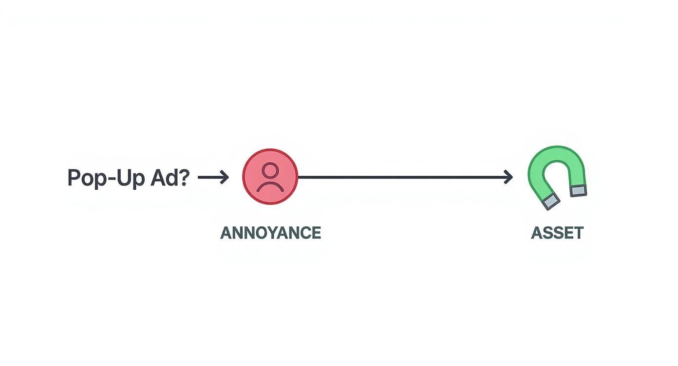
As the diagram shows, a thoughtful approach can turn a potentially disruptive tool into a powerful magnet for engagement.
Understanding the Main Pop Up Triggers
Modern pop-ups are all about their triggers—the specific actions or conditions that make them appear. Each trigger gives you a clue about the user's mindset, letting you tailor your offer for maximum impact. Let's look at the most common ones.
1. Time-Based Pop Ups
This is the most straightforward type of pop-up. It simply appears after a visitor has been on a page for a set amount of time, say, 15 or 30 seconds. This gives them a moment to get their bearings before you present your offer.
- Best Use Case: Perfect for welcoming new visitors with a general discount or nudging someone who has been inactive on a page for a while.
- Pros: They are incredibly easy to set up and feel less aggressive than an immediate, in-your-face pop-up.
- Cons: Because they aren't tied to a specific action, the timing can sometimes feel a bit random to the user.
2. Scroll-Triggered Pop Ups
This pop-up ad appears only after someone has scrolled a certain percentage down the page, like 60% of the way through a blog post. It's a fantastic indicator of genuine interest—they’re clearly engaged and invested in what you have to say.
- Best Use Case: Ideal for offering content upgrades, like a free eBook, checklist, or case study that relates directly to the article they're reading.
- Pros: You're targeting users who have already demonstrated they value your content.
- Cons: Not very effective on short pages where users don't have to scroll much, if at all.
Harnessing User Intent with Advanced Triggers
While timing and scrolling are good signals, two other triggers are even more powerful because they tap directly into what a user intends to do next. These are often the heavy hitters in a marketer's toolkit, delivering the highest conversion rates.
3. Click-Activated Pop Ups
Unlike any other type, these put the user firmly in the driver's seat. The pop-up only appears when a visitor clicks a specific link, button, or image. Think of it as a two-step handshake: the user signals their interest first, and then you present the form.
By requiring a click to activate, you ensure that 100% of the people who see the pop-up have actively requested it. This pre-qualification dramatically increases the likelihood of conversion.
4. Exit-Intent Pop Ups
This is probably the most valuable pop-up ad in the world of e-commerce and lead generation. Exit-intent technology is clever stuff; it tracks a user’s mouse movements, speed, and direction to predict the exact moment they’re about to leave your site. Just as their cursor heads for the exit, your pop-up appears with one last, compelling offer to convince them to stay.
This isn't just a niche trick anymore; it's a standard practice for many UK businesses. Data shows that around 60% of the top 500 UK retail websites use some form of exit-intent technology, often with a discount, to combat basket abandonment. If you're interested in how advertising spend is shifting, you can read the full report about UK digital advertising growth.
Of course, even the best pop-up needs to be part of a bigger plan. To make sure your efforts are aligned with your overall goals, take a look at our guide on building a solid marketing strategy for small business.
Comparison of Modern Pop Up Advertisement Types
Sometimes, seeing all the options side-by-side makes the decision much clearer. This table breaks down each pop-up type to help you match the right tool to your specific goal.
| Pop-Up Type | Best Use Case | Intrusiveness Level | Primary Goal |
|---|---|---|---|
| Time-Based | General announcements, site-wide offers | Medium | Brand Awareness |
| Scroll-Triggered | Content upgrades, related articles | Low | Lead Generation |
| Click-Activated | Gated content, two-step opt-ins | Very Low | High-Quality Leads |
| Exit-Intent | Cart abandonment, last-chance offers | High (but timely) | Conversion Recovery |
By understanding these nuances, you can stop throwing intrusive ads at your visitors and start having helpful, timely conversations that drive real results.
Best Practices for High-Converting Pop-Ups
Knowing which pop-up to use is half the battle. Knowing how to use it is what separates a minor lift in leads from a major surge in sales. Let's be clear: just launching a pop-up and hoping for the best isn't a strategy.
The real magic happens when you weave together compelling design, an offer people can't refuse, smart targeting, and perfect timing. Getting these four pillars right is how you turn a potentially annoying interruption into a genuinely helpful interaction. This isn't about guesswork; it's a playbook of proven tactics to make your pop-ups work for you without alienating visitors.
Let's break down exactly how to do it.
Craft Compelling Design and Copy
Think of your pop-up as a direct extension of your brand. If it looks cheap, spammy, or like it doesn't belong, it instantly erodes trust. A high-converting pop-up has to look and feel like a natural part of the user's journey.
First, nail your brand consistency. Use the same fonts, colour palette, and logo that appear across the rest of your site. This visual harmony makes the pop-up feel native to the experience, not like a jarring third-party ad.
Next, get straight to the point with your copy. A visitor should grasp your offer in seconds.
- Headline: Make it bold and benefit-driven. Instead of a flat "Sign Up," try something like "Get 20% Off Your First Order."
- Body Copy: Keep it tight—one or two short sentences explaining the value is all you need.
- Call-to-Action (CTA): Your button needs energy. "Claim My Discount" is far more compelling than a passive "Submit."
Finally, make absolutely sure your design is mobile-friendly. A pop-up that looks perfect on a desktop can be a total nightmare on a phone. Buttons must be easy to tap, text has to be readable without pinching and zooming, and the 'X' to close it should be obvious.
Create an Irresistible Offer
Even the most beautiful pop-up will fall flat if the offer isn't genuinely valuable. You're interrupting someone's browsing, so you need to make it worth their while. Let’s face it, a weak 5% discount probably isn't enough to convince someone to hand over their email address.
You need to think beyond simple discounts. While they can work, they aren't your only tool. Consider what your specific audience would find truly useful.
- Exclusive Content: Offer a free eBook, a detailed guide, or a handy checklist that solves a real problem for them.
- Free Shipping: For e-commerce brands, this is huge. Shipping costs are a primary reason for abandoned carts, so offering it for free is a powerful motivator.
- Early Access: Give subscribers a sneak peek at new products or let them shop sales before the general public.
- Contest Entry: Use a giveaway to build excitement and gather leads. Just make sure the prize is something your target audience actually wants.
Ultimately, a great offer is your secret weapon to increase your website's conversion rate by providing real value at the perfect moment.
The rule is simple: the perceived value of your offer must be greater than the perceived cost of the user's action (like giving you their email). If the exchange feels lopsided, your pop-up will be ignored.
Building a solid email list this way gives you a direct line to your most engaged audience. This is where you can see incredible long-term results, as we cover in our guide to the advantages of email marketing.
Implement Intelligent Targeting and Timing
This is where a modern pop-up advertisement really comes into its own. Instead of blasting every single visitor with the same generic message, you can deliver specific offers based on who they are and what they're doing.
Start by segmenting your audience. You can create different pop-ups for different groups of people:
- New vs. Returning Visitors: Welcome new visitors with an introductory offer. For returning visitors, show them a message about a new product or a loyalty reward.
- Traffic Source: Someone coming from a Facebook ad might see a different pop-up than a person who found you through a specific Google search.
- On-Site Behaviour: Target users who have visited certain pages, like your pricing page or a particular product category.
Once you know who you're talking to, you need to perfect the when. The trigger you choose is critical. Get it right, and your message feels helpful; get it wrong, and it’s just annoying. Exit-intent pop-ups, for example, are a fantastic way to recover abandoning visitors. A study from a top UK conversion optimisation firm found that well-designed exit-intent pop-ups on UK e-commerce sites could slash bounce rates by up to 15% and boost email sign-ups by 20–30%.
Try pairing triggers with user behaviour for maximum impact. A scroll-triggered pop-up offering a content upgrade works best when it appears after a user has read most of an article—it shows they're already engaged. By aligning the message, the audience, and the moment, you dramatically increase your chances of conversion.
Navigating Compliance and User Experience
https://www.youtube.com/embed/WeW7odzgR0Q
Getting pop-ups right is a bit of a tightrope walk. You've got legal requirements and platform rules on one side, and the actual experience of your visitors on the other. If you stumble on either, the consequences can be pretty severe – think hefty fines, a loss of customer trust, or even a drop in your search engine rankings.
The secret is to find a balance that respects both the law and the user. Your goal should be to create pop-ups that are not just compliant, but genuinely helpful and easy for everyone to use. Get this right, and you'll hit your marketing targets without alienating the very people you're trying to connect with.
Staying Within Legal Boundaries
Here in the UK, the big one you need to worry about is the General Data Protection Regulation (GDPR). If your pop-up is designed to collect personal data, like an email address, your obligations under GDPR are crystal clear.
You can't just assume someone wants to hear from you. Your opt-in forms need to be transparent and require a clear, positive action from the user.
- Explicit Consent: Forget pre-ticked boxes; they’re a no-go. A user must physically tick a box to show they agree.
- Clear Purpose: Be upfront about what they're signing up for. Something like, "Sign up for our weekly marketing newsletter," leaves no room for doubt.
- Easy Withdrawal: Making it as simple to unsubscribe as it was to subscribe isn't just good practice; it's a requirement.
Under GDPR, consent must be freely given, specific, informed, and unambiguous. Cutting corners here can lead to eye-watering fines and seriously tarnish your brand's reputation.
Prioritising User Experience and Accessibility
Beyond the letter of the law, you have to think about the practical experience for every single visitor. A pop-up that someone can't see properly, understand, or easily close is just a recipe for frustration. It makes your website feel hostile.
This is where the Web Content Accessibility Guidelines (WCAG) come into play. They offer a solid framework for making sure all your web content, including pop-ups, is usable for people with disabilities. This means ensuring it works with screen readers and can be navigated using just a keyboard. A simple, obvious 'close' button is non-negotiable for everyone.
On top of that, Google has its own standards, especially for what it calls "intrusive interstitials" on mobile. A pop up advertisement that completely blocks the content the moment a user lands on your page from a search result can actually hurt your SEO.
To stay on Google's good side, make sure your mobile pop-ups:
- Don't show up immediately. Give people a chance to see what the page is about first.
- Use a reasonable amount of screen space. They shouldn't feel like they're hijacking the entire screen.
- Are easy to dismiss. A 'close' icon should be clearly visible and easy to tap.
When you design pop-ups with compliance, accessibility, and the user's experience at the forefront, you turn a potential annoyance into a powerful marketing tool. It’s how you build trust and drive conversions at the same time.
How to Measure and Optimise Your Pop Up Campaigns
Getting your pop up advertisement live is just the starting line. The real wins don’t come from launching a perfectly designed campaign on day one, but from a relentless focus on measuring what works, figuring out what doesn't, and tweaking your approach based on what your users are actually doing.
Without data, you’re just guessing. A pop-up might feel like it’s doing a good job, but gut feelings don't drive growth. Optimisation is how you turn that guesswork into a reliable engine for better results.
Identifying Your Key Performance Indicators
Before you can start improving, you need to know what you’re measuring. Think of Key Performance Indicators (KPIs) as the vital signs for your campaign's health. Zeroing in on the right metrics tells you exactly where you're succeeding and where you need to make changes.
For any pop-up campaign, you'll want to keep a close eye on these essentials:
- View Rate (or Impression Rate): This is simply the percentage of your total website visitors who are actually shown the pop-up. If this number is low, it’s a red flag that your trigger rules might be too narrow, meaning most people never even see your offer.
- Conversion Rate: This is the big one. It’s the percentage of people who saw your pop-up and took the action you wanted them to take—submitting an email, clicking a link, or using a discount code. Studies show an average pop-up conversion rate is around 3%, but the really well-optimised ones can hit over 9%.
- Impact on Bounce Rate: Always monitor your site’s overall bounce rate. If you see a sudden jump right after launching a new pop-up, it’s a strong sign that it’s too aggressive and is scaring visitors away before they get a chance to look around.
The Power of A/B Testing Your Pop Ups
Once you have a baseline from your KPIs, it's time to start making things better with A/B testing. The idea is simple: create two versions of your pop-up (an 'A' and a 'B') with one small difference between them. Then, you show each version to a different segment of your audience and see which one performs best.
A/B testing is how you stop making assumptions. It lets your audience tell you exactly what they prefer, not with words, but with their actions. This leads to data-backed decisions that genuinely move the needle.
You'd be surprised how much of an impact tiny changes can have. To get started, try testing these elements one at a time:
- The Headline: Pit a question against a statement. For instance, does "Want 20% Off?" perform better than "Get 20% Off Your First Order."?
- The Call-to-Action (CTA): Play around with the text, colour, and even the size of your CTA button. Something active like "Claim My Discount" almost always beats a passive "Submit."
- The Offer Itself: Is a 20% discount more compelling than free shipping? Does a free guide convert better than a webinar sign-up? The only way to know for sure is to test it.
This process of continuous testing is what separates the good from the great. For example, a UK study found that only about 40% of users who see an exit-intent pop-up actually interact with it. That leaves a massive 60% of potential interest on the table. If you want to discover more insights about UK ad engagement, you'll see how user behaviour is always shifting. By methodically testing and refining, you turn your pop-ups from simple announcements into powerful, data-driven conversion machines.
Your Pop-Up Ad Questions, Answered
Even with a solid plan in place, it’s natural to have a few questions. Let's clear up some of the most common queries about using pop-up ads so you can move forward with confidence.
Will Pop-Ups Hurt My SEO Ranking?
It's a valid concern, but the short answer is no—as long as you play by the rules. Google’s main issue is with intrusive ads that ruin the mobile experience, especially those that block content the second someone lands on your page from a search result. That's a definite no-go.
However, the pop-ups we use today are much smarter and generally safe for SEO. Think about well-timed overlays that appear after a user has had a chance to look around, or pop-ups triggered by a specific action, like a click. And of course, there's the exit-intent pop-up, which only appears when someone is about to leave anyway. The golden rule is to always put the user first: make the 'close' button obvious and never, ever make it impossible for them to get to your content.
What’s a Good Conversion Rate for a Pop-Up?
You'll often hear an industry average of around 3-5%, but honestly, that number can be all over the map. It really depends on your industry, your audience, and the quality of your offer. A simple newsletter sign-up, for instance, will probably convert differently than a pop-up offering a juicy 25% discount on a first purchase.
Some of the best, most finely-tuned pop-up campaigns can pull in conversion rates well over 9%. Don't get hung up on a magic number; focus on finding your own baseline and then relentlessly A/B test to beat it.
At the end of the day, how much your offer resonates and how clear your call-to-action is will always be the biggest drivers of success.
What Are the Best Tools for Making Pop-Ups?
By far the easiest way to get started is with a dedicated platform. Tools like OptinMonster, Sumo, and HubSpot are fantastic because they do all the heavy lifting for you. They come packed with user-friendly drag-and-drop builders, plenty of templates, sophisticated targeting options, and built-in analytics.
Getting set up usually involves adding a small bit of code to your website. Once that’s done, you can create, manage, and test all your pop-ups from one dashboard, no coding required.
Ready to find the perfect tools for your own high-converting pop-ups? Check out the curated solutions on The Digital Marketing Toolbox. We have everything you need to grow your business, from analytics to automation. Visit us to get started.


