
You’ve seen them everywhere: those rotating, slideshow-like features on a website that cycle through different images, products, or testimonials in a single spot. That’s a website carousel, often just called a slider. At first glance, it seems like the perfect solution for maximising prime screen real estate, especially on a busy homepage.
What Is a Website Carousel
Think of a carousel as a digital rotating billboard for your website. It’s a tool designed to give multiple messages a moment in the spotlight without any one promotion or department hogging all the attention. This way, you can show off new products, announce a sale, and share company news, all in the same compact area.
But here’s the catch. This neat, space-saving idea often creates a serious clash with what makes a website great: a clear, easy-to-use, and accessible experience for the visitor. A website carousel isn’t just a simple design flourish; it’s a decision that has a real impact on everything from how people engage with your content to how search engines see your site.
The Underlying Trade-Offs
Before you jump in and add a carousel, it’s worth thinking about the trade-offs. You're not just picking a visual element; you're making a choice that affects several critical parts of your website's performance.
Here are the big questions you need to ask:
- User Engagement: Are people actually going to click past the first slide? Or will they suffer from "banner blindness" and just scroll right past it?
- Site Performance: All those high-resolution images and the code needed to make them slide don't come for free. How will they impact your page load speed and Core Web Vitals?
- Accessibility: Can someone using a keyboard or a screen reader navigate the carousel easily? If not, you’re shutting out a whole group of users.
- SEO Impact: Is important content getting hidden on later slides where search engine crawlers might miss it? And how does that slower page speed affect your rankings?
At its core, a carousel is just one type of interactive feature you can add to your site, much like other dynamic elements. You can get a better sense of how these components fit into a bigger picture by looking into different kinds of website widgets and what they do.
The central challenge of using a carousel is balancing stakeholder demands for visibility with the user's need for control, clarity, and speed. A poorly executed carousel can frustrate users and hurt performance, while a thoughtful one can effectively present content in a limited space.
Getting this balance right is the first step. Before you commit to a carousel, you have to honestly weigh the perceived benefits against the very real potential drawbacks.
The Great Debate: Pros and Cons of Website Carousels
The website carousel is easily one of the most divisive elements in modern web design. Mention it in a room of designers, marketers, and UX specialists, and you're bound to kick off a lively debate.
On one side, carousels look like the perfect solution to a classic problem: too many messages, not enough space. When every department—from sales to marketing to product—wants their latest campaign featured front and centre on the homepage, a carousel can feel like a diplomatic compromise.
It offers a neat, compact way to showcase a whole range of content—new products, special offers, company news—without turning the page into a cluttered mess. This space-saving appeal is often the main reason they get the green light. But this convenience often comes at a steep price, hitting everything from user experience to the website's overall performance.
The Allure of Efficiency vs. The Reality of Engagement
At first glance, the logic seems sound. Why wouldn't you want to pack multiple messages into that prime, above-the-fold real estate? An e-commerce site, for instance, could use it to shout about a seasonal sale, a new collection, and its loyalty programme all at once.
This approach certainly keeps internal teams happy and creates the impression of a dynamic, ever-changing homepage. But it begs a critical question: are people actually seeing and interacting with all this content? The data, unfortunately, paints a pretty clear picture. They’re not.
The infographic below breaks down some of the key factors you need to weigh up, showing how a carousel's impact on performance, SEO, and engagement isn't always what you'd hope for.
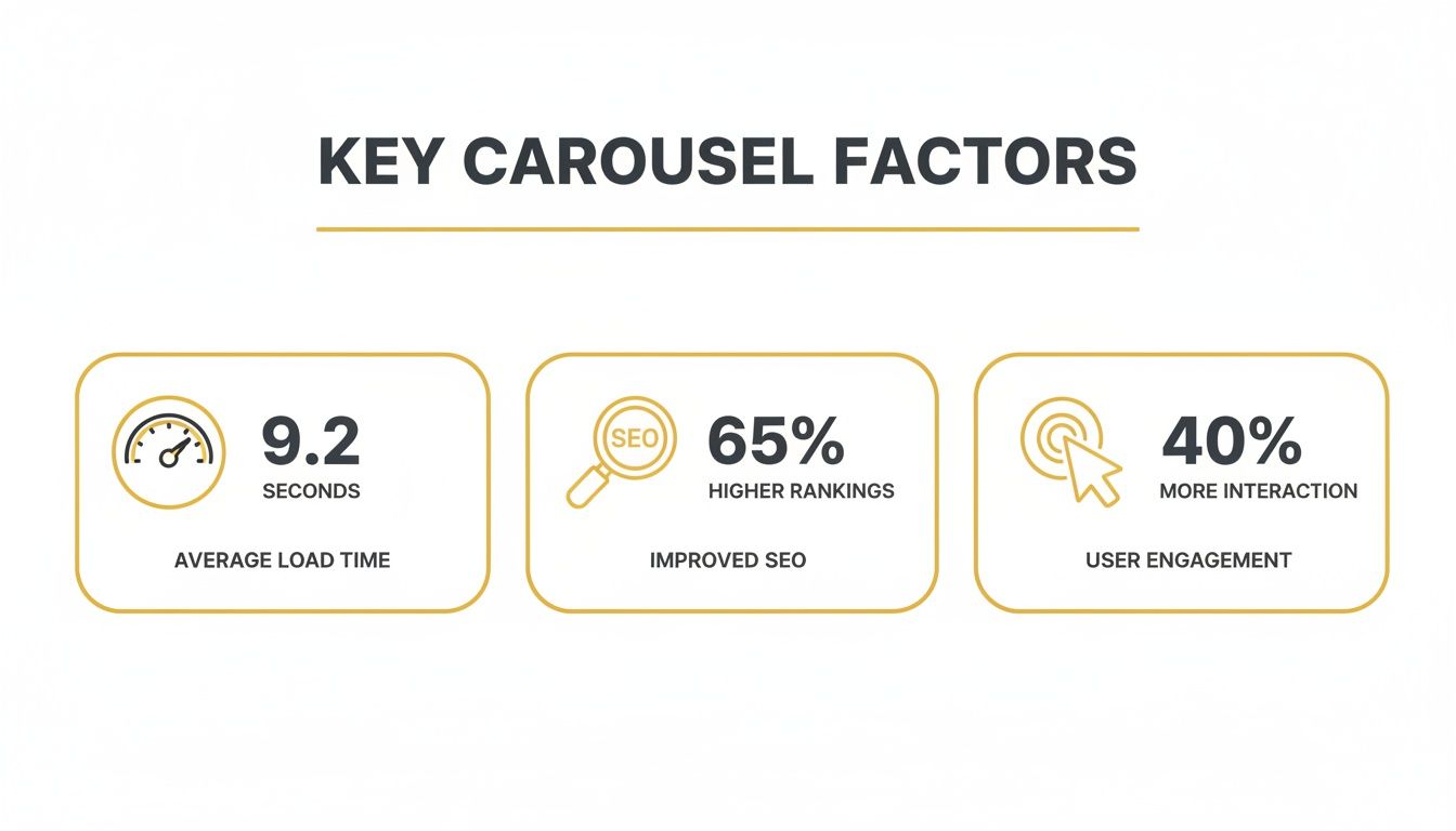
As you can see, while the goal is to boost engagement, carousels often bring performance and SEO headaches that can do more harm than good.
Understanding Banner Blindness and User Frustration
One of the most powerful arguments against carousels comes down to a simple human behaviour: "banner blindness." We’ve all spent years browsing the web, and in that time, our brains have learned to subconsciously filter out anything that looks like an advert. Because carousels often sit in the same spot and have the same flashy, rectangular look as banner ads, many visitors just ignore them completely and scroll right on by.
Even when users do take notice, engagement falls off a cliff after the very first slide. Some eye-opening research from Notre Dame University found that manual image carousels get a dismal 1% click-through rate. What's worse, a staggering 84% of those clicks were on the first slide, leaving the other slides to fight over the scraps. This shows just how inefficiently that valuable homepage real estate is being used. You can dig deeper into these kinds of web design findings over at damteq.co.uk.
Auto-playing carousels add another layer of frustration to the mix. If the slides switch too fast, people don't have enough time to read the text, let alone decide if they want to click. This lack of control is just plain annoying and often leads to users either giving up on the carousel or leaving the page altogether.
A carousel often becomes a container for content that no one can agree on, resulting in a series of weak messages that get ignored by nearly everyone. The first slide gets some attention, and the rest might as well not exist.
To make a truly informed decision, it helps to see the arguments laid out side-by-side.
Carousel Pros vs. Cons: A Quick Comparison
This table summarises the core arguments, helping you weigh up whether a carousel is the right tool for your specific needs.
| Aspect | Potential Advantage (The 'Pro') | Common Disadvantage (The 'Con') |
|---|---|---|
| Space | Consolidates multiple pieces of content into a single, compact area on the page. | Hides important information on slides that most users will never see. |
| Stakeholders | Satisfies various internal departments by giving each a spot on the homepage. | Dilutes the primary message, creating a confusing or unfocused user journey. |
| Engagement | Can present a variety of interactive content to potentially capture user interest. | Suffers from "banner blindness" and extremely low click-through rates on slides 2+. |
| User Control | Allows users to browse through different offers or features at their own pace (if manual). | Auto-playing carousels remove user control and can be highly frustrating. |
In the end, this isn't just about aesthetics. The real question is whether a carousel is the most effective way to communicate your most important message without getting in the way of your user or slowing your site down.
How Carousels Impact SEO and Site Performance

While a carousel might look slick and modern on the surface, it often comes with a hidden technical debt that can seriously hamper your website's health. The very things that make a slider work—heavy JavaScript and a queue of high-resolution images—are notorious for slowing down page load times. This isn't just a minor annoyance; it's a huge red flag for both your visitors and search engines.
A slow website is one of the fastest ways to lose an audience. Think about it: if a page takes too long to load, people will simply leave. This sends your bounce rate soaring and tells search engines your site isn't delivering a good experience. To really get a handle on this, check out our guide on how to reduce bounce rate.
This performance drag has a direct, measurable impact on your SEO. Google has made it crystal clear that a fast, smooth user experience is a priority, and its Core Web Vitals are the yardstick for measuring it.
The Core Web Vitals Collision
Google's Core Web Vitals are specific, user-centric metrics that measure a page's health in terms of loading speed, interactivity, and visual stability. A carousel in a website can directly torpedo your scores, especially the one called Largest Contentful Paint (LCP).
LCP measures the time it takes for the largest piece of content (usually an image or a block of text) to appear on the screen. Because carousels are often the first thing a visitor sees—the big "hero" section at the top—that main slide image is almost always the LCP element. If that image is a huge, unoptimised file, your LCP score will plummet, signalling a poor user experience to Google.
This creates a nasty domino effect. A poor LCP score contributes to a lower overall page experience score, which can directly harm your search rankings. In short, the very feature you added to grab attention could be making your site much harder to find in the first place. Understanding how to improve website speed is crucial if you plan on using one.
Accessibility Hurdles That Alienate Users
Beyond pure speed, a poorly built carousel can be an absolute nightmare for accessibility, effectively shutting out a whole segment of your audience. For a website to be successful, it has to work for everyone, including people who rely on assistive technologies.
Here are a few common ways carousels fail the accessibility test:
- Keyboard Navigation: Many sliders are built to only work with a mouse. Users with motor impairments who navigate with a keyboard should be able to tab through the slides and controls, but this is often an afterthought.
- Screen Reader Confusion: Without the right ARIA (Accessible Rich Internet Applications) attributes, a screen reader can't make sense of a carousel. It might not announce slide changes or describe the content, leaving the user with a confusing jumble of unlabelled images and links.
- Lack of User Control: Auto-playing carousels are a major problem. The content can change too fast for users with cognitive disabilities to process. For screen reader users, it's incredibly disruptive when the content changes without their command.
A carousel that can't be paused, stopped, or navigated with a keyboard isn't just a minor inconvenience; it's an inaccessible barrier that tells a segment of your audience that your site isn't for them.
This isn't just a matter of ticking a compliance box; it's about creating an inclusive experience. Alienating users with disabilities means losing out on potential customers and tarnishing your brand's reputation.
The Mobile Performance Problem
The technical baggage of a carousel causes real headaches for developers trying to build a modern, responsive website. The complex code needed can weigh down performance, and this is especially noticeable on mobile devices, where every kilobyte counts.
It’s no surprise that carousels often feel clumsy and awkward on smaller screens, creating a disjointed experience. The auto-play feature becomes even more frustrating on a phone when you don't have enough time to read the text on a slide before it vanishes. This is a big reason why so many in the industry are moving away from them.
At the end of the day, a carousel in a website introduces serious risks that can sabotage your SEO and damage the user experience. The performance hit from large media files and scripts can drag down your search rankings, while poor accessibility can lock out valuable users. Before you decide to add one, you have to weigh these significant drawbacks against any perceived design benefits.
Designing a Better Carousel When You Have To
Let's be honest, sometimes a carousel is simply unavoidable. It might be a demand from a key stakeholder or a specific requirement in the design brief. When that happens, you don't have to just accept a subpar user experience. You can still make it work.
By sticking to some solid design principles, it's possible to sidestep many of the usual pitfalls. You can build a slider that's more effective, far less frustrating, and genuinely respects your visitor's attention. The goal isn't to make a flawed element perfect, but to make the best of a tricky situation with smart, user-focused solutions.
The key is to shift the carousel from a passive, easy-to-ignore billboard into an interactive tool that the user actually controls. It all starts by putting them back in the driver's seat.

Prioritise Content and User Control
Here’s the golden rule: place your most critical message on the first slide. Every piece of data we have shows that engagement drops off a cliff after slide one. So, don't bury your lead. Assume the first slide is the only one most people will ever see, because for many, it will be.
Next, give users absolute control. That means you must disable auto-play. There's almost nothing more annoying than an automatically rotating carousel that whisks content away just as you're trying to read it. Let people decide for themselves if and when they want to move on.
This idea of user agency isn't just a nice-to-have; it's non-negotiable for building a carousel that doesn't drive people away.
A carousel should empower users, not rush them. By disabling auto-play and providing clear navigation, you transform the interaction from a passive viewing into an active exploration, significantly improving the user experience.
With those fundamentals locked in, we can focus on the design details that really make a difference.
Craft Clear Navigation and Compelling Copy
If someone can't figure out how to use the carousel, whatever you've put inside it is completely invisible. Tiny, vague navigation controls are a classic design flaw.
To get navigation right, follow these simple guidelines:
- Use Large, Obvious Icons: Put clear, high-contrast arrows on either side of the carousel. Make sure the click/tap area is generous enough to be easily used on any device, from a desktop mouse to a thumb on a mobile screen.
- Include Slide Indicators: Pop some dots or thumbnail images below the carousel. This shows people how many slides there are and where they are in the sequence. Just as importantly, make these indicators clickable so users can jump straight to the slide that interests them.
- Make It Swipeable on Mobile: On any touch device, supporting intuitive swipe gestures is an absolute must. People expect to swipe through this kind of content, and failing to deliver makes your site feel clunky and dated.
Just as crucial as the navigation is the actual content on the slides. Resist the temptation to cram a wall of text over an image. Each slide needs to deliver a single, powerful message.
Write concise, high-impact copy and pair it with a clear, compelling call-to-action (CTA). Tell the user exactly what to do next, whether that’s "Shop Now," "Learn More," or "View the Collection." Every slide needs a purpose and a clear path forward.
Optimise for Performance Above All
Finally, none of these design tweaks will matter a bit if the carousel grinds your website to a halt. Performance isn't an afterthought; it's a core part of good design.
Before you even begin, make sure every single image is meticulously optimised. Use modern formats like WebP, compress them without wrecking the quality, and use lazy loading. This ensures that images on later slides only load when they're actually needed, speeding up that initial page load.
When you're ready to build, understanding how to add a Divi carousel to your website with various options can give you a practical starting point. Making the right technical choices from the get-go will save you a world of performance headaches down the line. A fast, responsive carousel will always beat a sluggish, feature-packed one.
Smarter Alternatives to the Homepage Carousel
Given all the baggage carousels come with, it’s no surprise that so many designers and marketers are looking for better options. The good news is, there are plenty of powerful, user-friendly alternatives that do a much better job of showcasing your key messages without killing your site's performance or clarity.
These designs let you take back your most valuable digital real estate, focusing your visitor's attention on a single, compelling action. By choosing clarity over clutter, you’ll make a much stronger first impression and guide people more effectively through your site.
Embrace the Simplicity of a Hero Layout
The most popular—and frankly, most effective—alternative to a carousel in a website is the classic hero layout. This approach dedicates the entire above-the-fold space to one primary message, a single striking image or video, and one clear, unmissable call-to-action (CTA).
Instead of trying to say five things at once, a hero layout says one thing brilliantly. It cuts through the noise, making it instantly obvious to visitors what you offer and what you want them to do next. That kind of focus almost always leads to better conversion rates because you've made the user's journey dead simple.
This approach also gives you a serious performance boost. Loading one optimised image is always going to be faster than loading five, which has a direct, positive impact on your Core Web Vitals and SEO.
A hero section acts like a confident handshake. It’s direct, focused, and immediately establishes value, whereas a carousel can feel like being handed five different business cards at the same time.
Use a Grid Layout to Display Multiple Options
Of course, sometimes you genuinely need to show several equally important options at once. An e-commerce store might want to feature different product categories, or a news site could highlight its top stories. When that's the case, a well-organised grid layout is a fantastic choice.
A grid lays all the options out at the same time, putting the user in complete control. Nothing is hidden behind a click or a swipe, so people can quickly scan everything and pick what's most relevant to them without waiting for a slide to animate into view.
It's just a more respectful way to present choices. Grids are also naturally scannable and work beautifully on mobile devices. Better yet, you can pull dynamic content into your grid to keep it fresh—for example, by learning how to embed an Instagram feed into your website.
Consider Other Dynamic and Static Alternatives
Beyond the hero and the grid, a few other designs can elegantly replace a carousel while adding a bit of visual flair.
- Subtle Background Videos: A short, looping video in the background can create a great atmosphere and express your brand’s personality without demanding any interaction. It adds a dynamic feel without the usability headaches of a slider.
- Column-Based Features: Why not break the space into two or three distinct columns? Each one can highlight a different service or product with its own image, headline, and CTA, creating a clear visual hierarchy.
- A Simple, Powerful Statement: Sometimes, less is more. A bold typographic statement with a compelling value proposition and a single button can be more impactful than any image could ever be.
By choosing one of these smarter alternatives, you can build a faster, more effective, and more user-friendly homepage that actually gets the job done.
So, When Do Carousels Actually Work?
For all the flak they get on homepages, carousels can be incredibly effective when used in the right context. The secret ingredient? User intent. When a visitor chooses to explore a set of related items, a carousel stops being an obstacle and becomes a genuinely helpful tool.
It’s a subtle but crucial shift from passive viewing to active exploration. Instead of having marketing messages pushed at them, users get to take the driver's seat and browse content they actually care about. In these moments, the carousel is transformed from a clunky billboard into a smart, user-friendly feature.
E-commerce Product Galleries
One of the best examples of a carousel done right is the e-commerce product gallery. Think about it: when you land on a product page, you’re there for one reason – to scrutinise that item. A carousel is perfect for this.
It lets you flick through photos from every angle, check out different colour options, or even watch a quick demo video, all without leaving the page. The shopper is in total control, swiping or clicking at their own pace. Here, the carousel isn't a distraction; it’s directly serving the user’s need for detailed visual information in a neat, tidy package.
Showing Off Social Proof and Portfolios
Carousels also shine when you need to display a collection of similar, bite-sized items, like client logos or glowing testimonials. If a visitor wants to check out your credentials, they can easily scroll through a roster of companies you've worked with.
The real test for a carousel is whether the user is exploring by choice. When interaction is voluntary—like swiping through a gallery of testimonials—the format feels intuitive and empowering, not forced.
This works so well because no single logo is mission-critical; the user's exploration is entirely optional. It’s a clean and efficient way to organise social proof without gobbling up a huge amount of vertical space on the page.
Taking a Page from Social Media's Book
Let’s face it, the swipe gesture is practically muscle memory for most of us now, thanks in large part to social media. On platforms like Instagram, carousels are a powerhouse format. They pull in an average engagement rate of 1.92%, outperforming both single images (1.74%) and videos. And when a post uses all ten slides? That engagement rate can jump to over 2%. You can dig into more of the data behind carousel performance from Embryo.
The big takeaway here is context. On social media, people expect to swipe through content they’re interested in; they’re already in discovery mode. If we apply that same logic to our websites—using carousels only when users have a clear reason to explore—we can build experiences that are just as engaging.
Frequently Asked Questions About Website Carousels
Still on the fence about using a carousel? Let's clear up some of the most common questions people ask. These quick answers should help you make a final, confident decision.
Are Carousels Bad for SEO?
They certainly can be. The two biggest culprits are performance and content visibility. Carousels often rely on heavy JavaScript and large images, which can drag down your site speed and hurt your Core Web Vitals—a key ranking factor. On top of that, search engine crawlers might give less weight to content buried on later slides, simply because users rarely see it.
To keep your SEO in good shape, you absolutely have to:
- Optimise all images to ensure they load in a flash.
- Make sure the carousel is fully accessible with clean, semantic code.
- Put your most crucial content and keywords right there on the first slide.
Should I Use an Auto-Playing Carousel?
In a word: no. Auto-playing carousels are notorious for frustrating users because they snatch away control. People often don't get enough time to read a slide before it zips away, and for users with cognitive disabilities or those relying on screen readers, the constant movement can be incredibly disruptive.
Always default to user-initiated navigation. Let visitors explore at their own pace with clear, clickable controls like arrows and dots. This simple choice dramatically improves the user experience.
Do Carousels Work on Mobile Devices?
They can, but only if they're designed with a mobile-first mindset. A carousel that works well on a smaller screen needs to feel natural, supporting intuitive touch gestures like swiping. The navigation elements—the arrows and indicator dots—also need to be big enough for someone to tap easily with a thumb, without accidentally hitting something else.
Can a Carousel Be Made Accessible?
Yes, but it takes deliberate effort from your development team. A truly accessible carousel needs to be navigable with a keyboard alone (letting users tab through slides and controls). It also requires proper ARIA attributes so screen readers can announce what's happening, and it must include controls to pause or stop any automatic movement.
What Is a Good Click-Through Rate for a Carousel?
This is where the reality of carousels really hits home. The data is pretty clear: overall click-through rates (CTRs) often hover around a dismal 1%. The vast majority of those clicks—sometimes over 80% of them—are on the very first slide. Engagement on any other slide is usually close to zero.
Ready to discover the perfect tools to build a better website and drive real results? At The Digital Marketing Toolbox, we've curated the best resources to help you grow. Explore our catalog and find your next favourite marketing solution at https://grow-your-biz.com.


