

An online contact form is far more than just a few boxes on a webpage. Think of it as your website's virtual front door—the primary way you turn a casual visitor into a genuine lead, a customer enquiry, or a valuable new connection for your business.
Your Online Contact Form Is a Digital Handshake
Don't just see your contact form as a simple tool. It's your first real conversation with a potential customer, a digital handshake that sets the tone for everything to follow. In an era where first impressions are almost always made on a screen, this humble feature is your best bet for turning passive browsing into an active conversation. It’s where relationships begin.

A well-crafted form does more than collect messages. It helps organise your incoming requests, simplifies your internal workflow, and makes sure no opportunity gets lost in the shuffle. For countless businesses, it’s the most reliable engine they have for generating a steady stream of leads.
Central to Customer Communication
An online contact form gives you a single, organised channel for all incoming enquiries. It’s a much smarter alternative to just listing an email address, which is often a magnet for spam bots. A form guides the user, prompting them for the specific information you need to help them properly.
This structured approach means your team can respond faster and more effectively, creating a much better customer experience from the get-go.
Meeting Modern Expectations
People today expect fast, convenient ways to get in touch. Recent research highlights this shift, showing that UK consumers prefer email for their first contact with a business (53%) and for getting account updates (39%). This preference for online forms significantly outstrips phone calls, proving just how much people value communication channels that don't demand an immediate, real-time response. You can dig deeper into these UK customer preferences on MaxContact.
An effective online contact form is more than a utility; it's a statement. It tells visitors you're organised, approachable, and ready to listen—building trust from their very first click.
Before we dive deeper, let's quickly summarise the key roles a contact form plays on a website. It's not just for messages; it's a multi-purpose tool that supports several core business activities.
Core Functions of an Online Contact Form
| Function | Business Benefit | Example Use Case |
|---|---|---|
| Lead Generation | Captures contact details from interested prospects around the clock, 24/7. | A potential client fills out a form to request a quote. |
| Customer Support | Provides a clear, direct channel for users to ask for help or report issues. | A customer submits a support ticket about a product issue. |
| Feedback Collection | Gathers testimonials, suggestions, or survey responses to improve services. | A user shares their experience or suggests a new feature. |
| Scheduling | Allows clients to request appointments or consultations directly from your site. | A patient requests a booking at a dental clinic. |
As you can see, this single feature is indispensable. By getting this digital handshake right, you create a smooth, professional experience that benefits both your business and your customers, making it a non-negotiable part of any serious growth strategy.
The Anatomy of a High-Converting Form
Any online form can collect information. That’s the easy part. A high-converting form, though, does something more—it starts a conversation and makes it incredibly easy for your visitor to say "hello". The secret isn't about adding more bells and whistles; it's about thoughtful design that turns a simple tool into your best lead-generation asset.
Think of your form like a well-laid-out shop. Every single element should have a purpose, guiding the visitor from the moment they walk in to the point of sale without a single moment of confusion. This all comes down to focusing on the user experience at every turn.
To really nail this, you've got to dig into form design best practices. It’s less about making things look pretty and more about understanding the psychology behind a smooth, frictionless interaction.
Essential Fields: The Core Components
First things first, let's cover the absolute must-haves. These are the foundational fields you need to actually get a conversation started.
- Name Field: This is your digital handshake. A single "Full Name" field usually does the trick, but splitting it into "First Name" and "Last Name" can make it easier to personalise your emails and CRM entries later on.
- Email Address: This is the most important field on the form. It's your direct line to a new lead. Always, always include validation to check for the "@" symbol and a proper format. This simple step saves you from bounced emails caused by typos.
- Message Box: This is where the real magic happens. An open-ended text box gives people the space to tell you exactly what they need in their own words, giving you invaluable context before you even reply.
These three fields are the bare minimum for most contact forms. If you have less, you won't have enough information to follow up. If you have more, make sure every extra field earns its place.
Strategic Fields: Enhancing the Conversation
Once you have the basics down, you can add a few extra fields to help qualify leads and get enquiries to the right person faster. The golden rule here is to make them optional. Don't force people to give you information they aren't ready to share.
For instance, a "Phone Number" field is great to have, but it can scare off people who are worried about getting spam calls. Simply marking it as (Optional) shows you respect their privacy while still giving them the choice. Another smart addition is a dropdown menu like "How can we help?" with options like 'Sales Enquiry' or 'Customer Support'. This helps you route the message to the correct department from the get-go.
Your goal is to gather just enough information to have a productive first conversation. Every additional required field increases the chance of abandonment.
The Little Details That Make a Big Difference
It's often the small, almost unnoticeable details that have the biggest impact on whether someone fills out your form or gives up in frustration. Getting these right shows you care about your visitor's time.
- Clear Labels: This isn't the place to be clever. Labels should be simple, easy to see, and placed directly above the field they relate to. Top-aligned labels are the gold standard, especially for mobile users.
- Helpful Placeholder Text: Use the text inside a field as a helpful hint, not as the primary label. For example, a message box with "Tell us a bit about your project…" gives the user a gentle nudge in the right direction.
- Real-Time Error Validation: There's nothing worse than filling out a form, hitting submit, and then being told you messed something up. Inline validation is a lifesaver—it checks fields as the user types and flags errors instantly with friendly messages like, "Oops! Please enter a valid email address."
Mastering these details is a crucial step to improve conversion rate (https://grow-your-biz.com/blog/improve-conversion-rate) across your entire website, well beyond just your contact page.
Crafting an Irresistible Call-to-Action
We’ve reached the final, and arguably most important, element: the submission button. The word "Submit" is functional, sure, but it’s also completely uninspiring. Your Call-to-Action (CTA) needs to be an engaging, action-focused phrase that reminds the user of the value they're about to receive.
Instead of 'Submit', why not try one of these?
- Get Your Free Quote
- Send My Message
- Request a Consultation
- Start Your Project
- Download My Guide
This small switch in wording transforms the button from a boring command into an exciting next step, which can make all the difference in getting that final click.
Strategies to Stop Form Abandonment
The biggest enemy of any contact form is the back button. Picture this: a potential customer lands on your page, starts to fill out your form… and then vanishes. This moment, known as form abandonment, is where countless leads go to die. Getting to grips with why this happens is the first step to fixing the leak.
People abandon forms for a few common reasons, but they usually boil down to friction, frustration, or confusion. If your form feels like a chore, demands too much personal information, or just doesn't work properly on their phone, they will leave without a second thought. Your job is to make the whole process so seamless that clicking "send" is the most natural next step.
The scale of this problem is huge. In the UK, a staggering 81% of users have abandoned a form after starting it. Factor in that over half of all web traffic now comes from mobile, and a clunky form means you're almost certainly losing a massive chunk of your audience. You can dive deeper into optimising forms for UK audiences on Numentechnology.
Adopt a Less Is More Philosophy
The single most effective way to cut down on form abandonment? Ask for less. Every single field you add creates a tiny bit more work for your user—another mental hurdle to jump. The more you ask for, the higher the chance they'll decide it's simply not worth the effort.
Take a hard look at every field on your form and challenge its existence. Do you really need their phone number right now? Is the company name essential for this very first point of contact? Often, all you truly need to kick off a conversation is a name, an email, and their message. You can always gather more details later on.
A professional services firm saw an 89% conversion boost simply by slashing their form fields from eight down to four and getting rid of a clunky CAPTCHA. It’s a powerful reminder of how much simplification matters.
By being ruthless with what you ask for, you show respect for your user's time. You lower the barrier to entry, making it far more likely they'll actually complete the form.
Streamline the Layout for Scannability
How your form looks is just as important as what it asks for. A cluttered, confusing layout can intimidate people before they even type a single character. The goal is to create a clear, logical path from the first box to that final "submit" button.
Best practice for this is a single-column layout. It’s much easier for the human eye to follow, creating a straight, downward momentum that guides the user smoothly through the process. Spreading fields across multiple columns can disrupt this flow, causing people to miss things or get confused about what to fill in next.
This is absolutely critical for mobile users. On a smaller screen, a single column is the only layout that really makes sense. It creates a clean, tappable experience without any of that frustrating pinching and zooming.
Break Down Complex Requests with Multi-Step Forms
But what if you genuinely need a lot of information? Perhaps for a detailed project quote or a complex support ticket. Forcing someone to confront a single, long form with a dozen fields is a recipe for abandonment.
This is where multi-step forms are a game-changer. By breaking the process into smaller, more manageable chunks, you can make the whole thing feel far less daunting.
- Step 1: Start with the easy stuff, like name and email.
- Step 2: Move on to project-specific details.
- Step 3: Gather any final information or file uploads.
This works because it taps into a psychological principle called commitment and consistency. Once a user has completed the first easy step, they're much more likely to see it through to the end. Adding a progress bar (e.g., "Step 1 of 3") is also incredibly effective, as it shows them exactly where they are and that the end is in sight.
Rethink Your Approach to Spam Prevention
Nobody wants spam, but let's be honest—traditional CAPTCHAs are a major source of frustration. Asking your visitors to decipher blurry text or click on endless pictures of traffic lights just creates unnecessary friction. It can easily be the final straw that drives them away.
Fortunately, there are much smarter, user-friendly alternatives that can protect your inbox without punishing your legitimate visitors.
- Honeypot Fields: This is a clever trick. You add a hidden field to your form that is invisible to humans but visible to spam bots. Since bots are programmed to fill out everything they see, you can automatically filter out any submission that has an entry in that secret "honeypot" field.
- reCAPTCHA v3: Google's newer reCAPTCHA technology works silently in the background. It analyses a user's behaviour on your site to assign a risk score, figuring out if they're human without them ever having to click a box.
By using these modern solutions, you can block spam effectively while giving your real customers a completely frictionless experience. You'll turn your form from a potential roadblock into your most powerful conversion tool.
Building Trust with Accessibility and GDPR Compliance
An online contact form is often your first handshake with a potential customer. To make a good impression, it has to do more than just collect information—it needs to build trust right from the start. In the UK, that trust rests on two critical pillars: making sure your form is usable for everyone, and respecting every user's data privacy.
Getting these wrong isn't just a minor oversight; it can alienate a huge portion of your audience and land you in legal hot water. Focusing on accessibility and GDPR compliance isn't about ticking boxes. It’s about showing visitors you value them and take their security seriously.
Making Your Form Accessible to Everyone
Web accessibility simply means that people with disabilities can use your website—including your contact form. This isn't just the right thing to do; it’s a legal requirement under the Equality Act 2010 and makes sound business sense. After all, you’re opening your door to a wider audience, which includes the one in five people in the UK living with a disability.
Imagine trying to use a machine with unlabelled buttons. That’s what an inaccessible form feels like for someone using a screen reader.
Here are a few straightforward ways to make your form more accessible:
- Label Everything Properly: Every single form field needs a clear, visible
<label>that’s programmatically connected to it. Placeholder text like "Enter your name here" is not a substitute for a proper label. - Check Your Colour Contrast: Text, field borders, and buttons need to stand out clearly from their background. This is a massive help for anyone with a visual impairment.
- Write Clear Error Messages: If someone makes a mistake, don't just turn a box red. Explain the problem clearly, like "Please enter a valid email address." It’s direct, helpful, and far less frustrating.
By building in these features, you create an inclusive experience that says "welcome" to every single visitor.
Navigating GDPR Compliance
The General Data Protection Regulation (GDPR) fundamentally changed how businesses in the UK handle personal data. Your contact form is on the front line of data collection, so getting compliance right is non-negotiable. A misstep can lead to hefty fines and, worse, a complete breakdown of customer trust.
The heart of GDPR is transparency. People need to know exactly what they’re agreeing to when they hand over their details.
GDPR isn't about creating barriers; it's about building a transparent and respectful relationship with your audience from the very beginning. It forces you to be clear about your intentions and gives users control over their own data.
To be compliant, you must get explicit and informed consent. This means you can't just assume someone wants to hear from you because they filled out a form. For marketing newsletters, you need a separate, unticked checkbox for users to actively opt in. This principle of clear consent and robust procedure is vital, especially when forms handle sensitive information, mirroring the legal frameworks seen in services like remote online notary services.
Here’s a practical checklist to help you verify that your online contact forms meet key legal and ethical standards in the UK.
GDPR and Accessibility Checklist for Your Contact Form
| Compliance Area | Checklist Item | Why It Matters |
|---|---|---|
| Data Privacy | Link to your Privacy Policy | Users must be able to easily find and read how you store, handle, and protect their data. |
| User Consent | Use an unticked checkbox for marketing opt-ins | Consent must be a clear, affirmative action. Pre-ticked boxes are not GDPR compliant. |
| Data Security | Secure your form submissions with HTTPS | Encrypting data in transit protects user information from being intercepted by third parties. |
| Accessibility | All fields have clear, visible <label> tags |
This allows screen readers to identify each field, making the form usable for visually impaired users. |
| Accessibility | Error messages are descriptive and easy to see | High-contrast text that explains the specific error helps all users correct mistakes quickly. |
By making accessibility and GDPR a priority, you're not just following the rules. You're actively building a trustworthy brand that shows respect for every single person who visits your site.
Choosing the Right Tools to Build Your Form
Thankfully, you don't need to be a coding whizz to create a polished, effective online contact form. There's a whole world of powerful, user-friendly tools out there, each designed for different needs, budgets, and levels of technical confidence. The real trick is matching the right tool's strengths to what you're trying to achieve with your business.
Generally, your options fall into one of three camps. You can go with a plugin that’s built right into your website's content management system (CMS), choose a specialised third-party form builder, or simply drop in a lightweight, embeddable widget. Each path offers its own unique blend of convenience, power, and flexibility.
CMS Plugins: The Integrated Solution
If your website is built on a platform like WordPress, CMS plugins are often the path of least resistance. These tools are designed to live inside your existing dashboard, so they feel like a natural part of your site from the get-go.
For instance, WordPress users can grab something like Contact Form 7 or WPForms and have a form up and running in minutes. The biggest win here is convenience. You don’t have to juggle a separate account or wrestle with tricky integrations. You just build it, save it, and add the form to a page with a simple shortcode or block.
The trade-off, however, can be the more advanced features. While these plugins are brilliant for basic contact or sign-up forms, you might find that sophisticated functions like conditional logic or deep CRM integrations are locked behind paid add-ons.
Dedicated Form Builders: Maximum Power and Flexibility
For anyone needing more than the basics, dedicated form builders are the gold standard. These are powerful, standalone platforms (SaaS, in tech speak) that do one thing and do it exceptionally well: create high-performance forms. Think of them as a specialist workshop for crafting exactly the form you need.
These tools are where the advanced features really shine. You can build multi-page forms, take payments, create complex "if this, then that" conditional logic, and connect to hundreds of other apps. This makes them perfect for businesses that depend on forms for critical tasks like qualifying leads, onboarding new clients, or generating detailed project quotes. It's no surprise they are often listed among the best lead generation tools for serious marketers.
The only real downside is that they exist outside your website. This means another subscription to manage, and while embedding the form is usually dead simple, it is an extra step. For the sheer power you get, it’s a trade-off many are happy to make.
Choosing the right tool isn't just a technical decision; it's a strategic one. The best solution is the one that removes friction for both you and your user, turning a simple point of contact into a reliable business asset.
Embeddable Widgets: The Simple and Speedy Option
Your third route is to use embeddable widgets. These are lightweight, often single-purpose tools that you can add to any website by copying and pasting a small snippet of code. They are the perfect solution when you need a specific function without the overhead of a full-blown plugin or form builder.
For example, you might use a widget just for collecting customer reviews or another one purely for booking appointments. Their main advantage is speed and simplicity. You can have a great-looking, mobile-friendly form on your site in a matter of minutes, no matter what platform your website is built on.
While this approach is incredibly flexible, it can get a bit disjointed if you need several different forms, as you could end up managing accounts with multiple widget providers.
This flowchart maps out a simple decision-making process for building a form your users will actually trust, zeroing in on usability, security, and transparency.
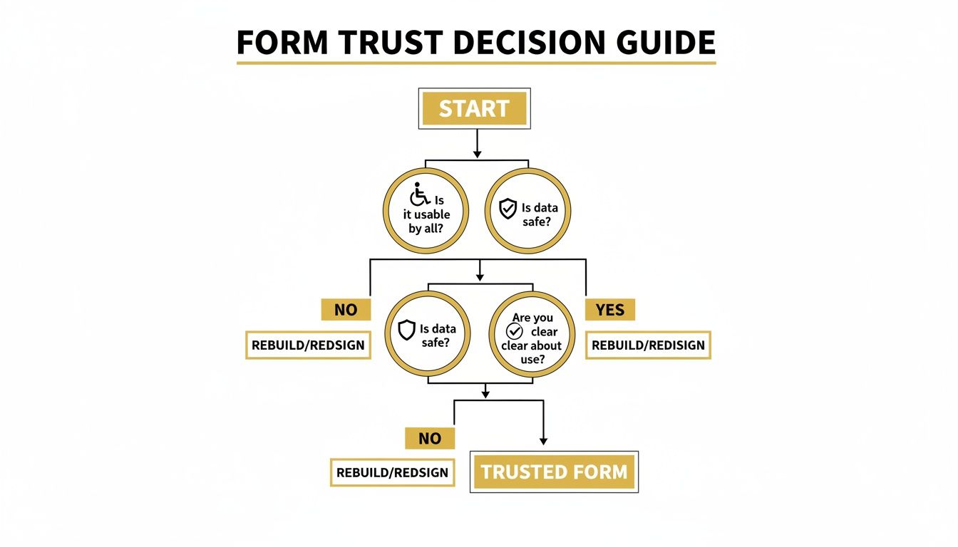
Ultimately, a trusted form is inclusive, secure, and honest. Your choice of tool should reflect and support these core principles.
Making Your Decision
So, how do you pick the perfect fit? It all comes down to what you really need.
- Are you a small business that just needs a simple way for customers to get in touch? A CMS plugin is probably your best bet.
- Are you a growing company that needs to automate how leads are sent to your sales team? A dedicated form builder is the way to go.
- Do you just need a quick, single-purpose solution right now? An embeddable widget will get the job done fast.
What Happens After a User Clicks Submit?
The moment a user hits your call-to-action button isn't the end of their journey; it’s actually the start of a crucial new phase. If your post-submission process is weak, you can undo all the hard work you put into your form, leaving potential customers feeling ignored.
Think of it like this: that click is the digital equivalent of someone walking up to your reception desk. What you do next decides whether they feel welcomed and valued or completely overlooked. A smooth, professional follow-up is what turns a simple submission into a strong first impression.
The stakes are surprisingly high. Data shows that only 38% of UK users who start filling out a contact form actually complete it. When you look at all website visitors, that figure drops to a tiny 9% visitor-to-completion rate. This just goes to show how critical it is to nurture every single lead you get. You can dig into more of these conversion rate benchmarks on Zuko.io.
Crafting the Perfect Confirmation
The very first step is to acknowledge their action immediately. You need to instantly confirm that their submission was successful and let them know what to expect. Never leave them wondering if their message vanished into the digital ether.
You have two solid options for this:
- Thank-You Page: This is often the best route. A dedicated page not only confirms their submission but also gives you space to guide their next steps, like suggesting they explore your blog or follow you on social media.
- On-Page Message: A simple, dynamic message that appears where the form was (e.g., "Thanks for your message! We'll be in touch within 24 hours.") is a clean and effective alternative.
Whichever you choose, the key is to be specific. Give a realistic response time to manage expectations and start building trust right away.
Automating the Welcome
While the user sees your confirmation message, your system should already be kicking into gear. An automated email response is an absolute must for a professional follow-up. This email does two important things.
First, it offers reassurance by landing in their inbox, proving their message was received. Second, it can provide immediate value. You could include links to helpful resources, answer common questions, or simply give more details about your process.
Your post-submission process is your first opportunity to deliver on the promises your brand makes. A swift, helpful, and organised response shows you are reliable and customer-focused before a human conversation even begins.
Organising Submissions for a Fast Follow-Up
On your end, where that submission goes is just as important. A disorganised system is a recipe for missed opportunities and slow replies. The goal is to get the right information to the right person as quickly as possible.
This is where integrations become your best friend. A great online contact form should automatically send data to the correct place. You can do this by:
- Routing Notifications: Set up email alerts to specific team members based on the type of enquiry (e.g., sales questions go directly to the sales team).
- CRM Integration: This is the most powerful option. Automatically creating a new contact or lead in your CRM ensures no submission ever falls through the cracks.
Connecting your form data to the right tools is fundamental. To learn more, check out our guide on choosing the best CRM software for small business. This connection is what turns a simple form into a reliable engine for building lasting customer relationships.
Frequently Asked Questions About Online Contact Forms
Even with the most straightforward setup, a few questions always pop up when you're managing contact forms. I've seen them all over the years, so let's walk through some of the most common ones, from fighting off spam bots to figuring out what "good" performance actually looks like.
How Many Fields Should My Contact Form Have?
The golden rule here is simple: as few as you can get away with. Every single field you add is another little hurdle for your visitor, and with each one, you increase the odds they'll just give up. For most general enquiries, all you really need is a name, an email, and a box for their message. That’s enough to start a conversation.
Of course, it all comes down to your goal. If you're trying to qualify a hot sales lead, you'll probably need to ask for more – maybe their company name or a rough budget. The trick is to question every single field. Do you absolutely need this piece of information for the very first contact? If the answer's no, get rid of it. You can always ask for more later.
What Is the Best Way to Stop Form Spam?
Fighting off spam can feel like a never-ending war, but you can win it without making real people squint at blurry letters. Forget those annoying old CAPTCHAs; modern spam prevention is much smarter and smoother for your users.
Here are a couple of the best, user-friendly techniques out there today:
- Honeypot Fields: This is a wonderfully simple but clever trick. You add a field to your form that's hidden from human eyes using code, but spam bots, which try to fill everything in, can see it. If a submission comes through with that hidden field filled out, you know it's a bot and can junk it automatically.
- Google reCAPTCHA v3: This is the invisible guardian. It works behind the scenes, watching how a user interacts with your site to give them a "human" score. There are no puzzles to solve or boxes to tick. It’s brilliant at weeding out bots without getting in a real person's way.
The best spam prevention is the kind your visitors never even notice. It should stop bots dead in their tracks but let genuine customers sail right through.
Can I Add a Contact Form to Any Page?
Absolutely, and you should! Most people think of a form as something that just lives on the "Contact Us" page, but you can put one anywhere it makes sense to start a conversation. Most WordPress plugins, for instance, use "shortcodes" – a tiny snippet of text you can copy and paste to drop a form onto any page, blog post, or even into a sidebar.
Think about placing forms on your most important pages, like your services or pricing pages. When someone is looking at what you offer, that's the perfect moment to make it incredibly easy for them to reach out. Don't make them go hunting for your contact details.
How Do I Know If My Form Is Performing Well?
You measure its success by tracking its conversion rate. In simple terms, this is the percentage of people who see the form and actually go on to fill it out and submit it.
You can track this using analytics tools by setting up a simple "Goal." You tell your analytics software to count a conversion every time a visitor lands on the "thank you" page that appears after they submit the form. If your conversion rate is low, it’s a red flag that something is wrong – maybe you have too many fields, the button is confusing, or the page is just too slow.
Ready to find the perfect tools to build, manage, and optimise your forms? The Digital Marketing Toolbox provides a curated catalogue of the best solutions for everything from form builders to analytics, helping you turn every click into a valuable connection. Explore our resources at https://grow-your-biz.com and start building better forms today.


