

A carousel for a website is essentially a rotating slideshow. It lets you display a series of images, text, or even videos in one compact spot on your page. Picture it like a digital flipbook cycling through your most important messages right where everyone can see them.
What Is a Website Carousel and When to Use One

At its heart, a website carousel—often just called a slider—is an interactive component that presents content in a series of "slides." Each slide can be a unique mix of visuals and text, giving you a way to feature promotions, highlight different products, or show off portfolio pieces without cluttering the page. You’ll most often see them sitting proudly in the "hero section" at the top of a homepage, where they grab immediate attention.
But here’s the thing: deciding to use a carousel isn’t a simple yes or no. While it seems like a smart way to pack more into that prime screen real estate, it can come with some serious trade-offs in user experience (UX), performance, and accessibility. The real trick is knowing when a carousel genuinely helps your goals and when a simpler approach would work much better.
Strategic Scenarios for Using a Carousel
When used thoughtfully, a carousel can be a fantastic tool. It’s not a one-size-fits-all solution, but in the right context, it really shines. For instance, a creative agency might use one to create a dynamic visual portfolio, immediately showing off their best work without making visitors click away.
Here are a few scenarios where a carousel for a website can be a clever choice:
- Visual Storytelling: Perfect for walking a user through a step-by-step process or telling a brand story where the sequence of information really matters.
- Product Tours: Great for introducing a new product by highlighting its key features, with each slide dedicated to a specific benefit.
- Showcasing Variety: Ideal for displaying a range of items that have similar importance, like different holiday packages for a travel agency or recent articles on a blog.
A carousel works best when the user is in an exploratory mindset and the content on each slide holds equal importance. If one message is critically important, it should never be hidden on a subsequent slide.
When to Consider an Alternative
On the flip side, there are plenty of times when a carousel can cause more problems than it solves. If your main goal is to drive a single, specific action—like getting someone to sign up for a newsletter or click "Buy Now"—a carousel can seriously water down that message. The constant motion can be distracting and might even cause people to miss your primary call to action entirely.
In these cases, simpler is almost always better. A static, powerful hero image with a punchy headline and a single, clear button often converts far more effectively. If you need to show multiple items, a well-organised grid lets users see all their options at once, putting them in control. It's all about making a strategic choice based on your specific objectives, not just adding a carousel because it looks slick.
To help you decide, here’s a quick guide on whether a carousel is the right fit for your needs.
Carousel Use Case Decision Framework
| Scenario | Consider Using a Carousel | Alternative to Consider |
|---|---|---|
| One clear call to action (CTA) | No, it dilutes the primary message. | Use a static hero section with a single, focused CTA button. |
| Showcasing a visual portfolio | Yes, it's great for displaying multiple creative works. | A grid layout can also work well, allowing users to see all items at once. |
| Announcing a single, vital update | No, the message might be missed on a later slide. | A banner or modal pop-up is more direct and unmissable. |
| Displaying customer testimonials | Yes, it allows for multiple quotes without taking up too much space. | A dedicated testimonials page or a static grid of quotes. |
| Comparing a few key products | Yes, to highlight features side-by-side sequentially. | A dedicated comparison table provides a clearer, at-a-glance view. |
Ultimately, the best approach comes down to your content and what you want your visitors to do. A carousel is a tool, and like any tool, its effectiveness depends entirely on how and when you use it.
The Great Debate: Website Carousel Pros and Cons
The website carousel is easily one of the most argued-about elements in web design. On the surface, the idea is brilliant. You get a compact, space-saving powerhouse to show off multiple key messages, all in that prime spot on your homepage. For a business juggling several important promotions, it feels like the perfect fix.
The logic is simple: you can cram multiple offers "above the fold" where everyone will see them, all without making the page look cluttered. It's a tempting proposition, especially for marketing teams trying to keep different departments happy with very limited screen real estate.
But the reality of how people actually use websites often tells a very different story. That promise of getting more eyes on more content can be completely undone by some serious user experience (UX) and technical problems. These issues can quietly sabotage your marketing goals, so it’s crucial to understand both sides of the coin.
The Major Drawbacks of Using a Carousel
The biggest problem you'll run into is something called banner blindness. We’ve all been conditioned to tune out anything that looks and moves like an advert, so our eyes just glide right over them. You might think you're showing visitors five can't-miss messages, but the truth is, they probably aren't seeing a single one.
Recent UK user experience studies really drive this point home, showing that a staggering 70-80% of homepage visitors don't interact with a rotating carousel at all. That’s a huge chunk of your audience. This leads to click-through rates that are often miles lower than what you'd get from a simple, static image.
Beyond how users behave, carousels bring their own technical baggage that can weigh your site down.
- Slower Page Load Times: All those large images and the extra JavaScript needed to make them slide can seriously slow down your website. A slow site doesn't just annoy visitors; it's also a big red flag for search engine rankings.
- Accessibility Hurdles: Many carousels are a nightmare for people with disabilities. Slides that move on their own can be impossible for someone with a motor impairment to click on, and screen readers often get confused trying to announce the content coherently.
- Mobile Experience Issues: What looks slick on a big desktop screen can quickly become a clunky, frustrating mess on a phone. Swiping through slides can feel awkward, leading to accidental taps and a bad time for a massive part of your audience.
The Potential Advantages When Used Correctly
Despite all the compelling reasons to avoid them, carousels aren't completely useless. If you use one with a very clear purpose and a thoughtful design, it can actually offer some benefits that might fit your marketing strategy for a small business.
The main perk is, without a doubt, space efficiency. A well-made carousel lets you present a carefully chosen sequence of content in one tight spot. This can be genuinely useful for highly visual sites—think of a photographer’s portfolio or a travel agency showing off different holiday packages. In these cases, each slide has similar weight and appeal.
The core appeal of a carousel for a website is its ability to present diverse content streams without overwhelming the user visually at first glance. It’s a tool for guided discovery rather than a billboard for critical information.
In the end, deciding whether to use a carousel is a balancing act. You have to weigh the potential upside of showcasing multiple items against the very real risks of banner blindness, poor performance, and accessibility issues. It's not about whether carousels are "good" or "bad"—it's about whether they are the right tool for your specific goals and your audience.
How People Actually Interact with Carousels
On the surface, a carousel seems like a neat, tidy way to pack a lot of information into a small space. But when you dig into the user behaviour data, a very different story emerges. To make a smart choice, we need to look past the slick design and see how real people engage with them. The numbers often tell a tale of missed messages and dwindling attention spans.
The data is surprisingly consistent on this: the first slide gets almost all the attention. It's a simple truth. Most visitors just don't hang around to see what’s on slide two, three, or four. This reality completely undermines the main reason people use carousels – the assumption that visitors will patiently click through every single featured item.
The Steep Drop-Off in Clicks
Hard data backs this up. One study tracking clicks on UK websites found that while the average click-through rate (CTR) was already low at 1.7% to 2.3%, how those clicks were distributed was even more revealing. The first slide grabbed around 40% of all interactions, but engagement fell off a cliff after that. The second slide? Only 18% of clicks. And the last slide scraped by with a tiny 11%.
When you consider that the average homepage bounce rate in the UK hovers around 41%, it becomes obvious that carousels are fighting a losing battle for user attention. You can learn more about these carousel statistics and what they mean for UK businesses.
This chart paints a pretty clear picture of how users generally feel about them.
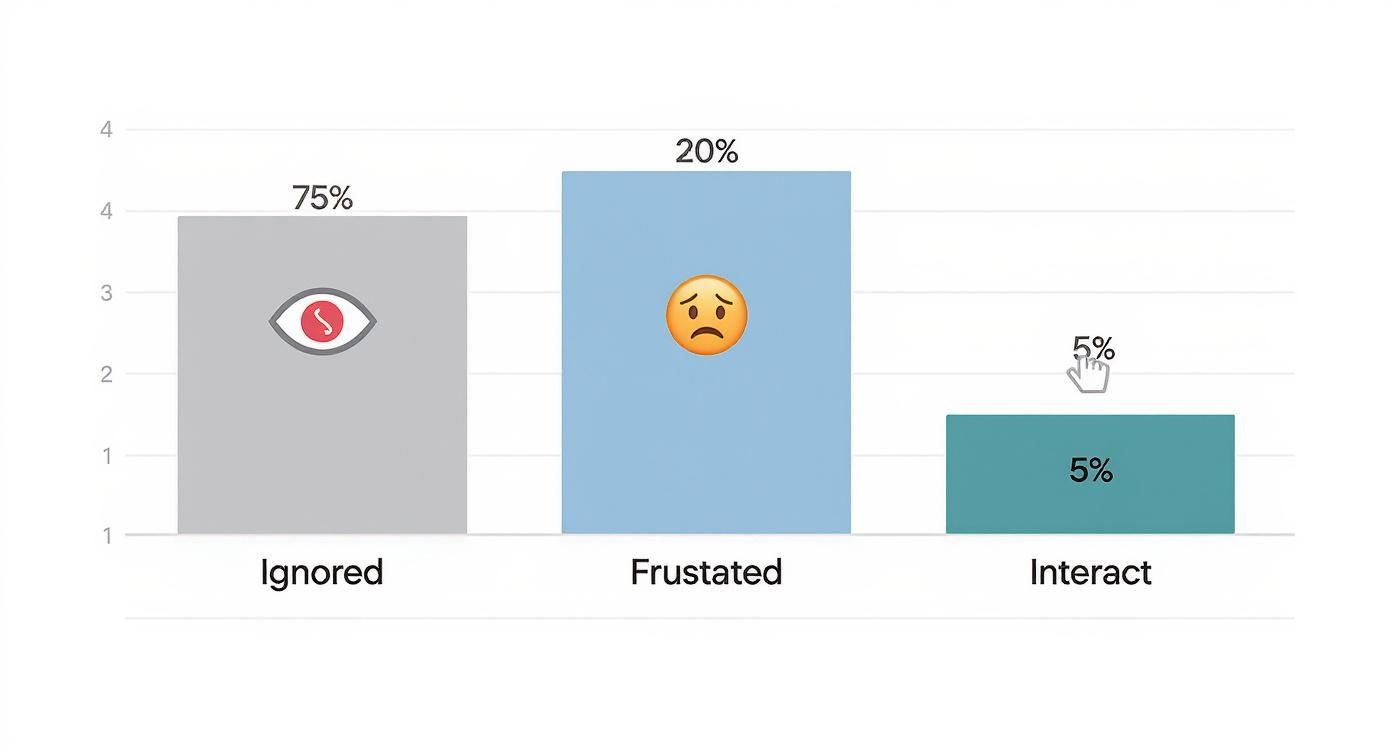
As you can see, the vast majority of people either ignore carousels entirely or find them actively frustrating. Only a small sliver of users actually engage.
The Trouble with Auto-Playing Carousels
Auto-playing carousels just make all these problems worse, often leading to a genuinely frustrating experience. When content moves without being asked to, it snatches control away from the user. Imagine you're halfway through reading an important message, and poof – the slide changes. Now you have to either wait for it to cycle back around or, more likely, just give up.
This lack of control can cause a few negative knock-on effects:
- User Frustration: People feel rushed and can't absorb information at their own pace.
- Missed Information: Crucial details and calls to action are easily overlooked if they aren't on screen long enough.
- Accessibility Roadblocks: For anyone using a screen reader or keyboard to navigate, automatically moving content can be a nightmare to deal with.
A golden rule of good user experience is to put the visitor in control. An auto-playing carousel breaks this rule by valuing movement over the user's need for information and control.
Getting to grips with these real-world interaction patterns is crucial. It forces you to put your most important message on that first slide, or better yet, to step back and ask if a carousel is even the right tool for the job. If your key message is buried on any slide but the first, you’re gambling on a tiny fraction of your audience ever seeing it.
Where the Carousel Format Actually Succeeds
https://www.youtube.com/embed/Zt7djvYP3z8
Despite all the valid criticism, writing off the carousel format completely would be a big mistake. The problem isn't the carousel itself; it's how it gets misused, especially on website homepages. When you put it in the right context—where someone is curious and ready to explore—it can work wonders. The best example of this in action is on social media.
Think about your experience scrolling through Instagram. A post with multiple images you can swipe through feels totally natural, right? People are on there to browse, and swiping through content is just part of the fun. The goal is discovery, not a frantic search for one specific bit of information. That's a completely different mindset from someone landing on a homepage with a clear task in mind.
The Power of Context and User Intent
The crucial difference comes down to what the user actually wants to do. When someone lands on your website, they usually have a goal, like finding your phone number or buying a specific product. An auto-playing carousel often feels like a flashy, distracting advert that’s simply getting in their way.
On the other hand, a platform like Instagram is where the carousel truly shines because it becomes a fantastic tool for telling a story.
- Step-by-Step Guides: A fitness coach can break down a workout, showing one exercise per slide.
- Product Showcases: An online shop can reveal different angles or features of a new item.
- Before-and-After Reveals: A home renovation company can build excitement by showing a transformation in stages.
- Narrative Storytelling: A charity can share a powerful, personal story through a sequence of images and text.
On social media, the carousel isn't an obstacle; it's the destination. It invites people to actively engage with the content at their own pace, turning passive viewing into an interactive experience.
Engagement on Social Platforms
The numbers coming out of the UK’s marketing scene back this up. Recent data shows Instagram carousel posts hit an average engagement rate of 1.92%. That’s better than single-image posts (1.74%) and even video posts (1.45%). What’s really interesting is that engagement can jump from 1.83% to over 2% with a simple prompt like "swipe left"—a tactic that only about 5% of UK carousels currently use. It just goes to show that when you use them right, carousels can seriously boost interaction. You can read more about the performance of carousel ads in the UK.
This success proves the swiping mechanic isn't broken. It's all about putting it in a place where it serves the user's desire to explore. If you're keen to learn more foundational principles, our beginner's guide to digital marketing is a great place to start. The lesson is clear: context is everything. A carousel on a website homepage is a gamble, but on social media, it's a proven tool for engagement.
Best Practices for Effective Carousel Design

So, you’ve decided a carousel is the right tool for the job. Great! Now, the real work begins: making sure it actually helps your visitors instead of annoying them. Getting this right means moving beyond just slapping some images together and hoping for the best. The golden rule is simple: always put the user in complete control.
This starts with a hard stop on auto-play. Carousels that cycle on their own are a massive source of user frustration and create a whole host of accessibility problems. Instead, give people clear and obvious ways to navigate, like prominent arrows and easy-to-see slide indicators. Let them explore at their own pace.
Prioritise Mobile and Accessibility
These days, a clunky mobile experience is a deal-breaker. When building a carousel for a website, it absolutely must feel natural on a phone. That means supporting intuitive swipe gestures and ensuring buttons and arrows are big enough for a thumb to tap easily. The whole thing needs to adapt gracefully to different screen sizes without becoming slow or awkward.
Accessibility is just as critical. A truly effective carousel is one that everyone can use, including people with disabilities. This isn't just about ticking a box; it’s about creating an inclusive experience that welcomes all visitors.
Here are a few non-negotiables for accessibility:
- Keyboard Navigation: Make sure people can tab through the slides and controls in a logical order using only their keyboard.
- ARIA Labels: Use ARIA (Accessible Rich Internet Applications) attributes so screen readers can clearly describe what the carousel is and what’s on each slide.
- Pause/Play Controls: If you absolutely must use auto-play, you need a large, unmissable pause button right there on the carousel.
"A well-designed carousel empowers users by giving them clear control over their experience. If it moves without their permission or they don't know how to operate it, it has failed."
Finally, be brief and be fast. No one has the time or patience to click through ten different slides. Stick to a maximum of 3-5 slides to keep your message focused and respect your visitor's attention. Make sure every image is optimised for the web to prevent your carousel from bogging down your page load speed.
These principles fit into a wider strategy of good site design. For more on that, take a look at these website navigation best practices. And if you're managing this as part of a broader remote strategy, mastering these details is a core part of effective virtual marketing.
Your Top Questions About Website Carousels, Answered
Let's clear up some of the most common questions people have about using carousels. Getting these details right can make all the difference.
Do Carousels Hurt SEO?
They definitely can, and it’s something you need to watch out for. The biggest culprits are slow-loading images and the extra code (JavaScript and CSS) required to make them work. Both can drag down your page speed, which is a major factor for Google's rankings.
There's also the human element. If a carousel is clunky or poorly designed, visitors might get frustrated and leave. This increased bounce rate can send a signal to search engines that your page isn't helpful, which may negatively impact your SEO performance over time.
What's The Ideal Number Of Slides For A Carousel?
If you're set on using a carousel, remember this: less is more. Stick to a maximum of 3 to 5 slides.
It's a well-documented fact that engagement plummets after the first slide. Most people simply don't click through the rest. For this reason, your most critical message must always be on that first slide – don't save the best for last.
Packing too much into a carousel just splits your visitor's attention and buries the important stuff. Keep it short, focused, and powerful.
Is It A Good Idea For A Carousel To Auto-Play?
In a word, no. We strongly advise against auto-playing carousels. Moving content that the user doesn't control can be incredibly distracting and just plain annoying.
It essentially yanks control away from your visitors, often changing slides before they've had a chance to read everything. This is also a huge problem for accessibility. If you feel you absolutely must have it auto-play, you are obligated to provide obvious, easy-to-use pause and play buttons.
Ready to find the perfect tools to build a better website? Explore The Digital Marketing Toolbox and discover top-rated solutions to drive growth. Visit us at https://grow-your-biz.com.


