
To really get a grip on reducing cart abandonment, you need to stop seeing it as just a lost sale. Think of it as a flashing red light on your dashboard, pointing to a serious leak somewhere in your customer's journey. It’s money down the drain from your marketing budget, a clear sign of a wobbly user experience, and a missed chance to create a loyal customer. Fixing this is one of the quickest routes to boosting your bottom line.
The True Cost of a Lost Shopping Cart
When a shopper wanders off your site with a full basket, the obvious hit is the lost revenue. But honestly, the real damage goes much deeper, affecting your business in ways that won't show up on a spreadsheet. Every single abandoned cart tells a story of a customer who was genuinely interested—they browsed, they picked out items, they even started to pay, but then… they hit a wall.
This means your marketing budget is taking a beating. All the money you poured into ads, content, and SEO to get that visitor to your site? It's gone up in smoke. Worse, it’s a massive clue that there's a problem with your website's user experience (UX) that’s probably tripping up countless other potential buyers.
Every abandoned cart is a priceless piece of data. It’s not a failure; it’s direct feedback from a real person showing you exactly where the friction is in your buying process. Once you see it that way, a negative metric becomes your most powerful tool for improvement.
Understanding the Scale of the Problem
The stats on this are pretty staggering and show just how normal this behaviour is for online shoppers. In the UK, the average cart abandonment rate is currently sitting around 70.19%. That number has crept up consistently from just under 60% back in 2006. Let that sink in: for every ten people who add something to their basket, seven of them will walk away without paying. You can dig into the data on these trends to see how they stack up globally.
This isn't just a number on a page; it's a direct reflection of how UK consumers shop. These aren't window shoppers. They are high-intent visitors who were seconds away from giving you their money. The reasons they bail are almost always things you can fix, from surprise shipping costs to a checkout process that feels like a chore.
The Hidden Costs Beyond the Sale
Aside from the cash you lose on the spot, abandoned carts bring a whole host of hidden costs that can quietly sabotage your long-term success. Getting your head around these is crucial to understanding how big this problem really is.
- Damaged Customer Lifetime Value (CLV): A customer who ditches their first purchase might never come back. That lost opportunity means you miss out on every single future sale from them, completely tanking their potential lifetime value.
- Skewed Analytics Data: High abandonment rates can throw your conversion data way off. This makes it incredibly difficult to get a true read on how well your marketing campaigns or website design are actually performing.
- Wasted Retargeting Spend: Look, retargeting is a fantastic tool for winning people back, but it's a plaster on a wound if you don't fix the original problem. You end up spending more to reclaim customers who should have bought from you the first time around.
By changing your perspective—seeing cart abandonment not as a failure but as a crucial insight—you can start to diagnose and patch up the leaks in your sales funnel. In the sections that follow, we'll get into the practical, actionable strategies to do just that.
How to Design a Checkout Experience That Actually Converts
Think of your checkout process as the final handshake. It's the last hurdle between a customer's interest and your revenue. If it’s clunky, confusing, or long-winded, you’re practically inviting them to leave. All the hard work you put into getting them this far goes to waste.
The goal here is simple: eliminate every possible reason for hesitation. Consider this: a staggering 26% of shoppers will ditch their cart if you force them to create an account. That’s a massive leak in your sales funnel, and thankfully, it’s an easy one to plug.
One of the quickest wins is to offer a guest checkout. This is perfect for first-time buyers or anyone in a rush. By removing that initial commitment, you lower the barrier to purchase. You can always ask them to create an account after the sale is complete, perhaps sweetening the deal with perks like easy order tracking or a future discount.
Keep Your Forms Short and Sweet
Every single field in your checkout form is a tiny bit of work for your customer. Step back and ask yourself, do you really need their middle name? A home phone number? An optional second address line? Be ruthless. Cut your forms down to the bare essentials.
For most physical products, you only need this information:
- Customer Name
- Email Address
- Shipping Address
- Payment Details
Anything more is just noise that increases the cognitive load and the odds of abandonment. You can even make it easier by using clever tools like a postcode lookup that automatically fills in the rest of the address. This not only speeds things up but also cuts down on delivery errors. A solid marketing strategy for a small business is built on small but significant user experience wins like this.
Build a Sense of Progress
A well-designed checkout doesn't just ask for information; it guides the customer forward and makes them feel like they're making progress. The best way to do this is with a visual progress indicator.
Think about the progress bar you see when downloading a file. Watching that bar fill up gives you a little psychological boost, right? It shows you the end is in sight. Your checkout should do the same, turning a chore into a clear, manageable task.
Break your checkout into a few logical steps—"Shipping," "Delivery," and "Payment" are common ones. The progress bar should clearly show where the customer is and what’s left to do. This kind of transparency is fantastic for managing expectations and reducing the anxiety that often leads to abandoned carts.
Another smart move is to keep the cart summary visible throughout the entire process. Show the customer a picture of their chosen products, the quantity, and a running total. This constant reassurance confirms they’ve got the right items and stops them from hitting the back button, which is a notorious flow-killer. By focusing on these details to create a truly seamless checkout, you can drastically reduce cart abandonment and start turning more browsers into loyal customers.
Eliminate Surprises to Build Customer Trust
Picture this: you're at the supermarket till, ready to pay, and the cashier suddenly tacks on a "shelf-stocking fee" you knew nothing about. You'd feel ambushed, right? That's exactly how your customers feel when they reach the checkout and get hit with unexpected costs. It's one of the fastest ways to shatter trust and lose a sale.
Hiding the true cost of an order until the final moment is probably one of the most damaging mistakes an e-commerce store can make. Time and time again, research shows that surprise costs are the single biggest killer of conversions. This is especially true in the UK, where shoppers are particularly savvy about pricing and demand transparency.
In fact, fresh data from 2024 shows that a staggering 48% of shoppers ditch their carts purely because of surprise shipping charges, taxes, or other fees. If you're looking for more ways to fix this, you can explore how to reduce shopping cart abandonment by optimising your checkout.
The only real solution is radical transparency. Don't make your customers dig for information. Display every potential cost as early and as clearly as you can—ideally right there on the product page or within the shopping cart itself.
Lay All Your Costs on the Table
To really get a handle on cart abandonment, you have to show customers the full picture from the very beginning. A simple shipping calculator that works off a postcode on the cart page is a fantastic start. It demystifies delivery costs before a customer even commits to the checkout process.
Another brilliant tactic, especially for UK shoppers, is to offer a free shipping threshold. Make it a prominent message across your site: "Free Delivery on Orders Over £50." This not only gets rid of the dreaded surprise shipping fee but actually encourages people to add more to their cart, boosting your average order value.
It's also worth thinking about these transparent delivery options:
- Flat-Rate Shipping: Offer one simple, predictable delivery cost for every order. It removes all the guesswork and is beautifully simple for the customer.
- Click and Collect: Partnering with local collection points or offering in-store pickup is a convenient—and often free—alternative that many UK shoppers now expect as standard.
Let's look at the most common reasons people leave their carts and what you can do about each one.
Top Reasons for Cart Abandonment in the UK and Their Solutions
| Reason for Abandonment (% of Shoppers) | Actionable Solution |
|---|---|
| Unexpected extra costs (48%) | Display all costs (shipping, taxes, fees) upfront on the product or cart page. Offer a free shipping threshold (e.g., "Free Delivery Over £50"). |
| Account creation required (24%) | Offer a guest checkout option. Make it the most prominent choice to remove friction for new customers. |
| Slow delivery (22%) | Provide clear delivery estimates early. Offer express delivery options for those who need items quickly. |
| Complicated checkout process (18%) | Simplify your checkout to a single page. Remove unnecessary fields and use address auto-complete features. |
| Concerns about payment security (17%) | Prominently display security badges (Norton, McAfee) and logos of trusted payment providers (Visa, PayPal, Klarna). |
As the table shows, fixing these issues isn't rocket science. It's about being direct and removing friction.
The image below gives a sense of how effective cart recovery emails can be, which is a common strategy to win back shoppers who might have been put off by costs or other issues.
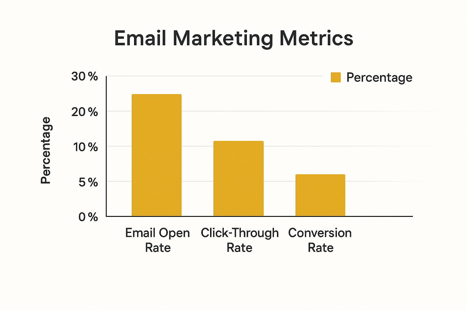
While the open rates look promising, the conversion rate is much lower. This really drives home how crucial it is to get the checkout experience right the first time around.
Put Your Trust Signals Front and Centre
Building trust isn’t just about being upfront with your prices. Today’s shoppers are incredibly switched-on and actively look for visual cues that tell them your site is secure and legitimate. These "trust signals" are vital for giving people the confidence they need to hand over their card details.
Make sure these elements are impossible to miss, especially as customers move through the checkout:
- Security Badges: Logos from providers like Norton or McAfee are instantly recognisable and show your site is protected.
- Payment Logos: Displaying the logos of methods you accept—Visa, Mastercard, PayPal, Klarna—reassures customers that you work with established, secure processors.
- A Clear Returns Policy: Make your returns policy dead simple to find and understand. A fair, no-quibble policy significantly reduces the perceived risk, particularly for first-time buyers.
- Accessible Customer Reviews: Social proof is unbelievably powerful. Integrating genuine customer reviews and ratings helps to validate the purchase decision and build confidence.
By weaving total cost transparency together with strong, visible trust signals, you create an environment where customers feel secure, respected, and ready to buy. This foundation of trust is absolutely fundamental if you want to reduce cart abandonment and build a loyal customer base that comes back again and again.
Optimise Your Store For Every Device
It’s almost a cliché to say mobile traffic dominates e-commerce, yet so many checkout experiences feel like they were built exclusively for a desktop computer. A clunky, slow, or frustrating mobile journey is one of the fastest ways to lose a sale. If your site isn’t designed for thumbs and smaller screens, you’re practically showing customers the door.
Device-specific data from mid-2024 paints a stark picture of cart abandonment in the UK. According to the latest figures, abandonment rates vary wildly depending on the device. For mobile shoppers, those rates are alarmingly high—often climbing past 75%. You can dig into the numbers yourself and find more insights about UK cart abandonment trends on Statista.com. This isn't just a minor blip; it's a huge leak in your sales funnel that demands immediate attention.
This gap usually comes down to tiny screens, less reliable mobile networks, and forms that are just a pain to fill out on the go.
Make Your Mobile Experience Thumb-Friendly
Think about how people actually use their phones. They’re usually scrolling and tapping with their thumbs, often one-handed while doing something else. Your mobile design has to be built for this reality.
This means all your buttons, links, and form fields need to be big enough to tap easily without hitting the wrong thing. Position crucial calls-to-action—like "Add to Basket" or "Proceed to Checkout"—in the easy-to-reach zones at the bottom or centre of the screen. Forcing someone to pinch and zoom just to navigate your checkout is a surefire way to send your conversion rate plummeting.
A truly great mobile experience feels effortless. It anticipates what the user needs, minimises typing, and makes the path to purchase as quick and simple as possible. Your starting assumption should be that every mobile user is distracted and short on time.
Streamline Data Entry with Mobile-Native Features
Nobody enjoys typing on a mobile keyboard. The less you make your customers do it, the more likely they are to complete their purchase. This is where you can lean on mobile-native features to make the whole process feel much smoother.
Here are a few small tweaks that make a huge difference:
- Embrace Autofill: Make sure your form fields are coded correctly (e.g.,
autocomplete="name",autocomplete="email") so browsers and password managers can instantly fill in a customer’s details. - Use the Right Keyboards: When a customer needs to enter their phone number or credit card, the numeric keypad should pop up automatically. It’s a tiny detail that signals you’ve actually thought about their experience.
- Integrate Digital Wallets: This is a total game-changer. Offering payment options like Apple Pay and Google Pay lets customers check out with a single tap or a quick biometric scan, completely bypassing manual card entry.
By optimising for every device, you aren't just making your site look good; you're knocking down the biggest barriers to a completed sale. This focus is a fundamental part of any solid digital strategy, a topic you can explore further in our beginner's guide to digital marketing. Adopting this mobile-first mindset is absolutely essential to reduce cart abandonment and win over customers, no matter how they choose to shop.
Winning Back Shoppers with Smart Recovery Emails
Even with a perfectly polished e-commerce site, some shoppers will inevitably wander off before they buy. But look at this as an opportunity, not a failure. A well-timed and thoughtfully crafted abandoned cart email sequence is one of the single most powerful tools you have to reduce cart abandonment and bring that revenue back.
The trick is to think beyond a single, generic "you left something" email. A smart, multi-email approach can gently guide the customer back to their purchase without coming across as pushy. Your first email is the most important one and needs to land in their inbox within an hour, while your brand is still top-of-mind. Often, that initial nudge is all it takes.
Crafting the Perfect First Reminder
Your first recovery email has one job: make it incredibly easy for the shopper to pick up exactly where they left off. Keep it simple, helpful, and direct. Now is not the time for complex marketing messages or other distractions.
To be effective, that first email absolutely must have:
- A clear, intriguing subject line: Think along the lines of "Did you forget something?" or "Your basket is waiting for you".
- Visuals of their items: Always include high-quality images of the specific products they left behind. It’s a potent visual cue.
- A direct link to their cart: A big, obvious button that takes them straight back to their pre-filled basket is non-negotiable.
- A hint of urgency (use with care): A gentle mention that stock is low or their cart might expire can add a little push.
This first email is your best shot. Data consistently shows that recovery emails sent within the first hour get the best results, so speed and simplicity are your allies here. For a deeper dive, check out the wider advantages of email marketing in our detailed guide.
Building a Strategic Recovery Sequence
What if that first email doesn't do the trick? It's time for the follow-ups. A great sequence usually involves another two emails, spaced out over a few days. Each message needs a slightly different angle so you don't sound like a broken record.
For instance, you could send a second email 24 hours later that offers assistance. A subject line like, "Can we help with your order?" opens the door to a conversation and positions you as helpful, not just salesy. This is also a fantastic place to include a few customer reviews for the items in their cart to build trust and social proof.
The most successful cart recovery strategies feel less like marketing and more like helpful customer service. You're not just chasing a sale; you're solving a problem or answering an unasked question that caused them to hesitate.
The third and final email, maybe sent after 72 hours, is where you can introduce a small incentive. This is your final attempt, so you want to make it count.
Consider offering one of these:
- A modest discount, like 10% off
- Free shipping
- A small free gift with their purchase
This final nudge can be the tipping point for price-sensitive shoppers who were on the fence. By creating a thoughtful sequence, you dramatically increase your odds of winning back those hesitant customers and turning abandoned carts into completed orders.
Your Cart Abandonment Questions Answered
As you dive into fixing cart abandonment, a few questions always seem to come up. I’ve heard them from countless business owners over the years. Let's get them answered so you can move forward with a clear plan.
One of the first things everyone wants to know is what a "normal" cart abandonment rate actually looks like. While it does fluctuate between industries, the benchmark most sources agree on is around 70%. If you’re seeing a rate much higher than that, it’s a big red flag. Something in your checkout process or pricing structure is likely causing serious friction for your customers.
On the other hand, if your rate is well below that average, give yourself a pat on the back – you're clearly getting a lot right.
It's also crucial to understand that not all "abandonment" is the same. I've found it helps to break it down into a few distinct types, as each one points to a different problem.
- Cart Abandonment: This is the one we all know. Someone adds items to their basket but never even starts the checkout.
- Checkout Abandonment: This one stings more. The customer has committed enough to start checking out but bails on the payment or shipping page. It points to a very specific, late-stage issue.
- Search Abandonment: Here, a visitor uses your site search but leaves without adding anything to their cart. This often tells you there’s a problem with how people find products on your site.
Do I Really Need AI to Lower My Cart Abandonment?
This is a big one lately. The short answer is no, it's not strictly necessary. But it can be a game-changer. Think of it as the difference between using a hand saw and a power saw – both get the job done, but one is far more efficient and precise.
AI-powered tools can analyse shopper behaviour in real-time to predict who might be about to leave. From there, they can automatically trigger a pop-up with a discount code or a helpful chatbot message to keep them on the page.
What AI really nails is hyper-personalisation on a massive scale. It can tweak product recommendations on the fly or send out thousands of uniquely tailored retargeting ads, a task that would be impossible for a marketing team to handle manually.
"Getting the fundamentals right—like transparent pricing and a simple checkout—is your foundation. Think of AI as the next level. It lets you shift from broad-stroke fixes to precise, one-on-one interventions that can seriously move the needle on your conversion rates."
Ultimately, the goal is always to create the smoothest possible path to purchase. Whether you get there through manual A/B testing or with the help of sophisticated AI, the focus should remain on finding and eliminating those friction points for your customers. Start with the basics, measure everything, and then look to more advanced tools as you scale.
Ready to explore the tools that can put these strategies into action? The Digital Marketing Toolbox has a curated catalogue of solutions for email marketing, website widgets, AI assistants, and more. You can find, compare, and integrate the best technologies to cut down on cart abandonment and grow your business at https://grow-your-biz.com.


