
Before you even think about picking a template, let's talk about what really makes a Squarespace website successful. It all comes down to a solid plan. A great website isn't just a pretty online brochure; it's a hard-working tool for your business, and that starts with laying the right groundwork.
First, you need to define its purpose, get clear on who you're talking to, and map out your content. Skipping this step is the fastest way to end up with a website that looks nice but doesn't actually do anything for you.
Blueprint for Building a Squarespace Website
Jumping straight into the design phase is like trying to build a house without a blueprint. You might end up with four walls and a roof, but it probably won't be a place you want to live in. In the UK, where Squarespace is hugely popular, a bit of strategic thinking at the start will help you stand out.
This is all about taking a step back to see the bigger picture. Who are you trying to reach? What do you want them to do when they land on your site? Nailing these answers makes every other decision—from your page layout to your a choice of words—so much easier.
Define Your Website's Core Purpose
First things first: what is the single most important job of your website? A site without a clear goal will just confuse people and won't deliver any real results.
Are you a Bristol-based potter looking to sell your creations online? Or maybe a freelance marketing consultant in Manchester trying to book more client calls? Your primary goal shapes everything.
Think about which of these common objectives fits your business:
- Generate Leads: Perfect for service-based businesses. Your main focus will be on capturing contact details through well-placed forms and compelling calls-to-action.
- Drive Sales: If you're running an e-commerce store, it’s all about showcasing products, making checkout a breeze, and encouraging that final click. A big part of this is mastering ecommerce conversion rates.
- Showcase a Portfolio: Crucial for creatives like photographers, designers, and architects. Your site needs to be a stunning visual gallery that lets your work speak for itself.
- Build an Audience: For bloggers and content creators, the aim is to pull in readers with great content, get them to subscribe to a newsletter, and keep them coming back for more.
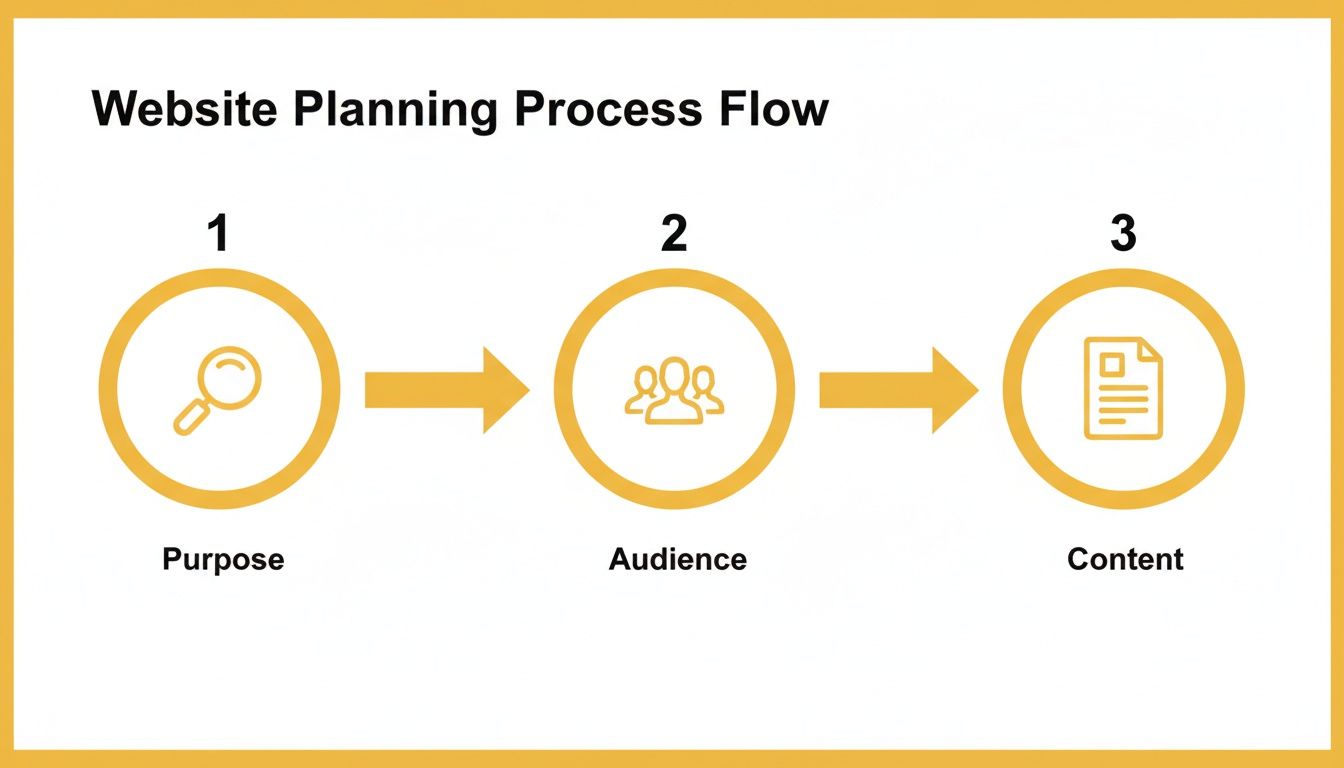
This simple flowchart shows how these planning stages fit together. It’s a logical flow: get your purpose clear, then define your audience, and finally, plan the content that serves them both.
Understand Your Target Audience
Once you know your ‘why’, you need to figure out your ‘who’. Creating a clear picture of your ideal visitor helps you get the content, design, and tone of voice just right. A website for a trendy London coffee shop is going to feel completely different from one for a corporate financial advisor in Edinburgh, and for good reason.
Your website should speak directly to your ideal customer. Don't try to appeal to everyone; focus on the audience that matters most to your business. This clarity makes your marketing more effective and your website more engaging.
In the UK alone, Squarespace powers a staggering 183,280 live websites. With that much competition, knowing your specific audience inside and out is the key to cutting through the noise.
Map Your Content and Sitemap
Now that you have your purpose and audience sorted, you can sketch out your website’s structure, which is often called a sitemap. This is basically a list of all the pages you’ll need and how they link together.
You should always start with the essentials:
- Home: This is your digital front door. It needs to tell visitors who you are, what you do, and what they should do next, all within a few seconds.
- About: Time to tell your story. This is your chance to build trust and connect with your audience on a more personal level.
- Services/Products: This is where you detail exactly what you offer. Use fantastic photos and write descriptions that convince people they need what you're selling.
- Contact: Make it ridiculously easy for people to get in touch. Include a contact form, email address, phone number, and a map to your location if you have one.
A pro tip is to gather all your brand assets before you start building. That means having your logo, brand colours, fonts, and any professional photos ready to go. Trust me, it makes the entire process of building a Squarespace website much, much smoother.
To help you organise your thoughts, here’s a simple checklist to work through.
Essential Website Planning Checklist
This table breaks down the key elements you need to define before you log in to Squarespace. Answering these questions now will save you a huge amount of time later on.
| Planning Element | Key Questions to Answer | Example for a UK Bakery |
|---|---|---|
| Primary Goal | What is the #1 action a visitor should take? | To get customers to place online orders for local delivery or collection. |
| Target Audience | Who are you trying to reach? What are their needs? | Local families and office workers in Manchester looking for high-quality, artisanal bread and celebration cakes. |
| Key Pages (Sitemap) | What are the essential pages for your site? | Home, About Our Bakery, Our Menu (Bread, Cakes, Pastries), Order Online, Contact & Find Us. |
| Brand Assets | What logo, colours, fonts, and images will you use? | Earthy tones (brown, cream), a rustic font, logo featuring a wheat sheaf, and professional photos of baked goods. |
| Call-to-Action | What is the main prompt on your homepage? | “Order Fresh Bread & Cakes Now” |
Working through this checklist provides the clarity you need to build a website that not only looks professional but also works tirelessly for your business.
Choosing the Right Template and Site Structure
Alright, with your plan in hand, we get to the fun part: picking your Squarespace template. It’s easy to get distracted by the beautiful demo photos, but this decision is about more than just aesthetics. You're choosing the functional foundation for your entire website.
Think of it this way: a template isn't a finished house, it's a professionally designed floor plan. The core layout, the style of the navigation, and the built-in features are the walls and windows. Your content, colours, and images are the furniture and decor you'll add later. Start with the right floor plan, and the rest of the process becomes so much easier.
Evaluating Templates Beyond the Surface
The good news is that with Squarespace’s latest version (7.1), all templates share the same core features and flexibility. This is a huge improvement, as it means you’re not permanently locked into a template's specific limitations. That said, each design still offers a unique starting point with its own style and layout.
My best advice? Ignore the industry labels like "Restaurant" or "Photography" when you're browsing. Instead, focus purely on the layout and how it presents information.
- For service businesses: Look for templates that make call-to-action buttons pop. You want clear sections for describing what you do and layouts that can easily accommodate client testimonials. The goal is to get your value proposition front and centre.
- For e-commerce stores: Your priority should be templates that hero large, high-quality product images. Think about the customer's journey – does the grid layout look clean? Are the filtering options intuitive? You want the path from browsing to checkout to feel completely seamless.
- For portfolios: Seek out designs with bold, immersive galleries and minimalist navigation. The best portfolio sites let the work shine without any unnecessary distractions, so look for project pages that can handle a good mix of images and text.
Before you commit, do this one crucial thing: check the mobile view. With over 60% of UK website visits now coming from mobile devices, your site has to be flawless on a small screen. Use the preview toggle to see how it looks and feels on a phone. Is it still easy to read and navigate?
Structuring Your Website for Intuitive Navigation
Once you've settled on a template, it’s time to build your site's architecture. This is all about setting up your pages and organising them into a logical navigation menu. Nothing sends visitors running faster than a confusing menu.
Pull out the sitemap you planned earlier—that's your guide now. Start by creating your core pages in the 'Pages' panel on the left.
A well-structured website guides visitors effortlessly to the information they need. Think of your main navigation as the primary signposts in a department store—they should be clear, concise, and logically ordered.
For instance, a London-based architecture firm's navigation might look something like this: Home | Projects | Our Practice | Journal | Contact. This structure immediately puts their work (Projects) in the spotlight while establishing their expertise (Our Practice).
On the other hand, a Manchester coffee shop needs a completely different approach: Home | Our Coffee | Menu | Visit Us | Order Online. This navigation is action-oriented, focusing on what a customer actually wants to do: see the menu, find the location, or buy something.
Adding and Organising Your Pages
Inside the Squarespace backend, any page you add to the 'Main Navigation' section will appear in your website's header. But what about pages like 'Privacy Policy' or 'Terms of Service'? These are important, but they don't need to clog up your main menu. Just drag them into the 'Not Linked' section, and you can add them to your website's footer later.
As you add pages, you'll see different page types. For most of your standard content, a 'Blank Page' is what you'll use. However, Squarespace also offers some really useful specialised pages:
- Blog: This is a collection page for all your articles. A common mistake I see is creating multiple blog pages. You should only ever create one. You can then use categories and tags to organise your posts and display filtered views on other parts of your site.
- Portfolio: This works much like a blog but is designed specifically to showcase projects, with sub-pages for each individual piece of work.
- Store: This is the gateway to your shop, housing all your products.
- Events: Perfect for listing workshops, gigs, or any other time-sensitive happenings.
By taking the time to choose a template thoughtfully and structure your pages logically, you create an intuitive experience that builds trust and helps visitors find exactly what they're looking for.
Customising Your Design with Fluid Engine
With your website's blueprint sorted, it’s time to give it some personality. This is the fun part, where you move beyond the template and make the design truly your own. We'll get hands-on with Squarespace's design tools, specifically the Site Styles panel and their brilliant drag-and-drop editor, Fluid Engine.
Think of it like moving into a new house. The walls are up and the rooms are laid out, but now you get to pick the paint colours, hang the art, and arrange the furniture. The goal is to create a cohesive look that feels deliberate, professional, and unmistakably you.
Mastering Global Site Styles
Your first port of call should always be the Site Styles panel. This is your command centre for the website's entire look and feel. Any changes you make here ripple across every single page, which not only saves a mountain of time but also keeps your branding tight and consistent.
Instead of changing every button one by one, you set the rules here. I always tell clients to focus on these three areas first:
- Fonts: Your typography says a lot about your brand. A forward-thinking tech company might go for a clean, sans-serif font, whereas a traditional tailor would probably lean towards a classic serif. You'll want to pick a primary font for headings and a super-readable secondary font for all your main body text.
- Colours: This is where your brand's visual identity really comes to life. In Site Styles, you can plug in your exact hex codes, and Squarespace cleverly generates a full palette of complementary shades. You can then assign these colours to backgrounds, text, buttons, and more.
- Buttons & Spacing: These details make a huge difference. Take a moment to define what your primary, secondary, and tertiary buttons look like. Consistent button styling creates a clear visual path for your visitors, pointing them right to your most important calls-to-action. Adjusting the site-wide spacing can also completely alter the mood, taking it from airy and minimalist to compact and focused.
One of the most common mistakes I see people make is tweaking elements page by page. Fight that urge! Always start with Site Styles. It guarantees consistency and makes updating your site down the line a thousand times easier.
Unlocking Creativity with Fluid Engine
Now for the real magic. Fluid Engine is Squarespace’s grid-based editor, and it gives you almost pixel-perfect control over your page layouts. The old, rigid block system is a thing of the past. Fluid Engine lets you build modern, dynamic designs where elements can overlap and interact in creative ways.
It all works on a simple grid. You can place any block—text, images, videos, you name it—anywhere you like on that grid. You can resize them freely and even layer them to create a sense of depth. This opens up a whole new world of design possibilities that used to require a web developer and a lot of custom code.
Building Engaging Page Sections
Let's put this into a real-world scenario. Say you’re building a 'Services' section for a marketing agency. Instead of just a boring bulleted list, you can use Fluid Engine to create something far more compelling.
- Start with a Blank Section: On your page, add a new, empty section.
- Create Your "Cards": For each service, add an Image Block and a separate Text Block.
- Arrange and Overlap: Here’s a pro tip: drag the text block so it slightly overlaps the bottom edge of the image. This one simple move adds depth and gives the layout a much more professional feel.
- Add a Call-to-Action: Pop a Button Block just below the text, linking to the dedicated page for that service. Make sure you set it to the 'Primary' button style you already defined in Site Styles.
- Duplicate and Customise: Once you're happy with the first one, just duplicate that group of blocks for your other services. This keeps the spacing and alignment perfectly consistent.
This approach turns a standard list into an interactive and visually appealing part of your website. You can use the same techniques to build a dynamic "About Us" section with overlapping team photos and bios, or to lay out customer testimonials in a staggered, more interesting format. It’s also fantastic for integrating social proof, and our guide on how to embed an Instagram feed on your website walks you through those steps.
By getting comfortable with these tools, you can transform a simple template into a bespoke digital experience that truly represents your brand.
Bringing Your Site to Life with SEO and Marketing Tools
A stunning website is a great start, but it's not much use if nobody can find it. Now we need to turn your beautiful site into a marketing machine that actually brings in business. This is where we’ll dive into the practical side of on-page search engine optimisation (SEO) and connect the essential tools you need to grow.
One of the best things about Squarespace is that so many crucial SEO features are already built-in. You don’t need to be a coding whiz to give your site a decent shot at ranking on Google. It’s really just about clearly telling search engines what each page is about.
Getting Your On-Page SEO Right in Squarespace
Let's focus on the basics that deliver the biggest bang for your buck. For every single page and blog post, you have a few key levers you can pull. You'll find these by going to your Pages panel, hovering over a page, clicking the little gear icon, and then heading to the 'SEO' tab.
Here’s what you need to nail:
- SEO Title: This is the clickable headline that shows up in Google's search results. Your goal is to make it compelling while including the main keyword for that page. So, instead of a generic "Services," try something like "Bespoke Carpentry Services in Bristol | Your Company Name."
- SEO Meta Description: This is the little blurb of text under the title in search results. It doesn't directly affect your ranking, but a good one makes people want to click. Think of it as a mini-advert for your page—briefly explain what it’s about and why they should visit.
- Image Alt Text: This one is non-negotiable. Every time you upload an image, you absolutely must add descriptive "alt text." This text not only tells search engines what the image is, but it's also vital for site accessibility. Ditch file names like "image123.jpg" and use something descriptive, like "Handcrafted oak dining table in a modern kitchen."
Plugging into the Google Ecosystem
To figure out if your website is actually working, you need data. Connecting your site to Google's free tools is an absolute must-do. They give you priceless insights into who your audience is and how visible you are in search.
First on the list is Google Analytics. This powerhouse tells you everything about your visitors—how they found you, what pages they viewed, and how long they stuck around. Getting it connected is easy. In Squarespace, just go to Settings > External API Keys and pop in your Google Analytics Measurement ID.
Next up is Google Search Console. Think of this as your direct line to Google. It reveals the search terms people are using to find you, flags any technical glitches, and lets you submit your sitemap so Google can index your pages more efficiently. Verifying your site is a simple, guided process right within the Squarespace settings.
I always tell clients to think of it this way: Google Analytics is your customer insights team, and Google Search Console is your website's health report. You can't make smart decisions without both.
Expanding Your Marketing Toolkit
Your website should be the central hub for all your marketing efforts. Thankfully, Squarespace makes it simple to plug in other key services, creating a smooth system for attracting and keeping customers. This is especially true in the UK, where Squarespace has become a dominant force in the market.
In fact, building a Squarespace website in the UK means tapping into a huge community; 292,023 businesses are already using the platform. It's a go-to for agencies and freelancers alike. The growth is there, too—UK stores saw a 4% increase year-on-year in Q3 2025. With 79.1% of them integrating Instagram, they're reaching millions through social commerce. This means small businesses can quickly launch powerful sites, often supercharged with AI content tools or SEO plugins.
Here are the integrations you should set up:
- Email Marketing: Connect your email service, whether it’s Mailchimp, ConvertKit, or something else. Sprinkle Newsletter Blocks around your site to capture email addresses. This is how you turn one-time visitors into a loyal audience.
- Social Media Feeds: Use Squarespace's own blocks to pull in a live feed from your Instagram account. It keeps your site looking fresh and gives people another reason to follow you.
- Third-Party Widgets: Need something extra? Tools like Elfsight offer a huge range of widgets you can easily embed. You could add customer testimonials, event calendars, or even a live chat feature to make your site more engaging. For a detailed walkthrough, check out our guide on adding live chat for Squarespace.
And don't forget your local presence. For better local search visibility, put some effort into optimizing your Google My Business profile. It works in tandem with your on-site SEO to pull in customers right in your area. By getting these tools connected, you make sure your Squarespace site isn't just a pretty face—it's a hard-working asset for your business.
Your Pre-Launch Checklist for a Flawless Debut
The final push before your website goes live is your chance to catch any small mistakes and ensure everything is polished and professional. Think of it as the final inspection before you open the doors to your digital shop. A thorough checklist takes the guesswork out of the process, giving you the confidence that every single element is working perfectly from the moment you hit ‘publish’.
Taking a systematic approach here will save you from those cringeworthy post-launch discoveries, like a broken contact form or a glaring typo on your homepage. It’s all about being meticulous now to save yourself a headache later.
Content and Functional Review
First things first, put on your "new visitor" hat and go through your site. You need to read every single word on every single page. It's shockingly easy to miss small errors when you've been staring at the same text for days on end.
- Proofread everything: Hunt for typos, grammatical mistakes, and any awkward phrasing. A great trick is to read your text out loud – you’ll be amazed at what your ears catch that your eyes skimmed over.
- Test every single link: Click on every button, navigation link, and in-text link you can find. Make sure they all go where they're supposed to, with no dead ends or 404 errors.
- Submit all your forms: Fill out your contact forms, newsletter sign-ups, and any other forms you have. Check that you actually receive the submission email and that the user gets a clear confirmation message on their end.
This isn’t just about making sure things work; it's about the user experience. A broken link or a faulty form can instantly erode the trust you’re trying so hard to build.
Technical and Visual Polish
Once your content is rock-solid, it’s time to zoom in on the technical and visual details. This is where you fine-tune the site's performance and make sure it looks fantastic and consistent, no matter how someone is viewing it.
A huge part of this is checking how it looks on mobile. A big reason Squarespace is so popular in the UK is its mobile performance. In fact, 62% of visits to Squarespace-powered sites come from mobile devices, which fits perfectly with Google's 'mobile-first' approach to indexing. UK-based Squarespace stores also lean heavily on social media, with 79.1% using Instagram, while 53.8% choose .co.uk domains to build that crucial local trust.
Your website doesn’t truly exist until you’ve tested it on a real mobile phone. The built-in preview is great, but nothing beats seeing how it loads and feels in your hand.
Be sure to tick these final technical boxes:
- Mobile Readiness Check: Use Squarespace’s mobile preview, but more importantly, grab your actual smartphone and test it. Is the text readable without pinching and zooming? Are the buttons easy to tap? Is the navigation smooth?
- Image Optimisation: Double-check that all your images have descriptive alt text. This is vital for both SEO and accessibility. Also, confirm they’re compressed enough to load quickly without looking pixelated.
- Favicon Upload: This is that tiny icon that appears in the browser tab. It's a small detail, but it’s a non-negotiable for looking professional.
- Social Sharing Image: Head into the Design settings and upload a default social sharing image. This is the preview image that pops up when someone shares a link to your site on places like Facebook or LinkedIn.
The Final Launch Sequence
You’re almost there. These last few steps are all about flipping the switch and telling the world your new site is officially open for business.
First, connect your custom domain if you haven't already. Next, you'll need to upgrade your site from a trial to a paid plan. With that sorted, you can set the site visibility to 'Public' and remove the site-wide password.
But don't put your feet up just yet. The first 24 hours are critical for getting your site seen by search engines. As soon as you go live, submit your sitemap to Google Search Console. This gives Google a nudge to come and crawl your new site, which can help it get indexed faster.
Finally, get into the habit of checking your analytics. You don’t need to be a data whiz, but getting familiar with the numbers is key to understanding what’s working and what isn’t. If you need a hand, you might find our guide on how to set up Google Analytics helpful. This early monitoring will help you make smarter decisions and ensure all your hard work building a Squarespace website leads to real results.
Got Squarespace Questions? Here Are Some Straight Answers

As you start getting your hands dirty building your site, you'll inevitably hit a few roadblocks or moments of confusion. It happens to everyone. Let's clear up some of the most common questions I hear from people new to Squarespace – sorting these out now will save you a lot of hassle down the road.
One of the first traps people fall into is with their blog. It feels intuitive to create separate blog pages for different topics, like one for 'Company News' and another for 'Industry Insights'. Don't do it. This is one of the biggest structural mistakes you can make.
Squarespace is built to run on only one blog page. Creating more than one splinters your content, makes it a nightmare to show all your latest posts in one feed, and messes with things like your RSS feed for email newsletters.
How Do I Organise Different Blog Topics Then?
The right way to handle this is by using a single blog page and getting smart with categories and tags. Think of categories as the big-picture filing cabinets for your content, while tags are the specific labels on the folders inside.
For example, a marketing agency’s blog might be set up like this:
- Categories: SEO, Social Media, Email Marketing
- Tags: Google Analytics, Instagram strategy, keyword research, lead magnets
This simple structure keeps everything neat. Then, you can use Summary Blocks on other pages to pull in and feature posts from a specific category or tag. This creates the illusion of having multiple organised blogs, but without the messy backend that will cause you problems later.
A single, well-organised blog is the foundation for a scalable content strategy on Squarespace. Resist the urge to create multiple blog pages; use categories and tags to create a clean, user-friendly experience that’s easy to manage.
Can I Change My Template Later?
Yes, you can, but it’s important to understand how it works now. On Squarespace's latest version (7.1), all the templates are built on the same core framework. This means they all have the same features and flexibility.
So, when you switch to a new 7.1 template, your content will just adopt the new design's default colours, fonts, and spacing. It’s more of a "reskin" than a complete rebuild.
The one thing to watch out for is that any page-specific layouts you've painstakingly created with Fluid Engine won't magically rearrange themselves. You’ll need to tweak those yourself. Still, it’s a far cry from the old days where changing a template meant starting from scratch.
What Is The Difference Between A Page And A Section?
Getting your head around this is key to mastering Squarespace layouts. Once it clicks, building pages becomes much faster and more intuitive.
| Element | Description | Example Use Case |
|---|---|---|
| Page | This is the main container for your content. Every page has its own unique URL. | Your “About Us” page or your “Contact” page. |
| Section | A horizontal strip within a page that holds your content. Pages are built by stacking sections on top of each other. | You might have a section for client testimonials, followed by an image gallery section below it. |
| Block | These are the individual pieces of content (text, images, buttons) that you arrange inside a section. | A text block for a heading, an image block for a photo, and a button block for a call to action. |
I always tell people to think of it like building with LEGOs: the page is your big green baseplate, the sections are the large, flat bricks you stack up, and the blocks are all the little individual pieces you use to build out the details on top.
At The Digital Marketing Toolbox, we've brought together a curated list of tools to help you take your new website to the next level. Whether you need SEO analysers or social media schedulers, you'll find what you need to grow your online presence. Explore our resources at https://grow-your-biz.com.


