
Let's be honest, pop-ups get a bad rap. But the truth is, a well-thought-out pop up in WordPress isn't an annoyance—it's one of the most powerful tools you have for growing your business. When done right, it can supercharge your email list, shout about your best offers, and even claw back sales from abandoned carts.
The secret isn't about interrupting people. It's about delivering real value at the exact right moment.
Why Smart Pop-Ups Are a Game-Changer
Forget everything you think you know about pop-ups. Stop seeing them as intrusive ads and start thinking of them as dynamic, direct lines of communication with your audience. They let you serve up the perfect message right when it’s most likely to land.
This shift in mindset turns a potential interruption into a genuinely helpful interaction. Instead of hurting the user experience, you actually improve it.
This is a massive opportunity, especially for businesses here in the UK. WordPress is the undisputed king of content management systems, powering a staggering 43–44% of all UK websites. If you only look at sites built on a CMS, that number jumps to an incredible 61–62% of the market share. With so many businesses relying on WordPress, getting your pop-up strategy right is a clear path to getting ahead.
From Annoyance to Asset
What separates a pop-up that gets instantly closed from one that gets results? It all comes down to purpose and timing. A generic, "sign up now!" message that appears out of nowhere is just noise. But a pop-up that solves a problem or offers a timely incentive feels like a welcome discovery.
Think about these real-world examples:
- The E-commerce Saver: Imagine someone is about to leave your checkout page. An exit-intent pop-up flashes a 10% discount. That tiny, last-second nudge is often all it takes to prevent an abandoned cart and lock in the sale.
- The Content Upgrade: A visitor is deeply engaged in your latest blog post, scrolling all the way down. Just as they near the end, a pop-up offers a free, downloadable checklist that complements the article. You've captured them when their interest is at its peak.
- The Local Connection: You're running a workshop in Manchester. A geo-targeted pop-up can show the event details only to visitors from that area, making the message hyper-relevant and cutting through the digital noise.
By focusing on context and value, a pop up in WordPress becomes an integral part of your engagement strategy. It’s a tool for building relationships, not just chasing clicks.
Ultimately, getting pop-ups right is a fundamental part of modern digital marketing. It's a key piece of the bigger puzzle of website conversion rate optimisation and is absolutely essential for turning casual visitors into loyal customers and subscribers.
2. Choosing Your Pop Up Method: Plugins vs. Custom Code
So, you’re ready to add a pop-up to your WordPress site. The first big decision you'll face is how to build it. You’ve really got two main paths: grabbing a dedicated plugin or going the custom-code route. The right choice for you boils down to your technical confidence, your budget, and what you’re trying to achieve in the long run.
For the vast majority of people—from bloggers to small business owners—a plugin is the way to go. It's the most practical and efficient choice. The WordPress ecosystem is packed with brilliant, user-friendly pop-up plugins that can get you from zero to a live campaign in minutes, not days. Most come with drag-and-drop builders, gorgeous pre-made templates, and advanced targeting rules, all without you ever needing to look at a line of code.
This decision tree can help you visualise what kind of pop-up aligns with your goals, whether you're hunting for new subscribers, aiming to boost sales, or generating fresh leads.
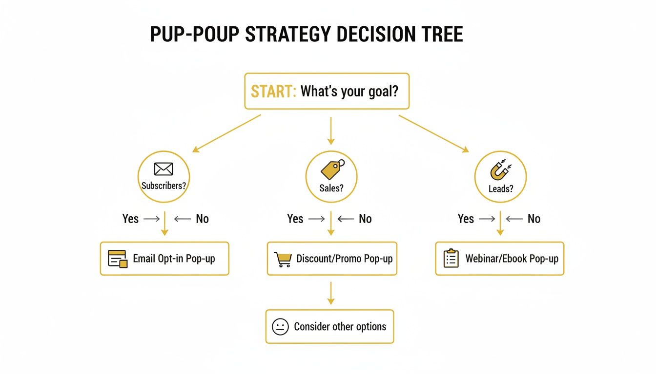
Ultimately, making sure your pop-up’s purpose lines up with your main business objective is the first, and most important, step. It will shape every other choice you make from here on out.
The Power of Pop Up Plugins
Good plugins are more than just a simple pop-up tool; they're complete conversion toolkits. They almost always include built-in analytics to track how many people see and interact with your pop-ups, alongside A/B testing features. This lets you scientifically test different headlines, calls-to-action, or designs to discover what truly resonates with your audience. That kind of data is gold for improving your results.
Picture a small e-commerce shop owner. They need a solution that’s quick to set up and easy to tweak. A plugin lets them launch a pop-up promoting a weekend sale in under an hour, complete with exit-intent technology to capture visitors just as they're about to leave. For an even more creative approach, you could integrate a WordPress quiz plugin for lead generation to create fun, interactive experiences that draw in even more subscribers.
Key takeaway: If you value speed, simplicity, and a powerful set of built-in features like analytics and A/B testing, a quality pop-up plugin is hands-down the best option for most WordPress site owners.
When Custom Code Makes Sense
On the other side of the coin, we have the custom-code approach. This path is really for developers or businesses with a development team on hand. Building a pop-up from scratch with JavaScript, HTML, and CSS gives you absolute freedom over every pixel and every function.
The biggest advantage here is performance. A hand-coded solution is incredibly lightweight because it contains only the code you need and nothing else. This helps you sidestep the potential "bloat" that can sometimes accompany plugins packed with features you'll never use, ensuring your pop-up has a minimal impact on your site’s loading speed—a massive factor for both SEO and user experience.
An enterprise-level website, for instance, might go this route to build a sleek, perfectly on-brand pop-up that integrates seamlessly with their unique internal systems. They get a lightning-fast, secure, and completely bespoke tool without any third-party dependencies. It demands a serious upfront investment of time and skill, but the payoff is a tailor-made asset built for maximum control and performance.
Comparison of WordPress Pop up Methods
To help you weigh your options, let’s break down the key differences between using a plugin and building a custom solution. This table gives a quick overview of what to expect from each approach.
| Factor | Using a Plugin | Using Custom Code |
|---|---|---|
| Ease of Use | Very high. Usually involves visual builders and no coding required. | Very low. Requires expertise in HTML, CSS, and JavaScript. |
| Speed to Launch | Fast. You can have a pop-up live in under an hour. | Slow. Development, testing, and deployment can take days or weeks. |
| Cost | Varies. Free versions are available, with premium plans ranging from £50-£200 per year. | High upfront cost for development time or agency fees. No recurring fees. |
| Features | Feature-rich out of the box (e.g., A/B testing, analytics, templates). | You only build the features you need. Anything extra requires more development. |
| Performance | Can add some overhead to your site, but good plugins are well-optimised. | Extremely lightweight and fast, as there's no unnecessary code. |
| Flexibility | Limited to the plugin's settings and design options. | Total control. The only limit is your imagination and development skill. |
| Support | Typically comes with documentation and customer support (especially for premium versions). | No external support. You or your team are responsible for all maintenance. |
In the end, there's no single "best" answer—only the best answer for you. If you need to get moving quickly and want access to powerful marketing tools without the technical headache, a plugin is your best friend. But if you have the resources and require a truly unique, high-performance solution, custom code offers unparalleled control.
Fine-Tuning Your Pop Up: Triggers and Targeting Rules
The real secret to a pop up that actually works—one that people click instead of instantly closing—lies in its timing and relevance. Once you’ve picked your tool for creating a pop up in wordpress, the strategic work begins. This is where you set the display rules that turn a generic blast into a genuinely helpful, targeted message.
Think of it this way: triggers are the "when," and targeting is the "who." Nail these two, and your pop up will feel like a natural part of someone's journey through your site, not an annoying roadblock. Instead of shouting the same offer at every single visitor, you can craft specific campaigns that connect with what a user is doing and what they might want next.
Choosing the Right Moment: Core Pop Up Triggers
Triggers are simply the actions that make your pop up appear. The right one depends entirely on what you're trying to achieve and where the user is on your site. Let's break down the most common ones and when they make the most sense.
-
Time-Based Triggers: This is the most straightforward option. The pop up appears after someone has been on a page for a specific amount of time, say, 15 seconds. It’s a great way to greet new visitors without jumping on them the second they arrive. Give them a moment to get their bearings, then present your welcome discount or newsletter sign-up.
-
Scroll-Depth Triggers: This one is brilliant for content-heavy pages. The pop up only shows up after a user has scrolled a certain percentage down the page, maybe 70%. If someone has read that much of your blog post, they’re clearly interested. That’s the perfect time to offer a related e-book or a link to a webinar on the same topic.
-
Exit-Intent Triggers: This is the big one. Using clever cursor tracking, this trigger detects when a visitor is about to navigate away from your site and displays the pop up in that final moment. If you run an e-commerce store, this is your last-ditch effort to prevent a lost sale. You can offer a special discount or just remind them about the items they left in their cart. It's a surprisingly effective way to reduce cart abandonment.
Getting Granular with Advanced Targeting Rules
Targeting rules add a powerful layer of precision, letting you decide who sees your pop up based on their behaviour, location, or history with your site. This is how you make your offers feel personal and relevant.
For instance, if you run an online shop, showing a "10% Off Your First Order" pop up to a loyal customer who's bought from you five times just looks sloppy. It breaks the experience. Instead, you can easily set up rules to exclude logged-in users or anyone with a previous purchase.
A perfectly timed pop up should feel like a helpful shop assistant appearing with exactly what you need, right when you need it. The goal is to be useful, not intrusive.
Here are a few real-world examples of smart targeting in action:
-
Page-Level Targeting: You could show a free shipping offer, but only on the checkout page to nudge people over the finish line. Or, display a pop up for a specific e-book exclusively on blog posts that are closely related to that e-book's topic.
-
Device-Specific Targeting: Tailor your message for the screen. A pop up on mobile could prompt someone to download your app, while the desktop version of that same pop up might promote a detailed guide that's easier to read on a larger screen.
-
Referral Source Targeting: Why not roll out the red carpet for visitors coming from specific places? You can create a unique welcome pop up for people arriving from a Facebook ad campaign or a partner's website. Something like, "Welcome, Facebook friends! Here’s a special 15% discount just for you."
When you combine smart triggers with precise targeting rules, your pop up in wordpress evolves. It stops being a blunt marketing tool and becomes a sophisticated engine for conversions that actually respects your visitors' experience.
Designing Pop-Ups That Convert Without Annoying Users
Let's be honest: nobody loves a pop-up. But they stick around for one simple reason—they work. The trick isn't just to throw an offer on the screen; it's to create something that feels less like an interruption and more like a genuinely helpful suggestion. A great pop-up in WordPress should blend in, add value, and gently persuade your visitor.
It all starts with your headline. This is your one shot to grab their attention, so make it count. Generic pleas like "Join Our Newsletter" are a one-way ticket to getting ignored. Instead, lead with the benefit. Something like, "Get 10% Off Your First Order Instantly" tells the user exactly what's in it for them, right away.

Building a High-Converting Design
Once you've hooked them with the headline, the rest of the design needs to pull its weight. Keep your copy short and sharp. People don't read pop-ups; they scan them. Use bullet points or quick, punchy sentences to outline the perks. If someone can't grasp your offer in three seconds, you've already lost them.
Think carefully about visual hierarchy. Your most important elements—the headline and the call-to-action (CTA) button—need to pop. A splash of contrasting colour on the CTA button can work wonders, drawing the eye right where you want it to go. And please, use active language. "Get My Discount" or "Download Now" is far more compelling than a lifeless "Submit."
Consistency is key for building trust. The pop-up should look and feel like it belongs on your site. Stick to your brand's fonts, colour scheme, and overall aesthetic. When it feels like a natural part of the experience, it's far less jarring than a generic ad that looks completely out of place. For more practical design tips, our guide on creating an effective pop-up advertisement has plenty of real-world examples.
A well-designed pop-up is an exercise in clarity and persuasion. Every word, colour, and image should serve a single purpose: making the user's decision to convert an easy one.
Contrasting Good and Bad Pop-Up Design
To really see what works, let's look at two very different approaches.
-
The Bad Pop-Up: We've all seen it. A massive, full-screen pop-up ambushes you the second you land on a site. It has a blurry stock photo, a vague "Subscribe Now" headline, and the close button is practically invisible. It’s aggressive, lazy, and the first impression it makes is a terrible one.
-
The Good Pop-Up: Now, imagine you're reading a fantastic blog post. After you've scrolled about 70% of the way down, a small, elegant box slides in from the corner. It uses the site's colours, shows a crisp image of a free e-book, and the headline reads, "Enjoying This Post? Get the Complete Guide." The button confidently says, "Send Me the Guide!" This pop-up feels relevant, respectful of my time, and genuinely helpful.
Getting GDPR and Accessibility Right With Your Pop-Ups
A high-converting pop-up in WordPress isn't just about sharp design and clever timing. It's about building trust and being inclusive. Here in the UK, that means taking data privacy under GDPR and web accessibility seriously. This isn't just a box-ticking exercise; it's a legal and ethical must-have that protects both your users and your reputation.
Get this wrong, and you risk more than just hefty fines. A pop-up that's impossible to close or sneakily gathers data creates a frustrating experience, eroding the very trust you're trying to build with your audience.

Staying Compliant with UK GDPR
Under UK data protection law, consent for things like marketing emails or cookies has to be crystal clear. Gone are the days of pre-ticked boxes. You need explicit opt-in. This means your users must actively take a positive step—like ticking an empty checkbox themselves—to agree. Silence or simply not unticking a box doesn't cut it.
This has been a major shift for businesses. In fact, a recent survey revealed that around 72% of UK WordPress site operators had to overhaul or completely replace their pop-up and consent plugins between 2020 and 2024. They needed better tools to log consent properly and give users more control. You can see more data on UK WordPress market trends on roidesigns.co.uk.
To keep your pop-ups on the right side of the law, follow this simple checklist:
- Leave it Unticked: Your consent checkbox for a newsletter must always start unticked.
- Link Your Privacy Policy: Make sure there's a clear, easy-to-find link to your privacy policy right there in the pop-up form.
- Be Straightforward: Tell people exactly what they're signing up for. No jargon. Just a plain explanation of what they'll get and how often.
Getting consent right is also the first step in ethically understanding how people use your site. If you want to dive deeper, our guide on how to track website visitors is a great place to start.
Designing Accessible Pop-Ups for Everyone
Accessibility is all about making sure everyone can use your pop-up, including people who use assistive technologies like screen readers. An inaccessible pop-up can literally trap someone on your page, making it impossible for them to continue. It's a deal-breaker.
A truly effective pop up doesn't just convert; it respects every user's right to privacy and equal access. Making compliance and accessibility a priority from the start is non-negotiable for building a trustworthy brand.
To ensure your pop-ups are accessible, they need to meet a few core requirements.
First, think about keyboard navigability. Can a user move through the form fields, click the buttons, and, most importantly, close the pop-up using only their Tab and Esc keys? They must be able to.
Next is screen reader compatibility. When the pop-up appears, it should be announced clearly by screen readers. That means giving it a proper title and ensuring all form fields have descriptive labels.
Finally, you need a visible and clear close button. It should be easy to see and click, but also properly labelled for screen readers, often with something like an aria-label="Close". Don't hide it or make it tricky to find.
Measuring and Improving Pop Up Performance
Right, so you’ve launched your pop up. Job done? Not even close. Getting it live is just the starting line. The real wins come from digging into the data, figuring out what your visitors are actually doing, and making smart tweaks based on that behaviour.
Success with pop ups isn't a one-and-done deal. It’s a cycle: test, learn, and refine. It’s about figuring out what truly resonates with your audience.
Thankfully, most decent pop up plugins have built-in analytics, giving you a quick snapshot of how things are going. If you prefer to keep everything in one place, you can also set up event tracking in Google Analytics to monitor pop up interactions alongside all your other site data. The trick is to look past the surface-level numbers and focus on the metrics that actually impact your goals.
Understanding Your Key Metrics
It's easy to get overwhelmed by data, so let's keep it simple. To begin with, you only need to keep an eye on a few core numbers to see what’s working.
- Impressions: This is just the total count of how many times your pop up has been shown to visitors. Think of it as your baseline.
- Conversion Rate: This is the big one. It’s the percentage of people who saw your pop up and actually did what you asked them to do—like signing up for your newsletter.
- Click-Through Rate (CTR): If your pop up has two steps (like clicking a "Get Offer" button before seeing the form), this tracks how many people take that initial action.
These figures tell a story. For example, a ton of impressions but a rock-bottom conversion rate is a classic sign that your triggers are firing correctly, but your message or offer just isn't hitting the mark.
The goal isn't just to get clicks; it's to create a value exchange. Data tells you how well you're communicating that value. A successful pop-up strategy is built on continuous improvement driven by real user behaviour.
The Power of A/B Testing
Once you’ve got a handle on your baseline numbers, it's time to start making them better. This is where A/B testing (or split testing) becomes your best friend. The concept is simple: you create a slightly different version of your pop up (Version B) and run it against the original (Version A) to see which one performs better.
You can test just about anything, but the key is to change only one thing at a time. Otherwise, you’ll never know what actually made the difference. Start with the big stuff: the headline, the call-to-action button, the main image, or the offer itself. This disciplined approach is how you achieve real, measurable improvements. For a more detailed breakdown, our guide on effective A/B testing for marketing campaigns is a great place to start.
For businesses here in the UK, this process really pays off. From what we've seen, well-executed pop ups for things like email sign-ups or special offers can boost site-wide conversion rates by an average of 1.5%–6%. According to some recent UK WordPress usage statistics, a huge number of sites could be seeing these gains. By consistently testing and optimising, you stop guessing and start building a reliable growth engine.
Got Questions? We've Got Answers
Even with the best plan, a few questions always pop up (pun intended) when you're getting things set up in WordPress. Here are some quick answers to the most common queries I hear, which should help you sidestep any potential hiccups.
Will a Pop-up Really Slow Down My WordPress Site?
That’s the million-dollar question, isn't it? The short answer is: it can, but it absolutely doesn't have to.
A well-built, modern pop-up plugin is designed to load asynchronously. This just means it loads in the background and won't hold up your main page content from appearing for your visitors. To keep things snappy, stick with reputable plugins, make sure you compress any images you use in the pop-up, and don't go overboard with flashy, complex animations.
Here's a pro tip I always recommend: run a site speed test before you activate your pop-up, and then another one after. This gives you a clear before-and-after picture, so you know exactly what performance impact, if any, you're dealing with.
How Do I Make Sure My Pop-up Works on Mobile?
This isn't just a "nice to have"—it's critical. Google has been known to penalise sites for using annoying, intrusive pop-ups on mobile, so you need to get this right.
- Be Responsive: Your pop-up has to automatically resize and reformat for smaller screens. It should never, ever cover the entire display.
- Make it Easy to Close: The 'X' button needs to be big enough to see and easy to tap with a thumb. Don't make people pinch and zoom just to close it.
- Think About the Trigger: On mobile, an instant pop-up can be really jarring. I'd suggest using a scroll-depth or time-on-page trigger instead. This ensures the visitor has had a chance to engage with your content before you ask them for something.
Can I Link My Pop-up Straight to My Email Marketing Service?
Absolutely! In fact, this is one of the main reasons people use them. Pretty much every pop-up plugin out there is built to integrate directly with major services like Mailchimp, ConvertKit, or ActiveCampaign.
This connection means new subscribers are automatically funnelled into your email list, making the whole process hands-off. Setting it up is usually as simple as finding an API key in your email provider's dashboard and pasting it into the plugin's settings.
Ready to build a high-converting pop-up without the guesswork? The Digital Marketing Toolbox offers a curated collection of the best pop-up plugins and conversion tools to help you grow your email list and boost sales. Find the perfect solution for your WordPress site at https://grow-your-biz.com.


